Countdown to €100 Oil: €70 Oil
Posted by Jerome a Paris on March 20, 2008 - 7:00pm in The Oil Drum: Europe
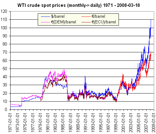
(Click to enlarge)
Below the fold, I'll explain what data is displayed on the diagram, and show a few more diagrams.
The Euro is presently the official currency of 15 of the currently 27 member states of the European Union (as well as four embedded micro-states, from Andorra to the Vatican), controlled by the monetary policy of the European Central Bank (ECB). But it became physical currency only in 2002, then in 12 of the then 15 EU member states, and started existence as accounting money of only 11 member states in 1999.
For the time before 1999, the Euro has to be pegged to some predecessor. There are two possibilities.
One is to use a virtual unit calculated from then extant national currencies. Preceding the Euro was a long convergence of European monetary policies and exchange rates, part of which was indeed the definition of such virtual monetary units. The last of these was the European Currency Unit (ECU). The Euro was set to equal the ECU at its launch. Thus the virtual Euro-ECU peg is simply 1:1.
The second possibility is to stick with the strongest of the preceding national currencies: the West German Mark (DEM). This makes sense because the ECB largely continues the monetary policy of the [West] German Bundesbank, thus in some practical respects, the Euro is more DEM 2.0 than ECU 2.0. In 1999-2001, the German Mark only served as paper money for the Euro, at a fixed exchange rate. Using this, the pre-1999 virtual Euro-German Mark peg can be set at 1.95583:1.
The actual data I used:
- Euro/Dollar exchange rate, 1999-present: daily reference data from the US Federal Reserve Bank
- ECU/Dollar exchange rate, 1979-1998: daily reference data from the US Federal Reserve Bank
- DEM/Dollar exchange rate, 1971-1998: daily reference data from the US Federal Reserve Bank

As oil price in dollars, the currently preferred reference values are that of front-month futures. However, NYMEX's WTI futures started only in 1983, IPE's Brent futures even only in 1988. For a benchmark extending back to the two Energy Crises, we need spot prices. Fortunately, today spot prices follow front-month futures rather closely, thus the distinction is of little importance.
The datasets I found & used:
- WTI crude, 1986-present: daily closing spot prices at Cushing, OK, from the EIA (Energy Information Administration of the US Department of Energy)
- WTI crude, 1971-1985: monthly average spot prices at Cushing, OK, from Economagic.com
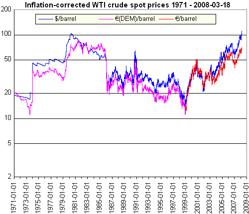
Now here is the finished graph again. One can observe the First and Second Energy Crisis, the seventies fall of the dollar, the 1985 dollar high and oil low, the Iraqi invasion of Kuweit energy mini-crisis, the early nineties ECU and DEM highs, and the Bush II Era.

How would oil prices look if corrected for inflation? That depends on the deflator used. The German Mark-pegged prices above give an opportunity for another crude comparison. The price indexes used:
- For the dollar-denominated oil prices, 1971-2008: monthly US Consumer Price Index (CPI) from InflationData.com
- For the Euro-denominated oil prices, 1999-2008: monthly Eurozone Harmonised Index of Consumer Prices (HICP) from the ECB
- For the post-Reunification DEM-pegged virtual Euro-denominated oil prices, 1991-1998: monthly German Verbrauherpreisindex (CPI) from the Federal Statistical Agency of Germany
- For the West German DEM-pegged virtual Euro-denominated oil prices, 1971-1990: annual West German Preisindex für die Lebenserhaltung (Life sustainment Price Index) [pdf!] from the Federal Statistical Agency of Germany
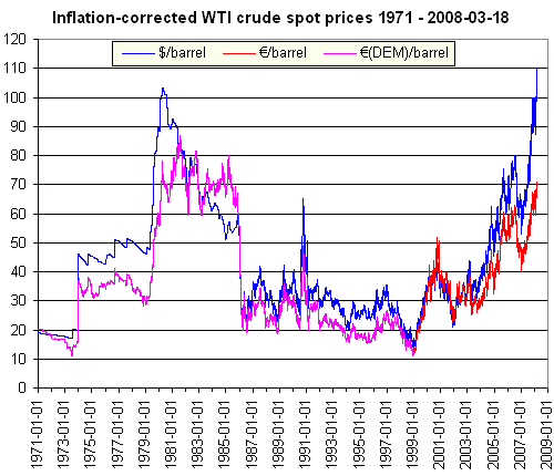
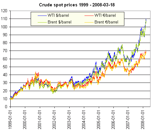
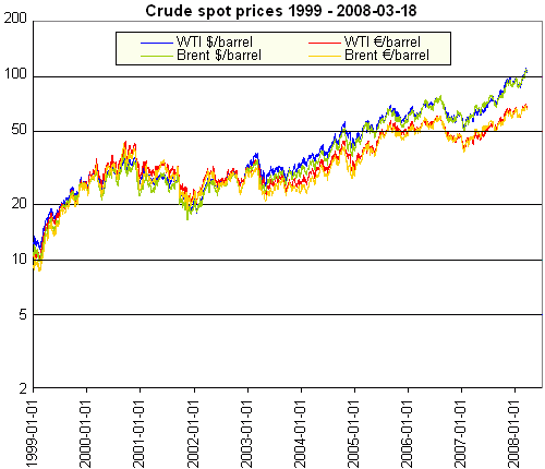
In the next diagram, let's zoom in on the Euro era (e.g. 1999-present). This period includes the Euro weakness bottoming out in 2001 and the rally since. For this, I also included daily Brent spot prices from the EIA, which is more relevant for European consumption. Price development in Euros is more moderate (we passed the August 2006 highs only with the October rally), but the trend is the same.
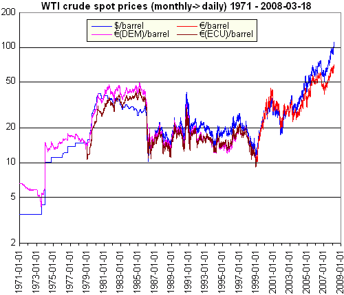
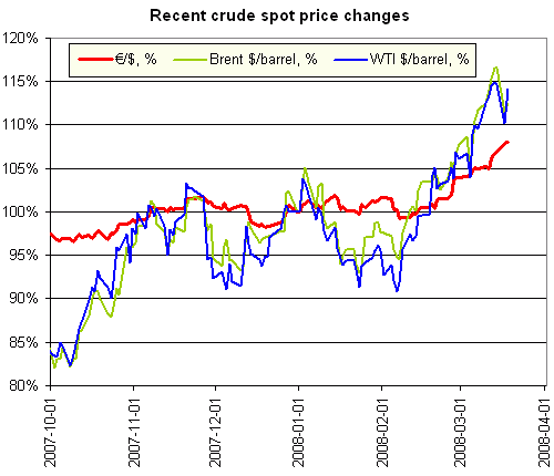
To have a better picture of relative changes, it is better to have prices on a logarithmic scale. I re-did all three three graphs above:
For more graphs of oil prices from 2006, in a greater variety of world currencies, check this Oil Drum story.


Now, if we could we do a similiar set of charts for a basket of other non-renewable commodities, i.e, gold, silver, copper, platinum, tin, etc.
I would imagine the results would come out very similiar, that is, dollar value decline in comparison to value of commodities in general.
Recently TOD US did a survey asking about future prices of oil, and gave as one option something like "it doesn't matter, it's the deflation of the dollar driving the price." or something to that effect.
Much to my surprise, almost no one voted for the "declining dollar" option as a cause of the price increase in oil, while many blamed politics.
In one way, the declining dollar achieves what many in the peak oil aware community desires to see, that is, higher oil and gas prices, thus forcing consideration of alternatives and efficiency/conservation. It is essentially a tax that never had to pass the House or Senate, and that no President had to vote on, thus saving them the politically suicidal step of having to tax fuel in America. The weak dollar drives up prices of imports (petroleum) slows economic growth and thus reduces consumption, all the things a petroleum tax would do. For those who believe that the Powers That Be know all too well about the coming age of peak oil, it could be conjectured that a weak dollar policy is a valuable tool going into an oil short age.
Cynical....nah, not me....:-)
(the risk of course is tha that the value of the dollar could start sneaking back up, and the price of commodities collapse in nominal dollar terms, leaving buyers of commodities and those they represent holding the bag...not likely you say, but stranger things have happened.
RC
Although I like the analysis and your interpretation I consider it a short term issue. Right now the EU is still enjoying growth. China if they wish could unpeg more against the dollar and show falling oil prices and even commodity prices for a bit. Of course their export economy would begin to slow as exports got more expensive even though commodity inputs where falling. What this shows is that the EU has been more fiscally responsible vs the US and thats not saying a lot.
The key is how this graph changes as the EU goes int a recession despite its economic policies.
In my opinion the EU has exactly the same economic structure as the US and will suffer the same fate as deflation takes hold. It may follow the US down slightly behind but will it and is it following you betcha. This is a intrinsic structural problem and until we revamp our economies to function in a declining energy deflationary environment the outcome is certain.
Can the EU change well that a political and social problem not economic. I'd say Europe has a better chance. In fact the euro points out why. Its impossible for the member countries to play the devalue the currency game as easy as the US can thus they have to deal with money reverting to a store of value if they keep the euro.
I guess I'll expand on that a bit its what I've been thinking about. Money has two uses as a liquid store of value and as debt. We mix the two together and I've been thinking about a monetary system where debt and store of value where two different entities.
So you could get paid in two types of money store of value or credit.
Excepting a credit note means you take on the risk of devaluing while the store of value note is constant. A credit note fluctuates vs a store of value. The store of value is in effect a replacement for gold or it could easily be gold.
They key here is credit notes are not unlinked from the entity that took on the debt. If that entity defaults the credit notes lose all value. Credit thus correctly maintains its risk vs a store of value.
In any case since we are entering a effectively infinite deflationary period the blurring of credit and store of value will be destroyed hiding this was only possible with continued growth. Thus how economies handle this unveiling is the key.
I don't agree, because the EU is, in the aggregate (and not counting the UK), more or less solvent. The US is not. Equilibrium can only be found through a huge debt-equity swap, where the sovereign funds end up .. owning you.
If you think being solvent or insolvent makes a difference then you simply did not understand what I wrote.
I'm not sure I understand it, either. At face value, the Eurozone as well as the EU as a region without trade deficit, and still strong internal manufacturing output, seems rather different from the credit-dependent US economy.
Or, do you mean it on the longer term, do you mean its fossil fuel dependency? On that I'd agree, the EU is not better on that presently. However, the EU (or at least some of its members) are ahead in the development and installation of renewables, as well as sustained energy efficiency measures (say in building codes). In my opinion this puts it potentially in a better position when supplies are shrinking, though a lot depends on the timescales.
Yes I mean on the longer term. Short term solvency in fiat currencies based on infinite growth is not all that important. One reason I think the US has no problem running its currency in the ground. TPTB know its dead and are milking it for all its worth. I don't agree with the approach but if your goal is a third world economy then the US is going to win big over Europe. Europe won't be able to compete with the new poor in America willing to work for nothing. Europe is going to have to deal with the rest of the world opting for a small wealthy class and a large poverty stricken working class.
A real, if possibly unavoidable problem, exists in this comparison, and that is the role of taxes.
The price of oil went up 3% in Germany on Jan. 1, 2007 when the German Mehrwertsteuer went from 16 to 19 percent - and that price rise had nothing to do with the broader market for oil. However, it did make oil 3% more expensive for most German purchasers (as always, exceptions are written into the tax code). Of course, the price paid for imported oil did not change - but the price for everyone following that importation did.
The difference in the level of oil taxation between Europe and the U.S. is profound, making many comparisons between the two economies difficult in this area.
As a second, not easily quantified, point - I am fairly certain that German contracts with Russian oil and gas suppliers are longer term, and significantly below current prices - much to the unhappiness of the Russians. Who occasionally turn off the spigot in turn. Being able to pay cash and commit over the longer term has allowed various Germany energy companies to buy fuel at a discount rate, when compared to countries like Italy or the UK. Changes in exchange rates are not likely to play a major role in this case, as neither the German companies nor their Russian counterparts were likely thinking of the dollar as being the primary currency of the transaction. However, the whole area seems quite murky, which is not really a surprise - I personally assume that German energy companies consider how they handle their Russian counterparts to be a matter of the highest discretion, in part because it is clearly corrupt, depending on your perspective. Schröder comes to mind, for example.
Comparing like and like is a very important concept. Unlike and unlike can not be compared as I have pointed out when EROEI is used to analyze electricity and ethanol.
When comparing like and like as with oil one must be careful in the United Sates. There are at least two kinds of oil that look the same, have the same energy content and are used identically but are really different and can not be compared. One is of course domestically produced oil such as in Texas and Alaska among many other places. This amounts to about 5 mbpd. The much larger kind of oil in the United States is imported oil. It is not the same. Why? Because it has to be paid for. It does not really have the same energy content as domestically produced oil. How come? Because the price that is paid to the foreign producer represents his share of the energy content of the oil which he gets for extracting it.
The EROEI concept completely ignores this since it does not consider price as relevant. What the United States is really doing is expending a large portion of its energy as represented by the dollars paid for foreign oil. Of course it gets the economic gain from that oil, but it is not as profitable as domestically produced oil. The result is a system which, because of the low taxation of oil, is similar to an energy sink which is constantly draining energy to pay foreign producers their share of oil's energy.
This is a vicious circle where dollars have to be conjured up in ever larger amounts to keep the thing going. With a national policy of globalization and the export of jobs to low wage countries, the costs of maintaining 1 million military overseas and the 2 wars in Iraq and Afganistan, the American economy is collapsing under the strain. In previous times the United States was more self sufficient in energy and did not have to expend a large portion of it to obtain more oil. Now it only collects the economic gain on imported oil and not the total energy gain as with domestic oil (which also is in decline).
It seems to me that the only way this can continue for long, if it can continue at all, is for the United States to either dramatically reduce it's standard of living which is politically not feasible or for the rest of the world to accept the funny money dollar gushing from the Fed's electronic well. Since the dollar is the main international currency, it would mean high global inflation for a long time and probably forever if allowed to continue. It is up to foreign powers to stop this since the United States is an oil addict that can not help itself.
Most long term oil contracts are still based on market prices (with an agreement to use an agreed index, with an agreed adjustment formula for quality/technical parameters). It's exceedingly rare for oil producers to sell oil on a long term basis with a fixed price.
similalry, long term gas contracts have variable prices based on market indices.
Adding some points to Jerome a Paris's:
On the issue of taxes, you are right that the picture is totally different for the end consumer, and as a transatlantic comparison, the above only applies to importers.
I note however an interesting factoid: the then German government saw fit to raise fuel taxes during the Second Energy Crisis.
Looking at the graphs, a few things that occur:
1) There tends to be a maximum rate of sustained rise the market is happy with. You can see it in the shape of the curves. Even if the rise continues for years, there appear to be few sticky shocks that do 50% in 1 day type rises.
2) The dollar seems to decouple from the rest of the world around the 2003 time period. A few years later and M3 is canned and there is an inflection point in the rate of rise. Looks like a planned devaluation.
3) From these figures a cost for a barrel of $140-145 at year end seems indicated. Significant variation would require a change from the status quo in supply or economics.
4) Recessions don't seem to make big differences.
5) Thus far, no matter how high the prices seem, there is no game changing inflection in the way the curves work - such as we might expect to see when people realise the peak is there and we are in a decline world. It doesn't seem to be there in the futures either. The wakeup will be interesting to watch...
Good article... just a little gripe... can't see the pretty pictures from where I'm sitting, because Photobucket is not deemed a useful professional site by my client's proxy server.
Note to technical editors : can you provide guidelines / useable site for uploads for your contributors, to avoid the problem of posting images that a large proportion of readers can't see?
Sorry about that, but this is a difficult problem. Photobucket happens to be among the few approved image host sites on major blogs like Daily Kos. But just these same sites are also high on the list of blocked sites for company content filters...
If you set the Euro exchange rate at 1:1 on Jan 1 2001 and give the dollar an inflation rate of 6.6%/annum, then on Jan 1 2008 the exchange rate is 1.56 to 1 with no Euro inflation.
There must be some amount of Euro inflation, so I suspect the real inflation rate of the $ is some where beyond 10% per annum averaged over 7 years. However due to the small amount of exchange rate change in the early years the current inflation of the $ is beyond 15%.
The inflation adjusted WTI on a log scale shows that, despite the feeling that the price of oil has gone ballistic, it actually looks pretty tame for a peaking scenario if you look at it in terms apart from the Fed and the dollar's problems (purple/red line). Incredibly, this chart shows that oil has been and still is trailing inflation for the last 30 years despite peaking production beginning to take hold. This would suggest that, as Simmons says, oil is preposterously cheap.
Excellent article thank you for posting this. The inflation adjusted curve is very valuable. As mentioned in a earlier comment, it would be interesting to repeat the inflation analysis using gold. I think that while oil is amazingly undervalued, we are looking forward to 300 $/barrel oil as a result of devaluation of the dollar. The US economy is now very far into uncharted economic waters. The Euro/Dollar gap caught my eye immediately. Thanks again for this!
With pleasure. But two notes:
1) Adjusting for inflation is a tricky issue, because the definition of the price index itself is tricky business. There are different price indexes, and each have their critics. I hope someone here (say JaP) has the link for an article maybe a year ago, which compared oil price graphs inflation-adjusted with different deflators, the standard CPI and two others -- and the peak of the Second Energy Crisis was reached long ago with the other two deflators.
I intended the graphs inflation-corrected with US CPI vs. Eurozone/German price index as another such comparison: if both indexes and the exchange rate would be 'true to value', the two curves would follow each other.
2) There's an Euro-Dollar gap, yet, one should note that even in Euros, the trend is clearly and inexorably upwards. But I agree that the still undervalued oil should climb significantly above €100/barrel, and that could be $300/barrel or more by that time.
Bill,
Here's a graph I found that goes back to 1970 but is a couple of years old, the ratio now is very roughly ten to one.
http://www.kitco.com/ind/saville/may022006.html
Interesting topic, nice plots. However, I feel that when you compare historical oil prices (in a way where you want to compare "affordability”), there are two more things that should be considered:
1: GDP growth: The average household income has increased significantly over time (in real terms), so even if the oil price was exactly as high as say during the oil crisis (inflation corrected), today, people would be able to buy many more barrels of oil than they were able a few years/decades ago.
To correct for this, a yearly GDP growth factor should be added just like the inflation number.
2: increase in energy efficiency:
Even if oil would cost exactly the same (inflation corrected), and our income has been made comparable, we would be able to do more with the oil today because energy efficiency has increased over the years (in many areas). Just think of for example improved home insulation, energy efficient light bulbs, more efficient planes, samilar size cars (some), engines, factories, relative reduction in industrial waste etc. We produce a lot more “goods”, for less oil. We can heat our house for longer, drive further (with the same size car), etc. Maybe it is this point, where Europe has performed better than the US, over the last years/decades.
To correct for this, you could calculate the yearly increase in (total GDP/annual oil consumption), and use this number also in the same as inflation.
Once you have factored in these things as well, the plot would show something like “oil expenditure burden” (not sure how to call it), expressed in a price per barrel. I think that the plot will show that oil is still much cheaper than it was in the 70's. Would be interesting to see the plots though!
Hope this is useful!
Oilworker