| A few more thoughts on Saudi and HL | The Oil Drum: Europe | Energy: the fundamental unseriousness of Gordon Brown |
Oil Prices around the World: Do Exchange Rates Matter?
Posted by Luis de Sousa on October 22, 2007 - 7:30pm in The Oil Drum: Europe
This is how the story has been running lately:
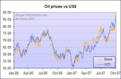
Figure 1 - Oil prices in United States Dollars
Following is the same story in other important currencies around the World.
This week the WTI index broke its all time records against most of the World's currencies. The Brent benchmark is yet to do that, but it's hanging by a thread.

Figure 2 - Oil prices against the Euro
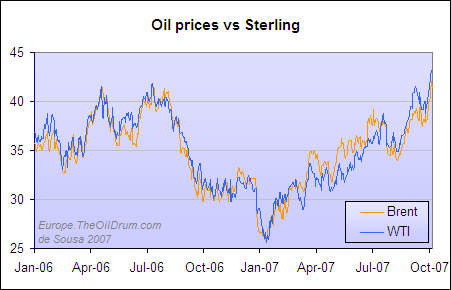
Figure 3 - Oil prices against the Pound Sterling
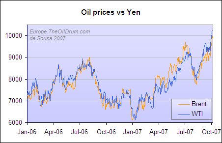
Figure 4 - Oil prices against the Japanese Yen
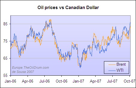
Figure 5 - Oil prices against the Canadian Dollar
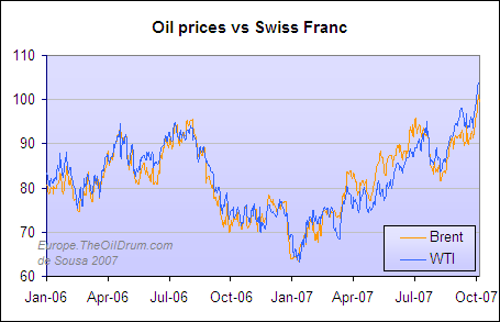
Figure 6 - Oil prices against the Swiss Franc
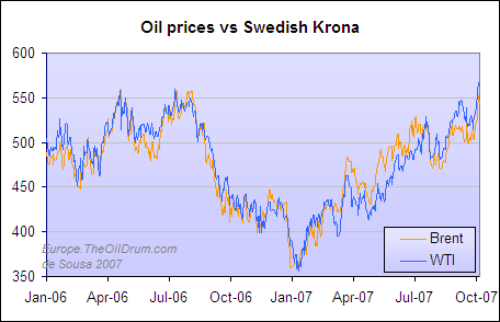
Figure 7 - Oil prices against the Swedish Krona
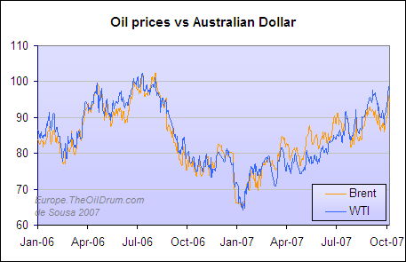
Figure 8 - Oil prices against the Australian Dollar
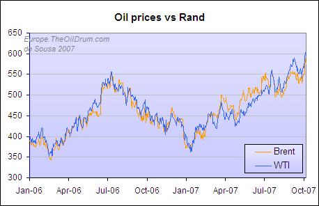
Figure 9 - Oil prices against the South African Rand
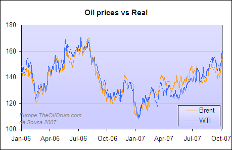
Figure 10 - Oil prices against the Brasilian Real
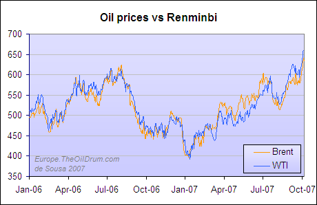
Figure 11 - Oil prices against the Chinese Renminbi
Figure 12 - Oil prices against the South African Rand
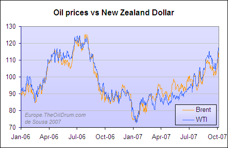
Figure 13 - Oil prices against the New Zealand Dollar
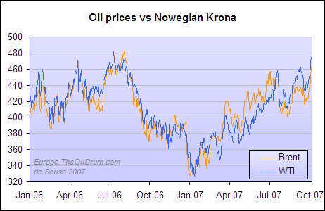
Figure 14 - Oil prices against the Norwegian Krona
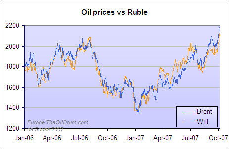
Figure 15 - Oil prices against the Russian Ruble
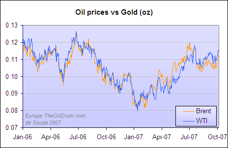
Figure 16 - Oil prices against a troy ounce of Gold
Previously at TheOilDrum:Europe :
The Cost of Gasoline around the World
Luís de Sousa
The Oil Drum : Europe
Personnel
Editors
Contributors
Peak Oil Primers
Archives
- November 2010 (3)
- October 2010 (6)
- September 2010 (4)
- August 2010 (7)
- July 2010 (6)
- June 2010 (7)
- May 2010 (2)
- April 2010 (8)
- March 2010 (4)
- February 2010 (6)
- January 2010 (3)
- December 2009 (5)
- November 2009 (8)
- October 2009 (12)
- September 2009 (6)
- August 2009 (5)
- July 2009 (11)
- June 2009 (8)
- May 2009 (16)
- April 2009 (10)
- March 2009 (7)
- February 2009 (10)
- January 2009 (15)
- December 2008 (9)
- November 2008 (9)
- October 2008 (9)
- September 2008 (13)
- August 2008 (10)
- July 2008 (14)
- June 2008 (23)
- May 2008 (16)
- April 2008 (12)
- March 2008 (16)
- February 2008 (9)
- January 2008 (13)
- December 2007 (13)
- November 2007 (16)
- October 2007 (22)
- September 2007 (8)
- August 2007 (9)
- July 2007 (16)
- June 2007 (8)
- May 2007 (7)
- April 2007 (7)
- March 2007 (10)
- February 2007 (10)
- January 2007 (12)
- December 2006 (9)
- November 2006 (15)
- October 2006 (4)
- September 2006 (5)
- August 2006 (5)
- July 2006 (9)
- June 2006 (5)
- May 2006 (10)
- April 2006 (9)
- March 2006 (13)
Vital Trivia
License

This work is licensed under a Creative Commons Attribution-Share Alike 3.0 United States License.
Luís – thanks for this constellation of tables
– it pretty much sums the situation, and places the guilt and load on the “culprit in charge” … namely those who depend on the dollar for their daily life …
Ps- I wonder when the same people will be able to link the drought in SE USA … to the climate-ghost ?
http://politics.reddit.com/info/5yw2g/comments/
if you are so inclined... :)
would it be possible to normalise and average all those graphs so that a roughly currency independent plot of the change in the value of oil could be displayed? (although it would still have an inflationary bias, due to the large amount of inflating currencies)
The interesting thing is that they are NOT averaged.
I'd like more thoughts on why there are the differences. Why is Russia suffering a higher oil price? [I'd have thought Russia might be analogous to CA because of internal energy resources.] Why is New Zealand less affected?
cfm in Gray, ME
Interest rates (prime rate), trade balance, money supply, other resources, speculation, et cetera, et cetera...
In NZ the interest rates have been in the order of 8% for some time, which have made their currency quite tempting.
No one wants their paper currency to get to strong against the US$, even in the case of an Oil exporter. The main difference from Canada and Norway to Russia is that in the case of the former two, investors and speculators flock to their currencies in times of US$ weakness and the central banks lag some time in resetting interest rates. As for the Ruble, it seems that somehow investors don’t see it as an alternative as good as the other two.
In order to keep oil prices low in Russia, Russia would have to let its currency rise substantially against the dollar. Despite Russia's energy resources, they simply do not account for enough of the economy to let that happen.
Were the Ruble to rise a great deal, the rest of the Russian economy would be wrecked. A strong Ruble makes Russian exports more expensive for consumers in foreign countries, and makes imports into Russia much cheaper. Russia still has other exports beyond oil and gas that account for a substantial share of GDP. Those export industries would crumble over night. Other Russian industries that produce for the domestic market - and Russia still has a large heavy manufacturing base, plus growing consumer and service sectors - would face ruinous competition from low-priced imports.
What the charts really show is that "demand"* for oil is rising worldwide. Supply has been largely fixed for the last two years, so the world is bidding up the price.
--
* "demand" in quotes to indicate the rising desire of individuals to obtain oil and spend more to purchase it (i.e., a shift of the demand curve), not the actual quantity demanded, which of course cannot rise when quantity supplied is unchanged.
I tried to do so here.
Yes, please. I'll side with Andrew here. You need to run moving averages throught this noise. I'll suggest running 3-month. The multiple graphs tell nothing. You need to present all the data in one place without producing the sphagetti-like nonsense that Khebab prints sometimes.
Create your own . You have confidence in yourself. Don't copy others' ideas. Have confidence in where your ideas are more informed than others' information. Take this and produce your own index.
Take what little you know about the market that others don't and show us that. I say this because I know. This is the only place anybody will ever pay attention to you. Peak oil is a crowded market. You know it's bad when WHT is making vulgar jokes.
And there is one other reason I say this. I do research.
I don't spend my time making pretty graphs. I used to. Charts are for other people.
Uhh. Exactly.
The thing that confuses what oil is doing relative to other real assets is this variable measure we use, paper money. If we all used a stable currency then we would have a clearer picture, but even gold is not completely stable because it ebbs and flows given the confidence or lack thereof in the various depreciating national or supranational debt instruments we call money, and it is somewhat controlled by the coordinated efforts of the government sponsored central banks.
Perhaps the one of the better way to see if oil is becoming more expensive relative to other real assets would be to compare it to a commodity index. You can be sure that until there is a financial collapse, all the currencies will depreciate because they are all being expanded, just at different rates at different times. If I had to pick one measure out of those you presented, I would pick gold or one of the currencies of the remaining countries which produce oil in excess of local demand.
Plunder and control imposed by force is the trademark of government. This is why it must be severely limited to insure maximum freedom.
If you go to this address:
http://stockcharts.com/h-sc/ui
and use the symbols $wtic:$crb to create a chart (which you then need to adjust with different attributes to get it expanded for the last three years) it gives you and idea of what West Texas Crude cost in terms of the Commodity Research Bureau index. Clearly oil is becoming more expensive in relation to other commodities irrespective of the expanding and contracting measuring stick of fiat money.
Sorry I could not figure out how to get the chart to just pop up in this comment (lack of computer skills).
Here's a graph of the Canadian dollar case going back a few more years. It graphs average monthly front-month Nymex contract converted to C$ using the average exchange rate for the month. (data points for Oct, of course, not available yet)
It clearly slows that so far from a Canadian standpoint the new highs are not that big of a deal. Oil was close to $80 in summer 2005 and it's not that much higher now 2 years later. Those new highs would be even less significant if adjusted for inflation.
Oil has yet to "break out" in Canadian dollar terms from it's trading range of the past few years.
Nymex futures prices from EIA:
http://tonto.eia.doe.gov/dnav/pet/pet_pri_fut_s1_d.htm
Canadian dollar data from Bank of Canada:
http://www.bankofcanada.ca/en/rates/exchform.html
I think that Canada and Norway are in the same boat small population large oil exports and appreciating currency.
But how has the internal cost of gasoline changed in Cananda ?
In CN vs USD.
I'd like to see gasoline costs vs oil price in each currency.
Try this link:
http://www.vancouvergasprices.com/retail_price_chart.aspx
Perfect timing. I'd be interested on your take on the whole "price of oil" vs. "dollar tanking" issue.
This is something that I actually get confused on. If the dollar let's say was $1.30 to the Euro 1 year ago now it is $1.40.
How does that effect the price of WTI in New York or Brent in London?
Explain exactly why the "cost" is actually higher or lower in one place or another.
This would really clear some stuff up for some people.
Think auctions.
Oil is priced in dollars. Assume that yesterday, the price of oil is the same as it was yesterday (e.g., $70). Assume you need 10 barrels - $700.
Finally, assume that today, the Euro appreciates against the dollar. One Euro buys more dollars today than it did yesterday ($1.40, vs. $1.30). What happens to the oil price?
Yesterday you needed (EUR)538,46 to buy your 10 barrels. But now you need fewer Euros to buy the same oil: (EUR)500,00. You save almost (EUR)40! If you get paid in Euros, it appears to you that oil is cheaper than it was or yesterday.
If EVERY major currency buys more dollars than it did last year, oil is cheaper everywhere than it was yesterday. Everywhere, that is, except the US, where the dollar price of oil is the same.
But if oil is cheaper, people can use more of it (and more people can use it). Some of those Europeans who are saving money on oil will do something to use their savings - and some of those activities will require more oil. They may go on a vacation (jet fuel? road trip?), or buy imported goods (transport).
Here's where the auction comes in. Oil goes to the highest bidder. In our scenario, Americans in the oil market are paying what they paid yesterday. Europeans, however, have that extra money to spend on energy - so they bid up the price of oil. Many Americans still need the oil for commuting, fertilizers, trucking, etc., so they pinch pennies (clip coupons, cancel Christmas, whatever) and spend more on oil than they did yesterday. Other Americans either can't afford to spend much more, or choose to conserve in the face of higher prices.
End result: dollar price of oil goes up. Europe gets more oil, America gets less.
----
I hope this answers your question.
As for the difference between Brent and WTI, both of those prices are in dollars. The difference has to do with the quality of the oil being contracted for (is it "sweet light", or a more "sour" crude?), and the transport costs to get the oil delivered to the designated market site.
Actually, don't think auction. There are physical restraints, from transport to storage to refinery capability which means that only a percentage of total oil production is available for any auction action. One reason that it looks like a bidding war today is that the amounts being bid are not large - a country like Kenya simply does not represent much in the way of tanker traffic.
However, the infrastructure simply does not exist to divert 2/3 of Great Britain's daily output to Italy, regardless of how much the Italians can pay for it.
Oil flows between regions, however there are limits - and those limits are ones that can only be overcome over a longer term with major capital. And considering the probable shrinking of the available oil volumes, it is not very likely that too many people will be doing it.
True for most probable scenarios. However, at some price, you could put UK oil on tankers to Italy.
Thank you for posting those charts. Many have the "reverse head and shoulders" look to them. The head on the $US chart is down at $50....the left shoulder is $78.....as is the right shoulder.....it's $38 from the head to the shoulder....add it to the breakout point at the shoulders (the neckline)....$78 + $38 = $116 target.....in historical context, it seems to fit....$40 was the high for many years, $78 for the last few years.... $116-$120 would seem to be the next logical step up on oil prices (WTI). When? now that's a good question.
The charts for Brits, Swiss, Japanese, Swedes, South African, Chinese and Russia all have similar to $US oil price breakouts.
For the chartists in you. It looks like we have completed the 10th (and largest percentage gain) up cycle in this oil bull market
The average up leg (in USD) in the 9 prior completed cycles is ~45% over ~5 months and the average correction is ~22% over ~2 months.
Courtesy of Adam Hamilton
Thank you for putting this together Luis
Luis, can y provide these graphs in percentual changes ? that will be more simple to compare between currencies.
good work.
[]s agsb
Álvaro try the last graph on this post.
Great post, thanks.
It sure would be nice to have easy access to these on a regularly updated basis.
On my previous post about this issue some other folks already ask for more info. That's why I did this one.
It's a promise.
Any chance of seeing (some of) these graphs from 1998, i.e. including the first peak in 2000?
I have daily Oil prices from Jan 1998 and Currency exchanges from Jan 1999. So it's a promise for a later post.
I forgot to mention the data sources in the post but here they are:
Oil prices from the EIA (xls file).
Currency exchanges from the Bank of Portugal (csv file).
Interesting, but to get a real grasp of the "price" of oil that matters, you'd need to chart the ratio of the price of oil to some measure of income (e.g. median household income). You can do that for each country and then see how they compare.
The point is to see whether, and to what extent, oil is becoming unaffordable. The nominal "price" is irrelevant. If we'd follow the recommendation of some and set up a world currency pegged to energy, then the "price" of energy would be constant, but we'd still be sliding towards demand destruction. It would be reflected in falling nominal incomes.
In the US we now have falling incomes in terms of real purchasing power (of fuels and food in particular), but inflationary monetary policy masks that. Also, increasingly extreme inequality can cause the "average" income to rise even as the median falls.
Another point is that affordability relates to the amount of oil actually used (per capita). Thus "rich" Americans are actually harder hit by rising oil prices than "poor" Chinese. One can pay more per pound of spice than pound of potatos.
And one more point: in countries with high fuel taxes the rise in pre-tax crude oil price may not be felt as much.