| Global Oil Supplies as Reported by EIA's International Petroleum Monthly for September 2010 | The Oil Drum: Europe | The oil 'peak' has been reached |
Trends in World Oil Supply/Consumption and Net Exports/Imports
Posted by Rune Likvern on September 28, 2010 - 9:36am in The Oil Drum: Europe
In this post I briefly present the results from my analysis of absolute and relative trends in world oil (all liquids) supply, consumption, net exports and net imports between 1980 and 2009. In this analysis the world has been split into 5 economic groups, OECD (30 developed countries), OPEC (current 12 countries), FSU (Former Soviet Union; 15 countries), China and India and ROW (Rest Of World).
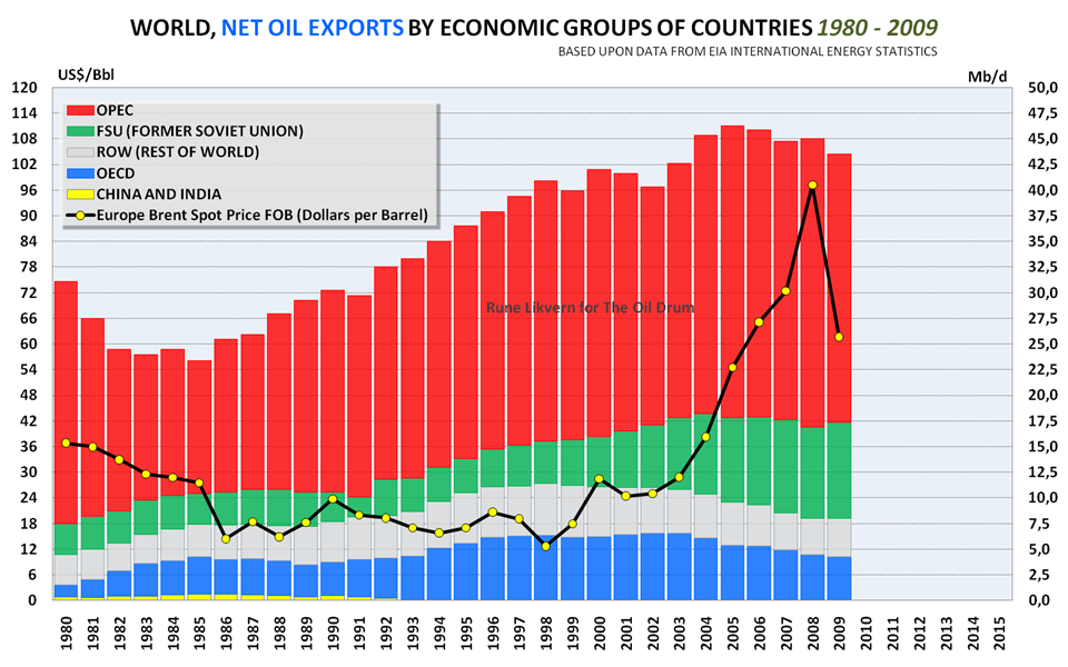
The stacked columns show development in net exports of all liquid energy split among OPEC, FSU (Former Soviet Union), ROW (Rest Of World), OECD and China+India from 1980 to 2009. The development in the annual oil price is plotted against the left hand y-axis.
My analysis very much supports the view that fundamentals (demand/supply balance) were the cause for the increase in the oil price in the 2002 to 2008 period. It appears to me that the continuation of economic growth during 2004 - 2008 also coincided with declining OECD oil supply, leading to strong growth in the oil price.
I also present some observations about what is different now compared to the recovery following the recession of the 80s. At that time, oil prices were very much declining due to growth in OECD oil supply from Alaska, the North Sea and Mexico. At this point, we are seeing rising prices compared to a year ago, related at least in part to the impact of stimulus programs.
It appears to me that between now and the end of 2011, we may see available supplies stretched increasingly tightly, provided that "the wheels stay on the world economy". This is similar to my conclusion from a recent post, OPEC's Spare Crude Oil Capacity - Will it Disappear by the End of 2011?
More below the fold.
DISCLAIMER: The author holds no positions in the oil/energy market that may be affected by the content of this post.
NOTE: Diagrams based upon EIA data that may be subject to future revisions.
Both EIA's Short Term Energy Outlook and IEA's Oil Market Report agree that near term world demand for liquid energy will grow. As we now move into winter in the Northern hemisphere (a time when oil demand normally increases) movement in oil price will become a good indicator of the world's oil supply/demand balance. Since energy data are not published until months or years after the fact, oil price movements also serve as an indicator for the general direction of the world economy.
World Oil Supply and Net Oil Exports
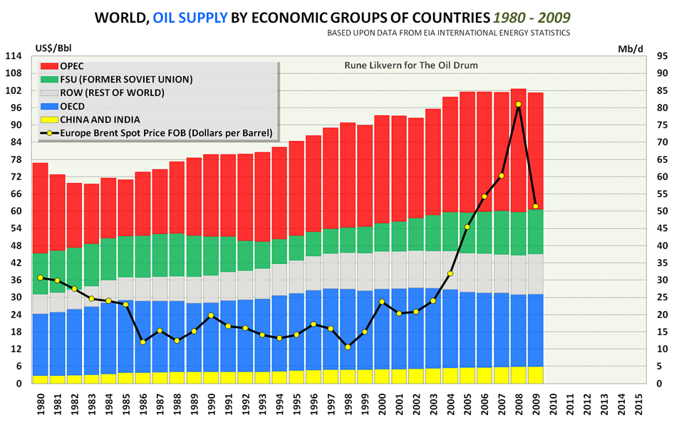
Figure 01: The stacked columns in the diagram above show the development in world supplies of liquid energy (crude oil, condensates, NGLs and other liquid energy) from 1980 to 2009, split among 5 economic groups of countries. Annual oil price (Brent) is plotted against the left hand y-axis.
The chart above illustrates how world oil supply grew steadily for over 20 years, between 1983 (after the oil price shock and the recession in the early 80s) and 2005. After 2005, it formed a plateau. Apparently, the growing oil supply from some OECD countries (ref also figures 03 and 05) helped bringing down the oil price and contributed to 2 decades of low and predictable oil price.
The chart also shows how recent (1997 to present) growth in oil supply from FSU supported Non OPEC growth in oil supplies and its effect on maintaining the recent plateau in world oil supply (ref also figure 06).
The remarkable thing is that by coincidence the oil price started its strong growth as OECD supply started to decline during 2004.
During the first half of 2010, the average oil price was $77/Bbl (Brent) which is approximately 25 % above the annual price of $62/Bbl in 2009. This has increased world supply by 1,6 Mb/d (1,1 Mb/d (C+C), 0,3 Mb/d (NGLs), 0,2 Mb/d (other liquid energy)) so far in 2010 relative to 2009. A major part of the growth in supply is growth in net oil exports.
In the past year, many of the OECD countries have applied stimulus packages. It appears that the result of this additional spending has been higher oil prices, without much additional oil supply. Furthermore, EIA and IEA forecasts now both indicate that OECD oil supply is headed for a near term decline.
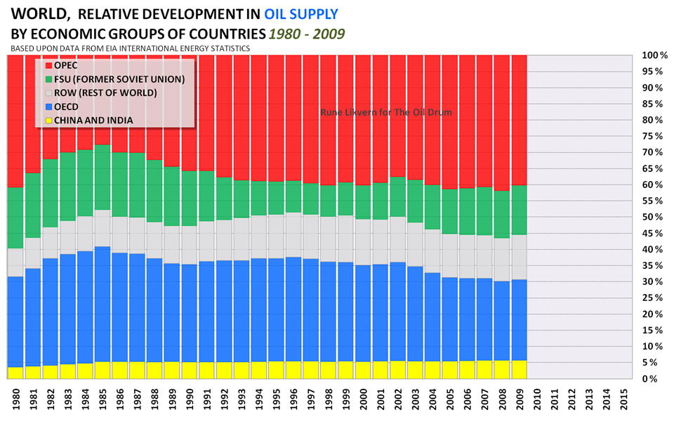
Figure 02: The stacked columns in the diagram above show relative development in world oil (all liquids) supply among the 5 economic groups of countries presented here.
Figure 02 illustrates how OPEC’s share of world supply declined between 1980 and 1985. Since then, it has grown to approximately 40 % now. The chart also shows how OECD’s share is now declining.
The world oil supply picture tells only part of the story. What is equally important is to understand developments in world net oil exports.
Figure 03: The stacked columns in the diagram above show development in world net oil exports of liquid energy (crude oil, condensates, NGLs and other liquid energy) from 1980 to 2009, split among the 5 economic groups of countries. The development in the annual oil price (Brent) is plotted against the left hand y-axis. NOTE: net oil exports are calculated as the difference between production and consumption for only those countries that are exporters. Adjustments for stock changes may impact the annual numbers a little in either direction.
The diagram shows that world net oil exports reached a high in 2005, and have since declined. There was a larger decline 2009, mainly due to reduced oil imports into OECD caused by the economic slowdown. The growth in oil price after 2005 did not result in an increase in world net oil exports, which strongly suggests that price rationing took place.
In 2009 there were 31 countries that had annual net exports above 100 kb/d. Some of these, including Brazil, Colombia, and Sudan, are included in the ROW group.
It appears that growth in the oil price coincided with the start of decline in OECD net exports in 2004.
The chart also illustrates that growth in net oil exports in recent years have come from FSU and OPEC. More about this following Figure 07.
World net oil exports could reach another high in the near future. For the first half of 2010, world oil supply grew by 1,6 Mb/d relative to 2009 in response to a 25 % growth in the oil price. Most of this supply growth is believed to be increased net exports. In the post OPEC's Spare Crude Oil Capacity - Will it Disappear by the End of 2011? I analyzed how OPEC oil supplies in recent years had responded to the oil price as an approach to identifying what probable spare marketable crude oil capacity OPEC has. In the linked post, I found it probable that present marketable crude oil spare capacity within OPEC is around 2 Mb/d. There are estimates from EIA and IEA showing higher spare capacity within OPEC, while some informed analysts believe it is lower.
The bottom line here is that there exists possibilities that new highs of both world oil supplies and net oil exports could happen in 2010 or 2011. What happens beyond 2011 is anyone’s guess--I expect that both total world oil supplies and net exports will show declines in 2012 at the latest.
Figure 03 also demonstrates how net oil exports from FSU have grown in recent years. World supplies, net exports and the world economy would have been quite different without FSU’s growth in supplies.
NOTE! It may appear strange to some readers that OECD in Figure 03 appears to be a net exporter. This is because Figure 3 represents the sum of exports for those countries who are oil exporters; its breakdown can be found in Figure 5.
Estimates of net imports into OECD have been done assuming that oil produced within OECD stays within OECD. Thus what is presented for OECD in Figure 09 is net imports for OECD from sources outside OECD.
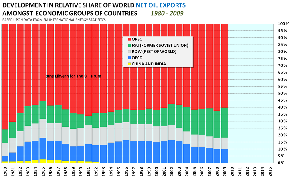
Figure 04: The stacked columns in the diagram above show relative development in world net oil (all liquids) exports among the 5 economic groups of countries presented here.
The chart shows how OPEC’s share of net oil exports declined from around 76 % to around 55 % during the first half or the 80’s. As of 2009 OPEC had around 60 % of world’s net oil exports and FSU had grown their share to around 22 %. I currently expect that both OPEC’s and FSU’s share of future world net oil exports to grow.
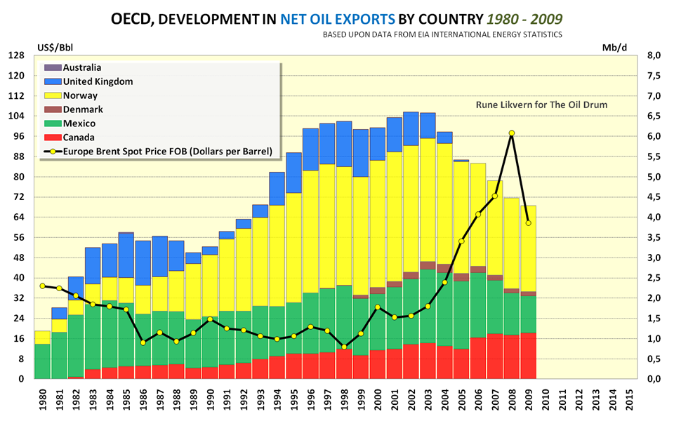
Figure 05: The stacked columns in the diagram above show development in OECD net oil exports of liquid energy (crude oil, condensates, NGLs and other liquid energy) from 1980 to 2009. The development in the annual oil price (Brent) is plotted against the left hand y-axis.
What I found interesting in the chart above is that it shows how the oil price declined during the first half of the 80s with growth in OECD oil supply and net oil exports, and then remained stable and predictable until net exports from OECD started its decline in 2004. The decline in OECD net exports continues in 2010, and the oil price so far in 2010 is up 25 % relative to 2009 on an annual basis.
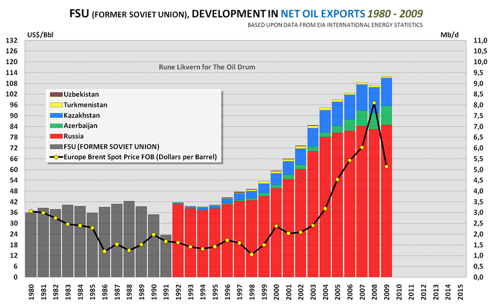
Figure 06: The stacked columns in the diagram above show development in FSU (Former Soviet Union) net oil exports of liquid energy (crude oil, condensates, NGLs and other liquid energy) from 1980 to 2009. The development in the annual oil price (Brent) is plotted against the left hand y-axis.
Apparently the events leading up to the collapse of Soviet Union with declines in its net oil exports from the late 80s had little effect on the oil price. This happened while OPEC had the capability to grow its share of world net oil exports.
The growth in oil supply and net exports from FSU in recent years gives some food for thought about how things may have been without this.
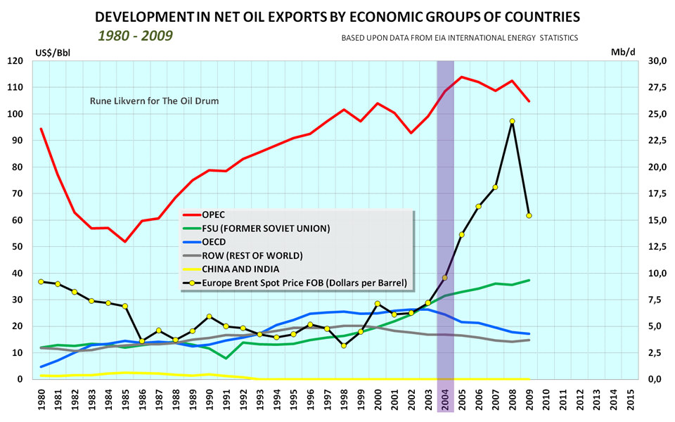
Figure 07: The lines in the diagram above show development in net oil exports for each of the 5 groups of countries presented here. The development in the average annual oil price is plotted against the left hand y-axis.
To me, 2004 appears to be the year when the oil price revealed that the world supply/demand situation was getting tighter. Total net oil exports from OECD, FSU, (China + India) and ROW reached a high in 2004, leaving OPEC as the only group of countries with the potential to still increase net exports.
Note also the uptick in the oil price in 2000 when OPEC provided a major part of the growth in net oil exports.
Between 2002 to 2005, OPEC increased their net oil exports by 5,3 Mb/d, while the oil price more than doubled.
The continued growth in the oil price between 2005 and 2008--which did not result in any growth in net exports from OPEC--strongly suggests that OPEC was maxed out in these years.
The full picture is probably better understood if developments in consumption (demand) are presented together with developments in oil supply.
The world totals relating to supply and consumption may differ slightly. This is now believed to be mainly due to stock changes, but the fact that some data are still estimates subject to future revisions, may also play a role.
World Oil Consumption and Net Oil Imports
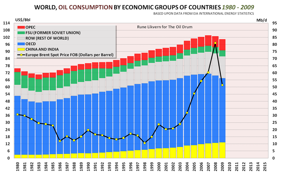
Figure 08: The stacked columns in the diagram above show development in world consumption of liquid energy (crude oil, condensates, NGLs and other liquid energy) from 1980 to 2009, split among 5 economic groups of countries. The development in the annual oil price (Brent) is plotted against the left hand y-axis.
OECD has so far had a high in oil consumption of 49,5 Mb/d in 2005 which declined to around 45,1 Mb/d in 2009.
The chart illustrates that the growth in oil consumption from (China + India) has not (yet) soaked up the entire decline in OECD consumption in recent years.
Oil consumption for ROW (Rest Of World) countries had a slight decline from 2008 to 2009. These may reflect effects from the financial crisis and/or the oil price.
Oil consumption within OPEC has seen growth in all the years presented in the Figure 07. Between 2003 and 2009, it grew from 5,9 Mb/d to 7,7 Mb/d or 30 %.
Presently the areas of the world with growing consumption are OPEC and (China + India). Between 2000 and 2009, these two groups of countries increased their oil consumption by 6,8 Mb/d which is more than 55 %.
For the first half of 2010, world supply of oil (all liquids) has been around 86,0 Mb/d, which is 1,6 Mb/d more than in 2009 and around 0,5 Mb/d more than in 2008.
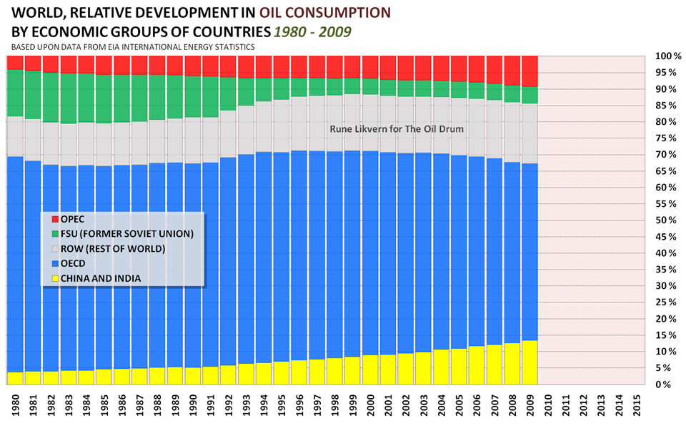
Figure 09: The stacked columns in the diagram above show relative development in world oil (all liquids) consumption for the 5 economic groups of countries presented here.
The chart above shows how OECD’s share of world oil consumption has shrunk while (China+India) and OPEC’s share has grown during the last 15 years.
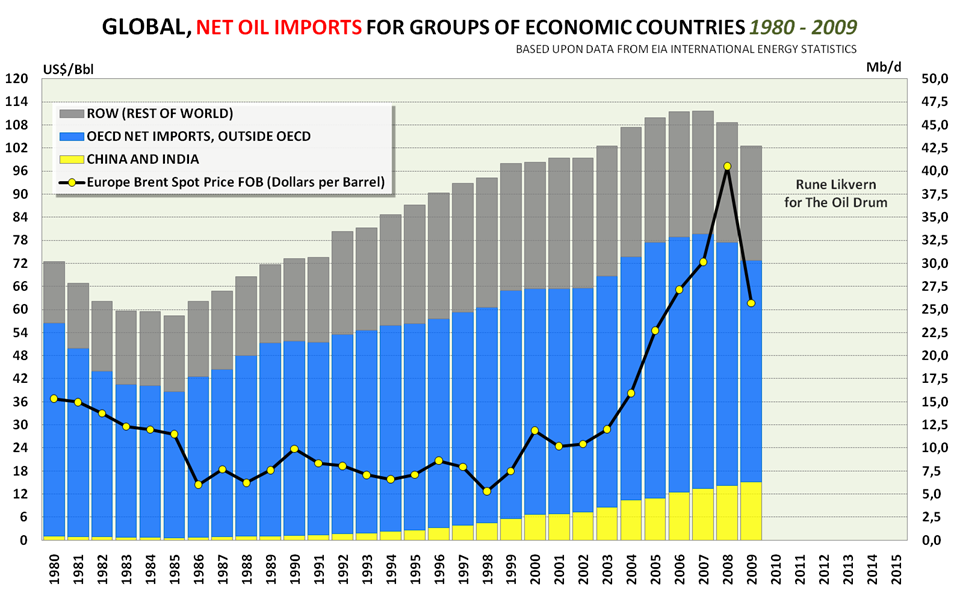
Figure 10: The stacked columns in the diagram above show development in world net oil imports of liquid energy (crude oil, condensates, NGLs and other liquid energy) from 1980 to 2009, split among 3 economic groups of countries (OPEC and FSU are net exporters). The development in the annual oil price (Brent) is plotted against the left hand y-axis. NOTE: net oil imports are here presented as the difference between consumption and production for the importers. Adjustments for stock changes may impact the annual numbers a little in either direction.
The chart illustrates that the decline in OECD oil imports in the recent years has not been completely mopped up by (China + India)’s growth in oil imports.
ROW reached a high point in net oil imports in 2001. Net oil imports declined by 1,7 Mb/d or 12 % between 2001 and 2009. ROW's share of world net imports declined from above 30 % between 1991 and 2004 to around 29 % after 2004.

Figure 11: The stacked columns in the diagram above show relative development in world oil (all liquids) net imports among 3 economic groups of countries. FSU and OPEC are net exporters.
To me it appears that we are now witnessing a race between demand, supplies and decline rates, and as long all the wheels on the world economy remain on, oil price movements will give an important signal about the supply/demand balance. This race may soon come to test the remaining marketable world oil spare supply capacity.
SOURCES:
[1] EIA, INTERNATIONAL PETROLEUM MONTHLY, SEPTEMBER 2010
[2] EIA, INTERNATIONAL ENERGY STATISTICS
[3] EIA, SHORT TERM ENERGY OUTLOOKs (STEOs)
[4] IEA, OIL MARKET REPORTS (OMRs)
Personnel
Editors
Contributors
Peak Oil Primers
Archives
- November 2010 (3)
- October 2010 (6)
- September 2010 (4)
- August 2010 (7)
- July 2010 (6)
- June 2010 (7)
- May 2010 (2)
- April 2010 (8)
- March 2010 (4)
- February 2010 (6)
- January 2010 (3)
- December 2009 (5)
- November 2009 (8)
- October 2009 (12)
- September 2009 (6)
- August 2009 (5)
- July 2009 (11)
- June 2009 (8)
- May 2009 (16)
- April 2009 (10)
- March 2009 (7)
- February 2009 (10)
- January 2009 (15)
- December 2008 (9)
- November 2008 (9)
- October 2008 (9)
- September 2008 (13)
- August 2008 (10)
- July 2008 (14)
- June 2008 (23)
- May 2008 (16)
- April 2008 (12)
- March 2008 (16)
- February 2008 (9)
- January 2008 (13)
- December 2007 (13)
- November 2007 (16)
- October 2007 (22)
- September 2007 (8)
- August 2007 (9)
- July 2007 (16)
- June 2007 (8)
- May 2007 (7)
- April 2007 (7)
- March 2007 (10)
- February 2007 (10)
- January 2007 (12)
- December 2006 (9)
- November 2006 (15)
- October 2006 (4)
- September 2006 (5)
- August 2006 (5)
- July 2006 (9)
- June 2006 (5)
- May 2006 (10)
- April 2006 (9)
- March 2006 (13)
Vital Trivia
License

This work is licensed under a Creative Commons Attribution-Share Alike 3.0 United States License.
Thanks very much Rune! Really nice graphs-- a lot of things we wouldn't have thought about.
I had forgotten how much higher the price of oil was in 2010 compared to the first half of 2009. In the first half of 2009, if may have contributed to what recovery we got. By now, it is contributing very little to a recovery, it would seem like.
It seems like the finances of countries is the wild card. This is what could "make the wheels come off" at least parts of the economy, it would seem.
From the graphs it is evident that while total oil production is hanging on to a plateau, total net imports have long since peaked. Hence for the importing countries of the world (Chindia/OECD/ROW) Peak Oil is already reality. Many people had predicted that hitting the downslope is precisely the thing that will make the wheels come off the world economy (and other things besides).
Let's hope that these wheels coming off does not result in a major war. One of the few things we've achieved with all this oil is to create a very interconnected world where there are fewer and fewer countries one dares to invade without knowingly starting world war 3. eg China would have made good its threat to repatriate Taiwan in a less interconnected world. But will those connections begin to ne severed in a world with less oil?
Ps I must say I've never been this close to being the first to see a new article posted :)
WesTexas
Export Land Model
One observation/thought that occurred to me when I looked at figure 01 (and/or figure 05) was that OECD had a high production and good economic growth while the oil price was low.
As OECD production declines, OECD will increasingly have to rely on more expensive oil imports and that must have an effect on OECD’s economic growth potential.
I discuss precisely this point in relation to the United States here:
http://marylandenergyreport.org/2010/09/23/is-petroleum-a-barrier-to-u-s...
Take the case of total world exports always being 50% and world net imports being 50%. By definition, absolute peak exports will occur when global peak production occurs. I really find it kind of redundant information. I also find it perplexing that these are done without a fundamental model for oil discovery and production. But that just highlights the differences beween the way we do analysis.
Think you might want to reconsider that for the general case. Peak exports and peak production do not have to coincide for a dynamically changing situation.
If you think about it, peak oil, net of oil used in the production of oil, must necessarily occur before "gross" peak oil. If crude oil has been on a plateau since 2005, it would be likely that peak oil, net of the oil used in the production of oil likely occurred in 2005 (assuming the EROI of oil is headed downward, so the amount of oil used in the production of oil is headed upward).
In the country where extraction is done, there is both direct and indirect usage of oil. Some oil is used directly in extraction. There is also indirect usage. Salaries are paid to workers, and these salaries percolate through the local economy. These salaries (and derivative spending) are often used to purchase oil-related products. So it should not be terribly surprising that a "net" peak oil and peak exports both seem to happen in 2005. If you didn't pay the workers salaries, and there wasn't a way for these workers to get to work, the oil wouldn't be produced.
I think EROI understates the real oil usage, because it does not pick up the usage of oil by the workers, and by the local economy. It is part of the reason EROI can never go down to 1:1.
My question is a little off center, but your comments raise it in my mind -- you mention percolate up as opposed to trickle down. Some have been arguing that trickle down is important to stir investment in business. Is this the best view in an economy that will likely shrink in the foreseeable future? Is there a reason why trickle down or percolate up is more important now?
The price has to be high enough relative to the cost of extraction for the extra funds to trickle down. With prices staying low relative to the cost of extraction in the new places OECD is looking at (ultra-deep, oil sands, etc), there is not a lot of trickle down.
Even if the price is very close to the cost of extraction, the oil companies will have to pay the workers, and those workers will pay local taxes, and buy food, etc. So there will be trickle up, regardless of price, if the oil is being produced.
You have to realize that we oil workers did not typically use oil to power our operations, we used associated natural gas. Solution gas used to come off the oil separators and tanks, and we fed it into our field equipment for fuel, and often used it to power our vehicles. We often got it more or less for free because there was no other market for it.
Other than that, we often used electricity to power our operations. Typically it was generated by giant coal-burning power plants. We got it at extremely low (sometimes negative) rates because we had a lot of options - if we didn't like their prices we could burn our own natural gas to generate electricity. We would sometimes get negative prices because 1) it was off-peak consumption and the utilities couldn't just shut down their powerplants at night, so they needed some kind of overnight load and 2) if one of their main powerplants tripped and the lights went out across the countryside, we could fire up our rows and rows of gas turbine backup generators and dump enough power back into the grid to save their asses from a major crisis.
And then we workers back at head office would walk, bicycle, or ride wind-powered electric trains to free up more oil that we could sell to people who wanted to drive big SUVs - but that concept seems to irritate a lot of people here.
Oddly enough, people seem to focus on Energy-ROI, when they should focus on liquid-fuel-ROI.
Electricity, coal, wind, natural gas, are all plentiful, and will be for the reasonably foreseeable future. Liquid fuel is having supply problems, and so what matters is the ratio of liquid fuel input to liquid fuel output.
This applies to oil production. It also applies to biofuels, which have a very marginal E-ROI, but have a much higher LF-ROI.
Interesting - this angle of Big Oil coming to the rescue with their backup generators isn't one I've seen played up for public appeal, but then again maybe I just missed it - I don't parse XOM PR in depth.
There are a lot of backup generators in the world: hospitals, army bases, industrial operations, etc, etc.
You'd be astonished: I've seen estimates that they comprise something like 15% of US generating capacity.
A real resource for managing wind/solar variation.
Another factor that people miss is that oil sands plants are capable of generating a large surplus of electricity as a by-product of their operations. Rather than generate low-temperature steam for their processes, they generate high-temperature steam, run it through steam turbines connected to electrical generators to reduce the temperature, and use the low-temperature steam in their processes.
It's kind of a two-for-the-price-of-one deal, otherwise known as co-generation.
The main problem is that oil sands plants are a long way from electricity markets - but it's not an insurmountable problem since the economics are sufficient to pay for some rather long transmission lines.
I'm not so sure that EROEI is actually the key bit. As stated elsewhere, the energy input to find and extract oil can be delivered in many ways, some of them essentially invisible to the process. Just because EROEI drops below 3 doesn't magically mean the extraction will stop - particularly if you can, say, use gas, hydro, or nuclear to power the process.
Rather I think it's much more a question of RoI. If the financial metrics don't look good, the field doesn't go ahead or the extraction is curtailed. Cost base from EROEI is one factor.
Thus if you want to track the steepening of the decline slope of oil production, post-peak, it's more important to model the total cost base for oil companies in difficult environments (and the acceptable levels of oil price) than it is to focus on the EROEI of a field. As such, fallout from the Deepwater Horizon spill in the Gulf, and the politically motivated responses, are much more likely to shape the downslope than how you exploit potential arctic oil reserves and the energy taken.
Shaping the downslope to not be a cliff edge means reducing the effective cost base as the complexity (and thus expense) of extraction increases through tax reductions - at just the time you might need those tax returns to deal with reduced production from your existing assets. See the North Sea as an example. It's that or Venezuela style nationalisation and control to force non-financial measures to the fore.
EROEI determines the point of the abstract export/import transition for a specific oil field. Above that point, a field operator net exports their oil. Below the transition, they import their oil (or energy if equivalent). The latter makes it counterproductive for the owner to keep going because their profit margins diappear. I think some of the ELM analysis is just this at its most basic.
That's part of the reason that I think the concentration of export/import is misguided. It conflates things to make the analysis seem simpler, but I think it actually makes it more complex. I have a more detailed analysis elsewhere in this thread.
Take the case of total world exports always being 50% and world net imports being 50%. By definition, absolute peak exports will occur when global peak production occurs.
If you take the case of USA, when did it's oil exports peak, was it not before it's production peak? Surely if oil producing countries consumption increases quicker than their production then exports will decline before production peak.
China and the US are examples of net exporters becoming net importers, prior to their production peaks. In the case of the US it was 1948, for net importer status, versus 1970, for the production peak. This was fundamentally of course due to the rate of increase in consumption (C) outpacing the rate of increase in production (P). Or, in other words, there was a steady increase in the C/P ratio.
Globally we looked at the top 33 net oil exporters (those with 100,000 bpd or more in net exports in 2005, principally using the BP data base, with minor input from the EIA). Here is a review (NE = Net Exports):
Top 33 Net Oil Exporters
If we round off to the nearest one mbpd, the numbers look like this (P - C = NE):
2005: 62 - 16 = 46 mbpd C/P = 26%
2006: 62 - 17 = 45 C/P = 27%
2007: 62 - 17 = 45 C/P = 27%
2008: 63 - 18 = 45 C/P = 29%
2009: 60 - 18 = 42 C/P = 30%
Of course, the problem is this steady increase in the C/P ratio.
Let's assume flat production at 62 mbpd:
In simple percentage terms, a 5% decline in production (from 62 mbpd), at C/P = 26% (consumption of 16 mbpd), would be a 7% decline in net exports, while a 5% decline in production (from 62 mbpd) at C/P = 30% (consumption of 19 mbpd) would be a 13% decline in net exports. At C/P = 35% (consumption of 22 mbpd), a 5% decline from 62 mbpd would a 20% decline in net exports.
So assuming flat production of 62 mbpd, with a 5% decline in production (3 mbpd), we have:
C/P = 26%, NE decline of 7%
C/P = 30%, NE decline of 13%
C/P = 35%, NE decline of 20%
This is the crux of the "Net Export Math" argument, to wit, that an increasing C/P ratio magnifies the impact of production declines on net exports.
And then there is the question of who wins the bidding war for declining net oil exports. Chindia's combined net oil imports as a percentage of total global net oil exports* increased from about 11% in 2005 to 17% in 2009. At this (2005 to 2009) rate of increase, the ratio of Chindia's combined net oil imports to global net oil exports* would approach 100% around 2026, 16 years from now. As they say, "Somethings gotta give." I suspect that "Something" will be that developed OECD countries, especially, the US, will continue to be on the losing end of the bidding war for global net oil exports.
*Top 33 in 2005
Combine that with the USA's non-oil trade deficit and the US is toast in 5 years (or maybe even less).
where does per capita income figure into that equation? In order to answer who wins in a bidding war wouldn't one have to figure out who is paying less for their oil as percentage of income- more important a percentage of their disposable income? On one hand consumers in India and China use energy more efficiently (although that is changing as they become more wealthy- the wealthy in a place like India are probably more inefficient users of energy than their counterparts in the US). That means all else being equal they would be able to withstand higher prices. On the other hand energy probably takes up a bigger share of their disposable income then it does in the US that would suggest that US consumers have more room to find offsetting spending cuts.
The pattern that has emerged, which is not what I expected to see a few years ago, is that developing countries pretty consistently increased their oil consumption as oil prices rose at an average rate of about 20% per year from 1998 to 2008, while developed countries consumption generally stagnated and fell relative to their late Nineties consumption levels (especially after 2005).
I think that the big difference between the developed and developing countries is the size of the discretionary sides of the economies in the developed countries. I expect to see the discretionary side of the US economy to continue to get crushed. Basically, I think that is where the oil rationing will largely occur in the developed countries--discretionary spending is trending toward vastly lower levels.
Unfortunately, government revenues in developed countries are already under severe pressure, and they need the tax revenue generated from discretionary spending, which may be one reason why OECD countries are trying so hard to keep BAU going. Given our outlook for global net oil exports, they are doing precisely the wrong thing at precisely the wrong time.
Here are the trade deficit figures (including oil) from 2000 to 2009 (in billions of $):
2000: 379
2001: 364
2002: 421
2003: 494
2004: 609
2005: 714
2006: 759
2007: 702
2008: 699
2009: 375
Up to and including July of 2010, the US has a trade deficit of $290 billion which makes it on track for a 2010 trade deficit of close to $500 billion. It's easy to see why the US is heading for a meltdown similar to 2008.
Data from http://www.census.gov/foreign-trade/statistics/historical/
Not to worry.
Whe have a large number of state and national parks, national forests, military bases, roads, bridges, schools, government office buildings, and sundry other federal, state and local assets that we can sell off to fund our debt.
If there's a buyer.
Thanks.
It would have been interesting to also have data on the value of US imported energy (oil and natural gas) for the same years.
Table 902. Crude Oil Imports Into the U.S. by Country of Origin: 1980 to 2008 gives the following volumes:
You can multiply that by your price per barrel.
Or BEA: Catalog of Products see U.S. Trade In Goods - IDS-0008, Historical trend series spreadsheet which has detailed import and export trade data. Data are quarterly from 1989 on.
http://sg.news.yahoo.com/afp/20100928/tts-eu-economy-strike-labour-socia...
Austerity whips up anger, protests mount in Europe
The unions -fat on sucking the government teat all these years of Labour 'governance'/public sector expansion- are clearly 'throwing their toys out the pram...
Strike situation not even registering yet here in UK.
Nick.
This is not surprising at all. In an undeveloped world, some liquid fuel could run a generator and in turn run a fridge, a stove, and a light bulb. That would be a lot of difference for a family that previously didn't have those things.
If we would get more electicity, we could... use more iPods. With more gasoline we could... comute to that mall 10 km longer away where they have chinese plastic toys at low low prices.
Simply spoken, they get much more usefullness in return for just using some of that liquid fuel. The same in families as in industries and trading operations. Sure it is more expensive for them (in hours of work for one unit of liquid energy) but they get so much more out of one extra litre of gasoline than we ever could.
So when OECD countries start feeling the pain of higher oilprices and we buy less, we free oil for poorer people to buy.
This was not what I thought either, but one learns news stuff every day.
Just in:
At an event Wednesday in Beijing, BYD announced it would donate 1,000 sets of electricity storage systems for houses in remote areas of Tibet.
"We take for granted having electricity. Many families haven't had electricity. It can change the world," Buffett said.
http://news.yahoo.com/s/ap/20100929/ap_on_bi_ge/as_china_gates_buffett
I would agree that disposable income in the US would help maintain oil imports except for the fact that US disposable income is entirely financed by debt. I expect to see nations with trade surpluses commanding an ever larger portion of available oil imports. Increasingly I believe oil importers will have to pony up and buy oil with actual production and export of real things and not just bonds. Especially not bonds of nations who have explicitly stated goals for currency debasement.
I find the whole per capita approach to be a red herring here. Pretend that China is a nation of "only" 500 million, with another 800 million hangers on you can ignore for the purposes at hand.
Per capita figures really boggle the mind - a Chinese vehicle fleet of 500 million in 2050 would only bring their nation to ca. 384 vehicles/1000 people, assuming the same population as now. This is still lower than the developed nations. This is also conservative - one forecast is for 679 million, which would put them at #15 in today's rankings. They being in the early stages of their buildout it's likely not to reflect the secular trend. For instance, projecting an IHS forecast forward using their numbers for 2015/2016 I get 1.433 billion, which is pretty absurd. But ca. 300 million is a definite low bound given BAU, and that means some handful of added mb/d no matter how you trick out efficiency.
that means some handful of added mb/d no matter how you trick out efficiency.
Unless they go with EVs. They are pushing heavily in that direction, though not as much as they should.
E-bikes outnumber car/SUV sales about 2:1.
JODI data had them up 500 mb/d YOY for gasoline in June. Just the single data point, you say? Average May-July is 391.51 kb/d, their strongest growing sector. I know about their skyrocketing eBike sales, but China nevertheless has an effectively infinite market for cars for the foreseeable future. Did you read about their two week long traffic jam? These people are Happy Motorists.
It's a choice. At the moment China is pushing growth of everything, including coal, wind, solar, nuclear and gas on the generation side, and ICEs, hybrids and EVs on the transportation demand side. Eventually they'll have to move more to renewable sources and electric transportation.
Sooner would be better.
westexas
There are a number of countries whose production is increasing such as Kazakhstan, Brazil, Iraq etc.
Do you think it possible that their increase in production will halt net oil exports decline for a few years. Or is the decline from those past export peak now too great?
Consider the North Sea case history. Oil fields whose first full year of production was in in 1999, when overall North Sea production peaked at about 6 mbpd (EIA, C+C), had a peak in 2005 at about one mbpd, but these post-peak fields only served to slow the overall decline to a little less than 5%/year.
And in regard to "Net Export Math," as more and more net exporters start showing high consumption to production ratios, their net export decline rates will increase into the double digit range.
as more and more net exporters start showing high consumption to production ratios, their net export decline rates will increase into the double digit range.
Only if they fail to do something to stop it.
Such a decline is a serious failure of good government. If domestic consumption is growing faster than world consumption, due to price controls and subsidies, then the country has a serious problem of misallocation of resources. For instance, KSA has a serious problem of underproduction of natural gas, due to excessively low domestic gas prices. All of these countries should raise prices and eliminate domestic subsidies, and it is very likely that most or all of them will do so eventually.
Some countries have already eliminated price controls. China is an important example. Mexico mostly doesn't control prices, and their consumption is pretty much in line with world consumption. Iran controls prices, but they use other means to control consumption, such as rationing. These changes will accelerate as countries see their exports evaporating.
"TEHRAN (AFP) – Iran is to halt the sale of subsidised petrol from late September as part of plans to phase out subsidies on energy products, ISNA news agency reported on Monday.
"Based on decisions taken, from the second half of this (Iranian) year (late September), the rationed petrol sales will be stopped," said Mohammad Royanian, head of Iran's fuel transportation organisation, quoted by ISNA.
From September "the rationing of petrol will be scrapped," he added."
http://news.yahoo.com/s/afp/20100705/wl_mideast_afp/iraneconomypetrol
Hi, long time no post.
There is a negative feedback loop that may push the 2026 deadline further into the future. Chindia relies on US/OECD to purchase goods that drive its economy, without these purchases it stalls and former peasants-come-city-dwellers revolt. I.e. ff US growth slows the Chindia growth story slows.
Thas' not to say 'we aint in trouble' just that your "somethings gotta give" may be the collapse of China due to unemployment being as likely as US collapse in the next 2 decades. We thus enter a more chaotic phase -the only outcome I can virtually gaurantee...
Nick.
WHT, just a few days ago I carried out a detailed analysis of the same EIA data in a different way intended as an empirical proof of the key insights of Sam Foucher's and Jeffrey Brown's ELM model.
Contrary to what you say, I found that if you take all countries which used to be net exporters at some point after 1980 but are now net importers (Albania, Benin, Bolivia, Burma, China, Indonesia, Papua New Guinea, Peru, UK, Uzbekistan), their net export peak was in 1985. Then followed a first production peak in 1986, but their ultimate collective production peak was not until much later, in 1999. The growth rate in consumption can bring forward the net export peak relative to the production peak, but more importantly the effect of domestic consumption will also bring about zero net exports long before zero production ever arrives. See the chart below.
Many of post-1980 peaks are still pending so that if you do an expected value analysis with date and proportion of output as arguments, you will get something close to global peak. It is a basic statistical approximation that will turn out very close to the right number. This stuff is pretty obvious but what can you expect if no one does the modeling?
Net export analysis is zero-sum.
Net export analysis is zero-sum.
Maybe so, but net exports still precede peak production whenever internal consumption is increasing, which will be in nearly every if not every case.
Its all really quite pointless. If we look at an individual oil rig, it is from the start an exporter. It does import a faction of oil to keep operating but the rest goes to someone else. It stops when the EROEI reaches some critical level of profit (that is all the ELM is I think). For that operational field, peak export will happen way before imports overcome exports. If the owner happens to be a trans-national corporation and it has authority, it can ship anywhere it wants. So this becomes an analysis of a transport agent, and exactly what the agents want to do with their oil.
Now if you want to do this correctly and account for where the oil is going to, assuming nation bounaries, you have to create a matrix of all the countries that can import and export oil and guess generally what the individual agents will do.
The full Production->Consumption model needed to keep track of all country interactions is set up like the following:
C = [E] P
P is a vector of size N giving the gross Production outputs of N countries.
C is a corresponding vector of the Consumption inputs of N countries.
(ignore the refinery bits where a country will import and then export)
[E] is a matrix of size NxN which describes the relative amounts of oil exported from one country to another. The invariant is that the sum of the elements in a row has to equal unity if an individual element in P gives the gross production. This will also result in the fact that summed Consumption equals summed Production. That is the Export matrix and it can have 900 elements if say N=30 countries.
Inverting that equation and you will find the corresponding import matrix [I] is just [E]-1. They have a built-in relationship so that if you know one, you can get the other.
There are two limiting cases. One case is trivial. It is where each exporting country becomes very nationalistic and only sends exports to itself. If every country did this then [E] will turn into the identity matrix with elements only along the diagonal. You might as well calculate individual production profiles for each country and keeping track of exports is trivial, as there are none.
The other limiting cases is a fairly balanced matrix. Each country sends its exports to other countries depending on its "demand", which further depends on its population among other things. In this case, things rise and lower in unison and export/import bookkeeping is pointless.
The difficult case is anything in between these extremes. The elements of [E] have to stay consistent and also match the consumption demands of all the countries involved. If you don't do this correctly it becomes a GIGO equation and if it only reflects current reality it doesn't tell you much. That is the zero-sum aspect of it.
So who can manage the model while understanding all the complex interactions among all the countries?
The level of discussion on export/import is a lot like people talking about books that they haven't read. It really helps to lay out the mathematical framework. If someone wants to pursue it some more, knock yourselves out. You will get mired in a socioo-political realm of guessing at all the matrix coefficients. This becomes equivalent to game-theory if geopolitical strategy is involved. You can try to take a shortcut and have it move towards a more balanced approach, which in fact is the highest entropy model. This high entropy is associated with trend toward free-market disorder or to free-market chaos. The distinction between chaos and disorder is irrelevant.
Its so much easier to have the agents apply a greedy algorithm and find and extract the oil as fast as possible, which becomes a model of global oil production. Yet no one seems to want to do this except for me, preferring to analyze a second-order effect which is obviously only applicable if you have the first-order effect figured out. I repeat: Import/export=2nd order and oil production=1st order, with the import/export bordering on a zero-sum game, with little predictive strength if game theory elements (war, corporate strategy, etc) come into play.
Maybe what I am trying to impart is a cautionary note. You can do these kinds of analysis in your day-to-day work, such as when you do multi-objective optimization. In fact, I would bet that oil companies do this calculation strategically, but we want to now be able to pin down or that we can guess all their criteria as well. Good luck with that!
Just one thing WHT; you are, I think, assuming it's a linear matrix. However this is a complex system with non-linear effects and feedback delays.
As a for instance: increased production in one country tends (via taxes) to raise the economy of the country, increasing its consumption, and also raising the wages, etc. of the workers in that country. That in turn impacts its export level, and thus its earnings (neg feedback), while at the same time raising costs and increasing the breakeven EROEI level.
If you want to model it properly you have to take all these non-linear effects into consideration.
Watching the 'exportland' figures however gives you a direct handle on one of the unequal distibution factors that helps to illuminate how much 'thee and me' will be hit by the oil downslope. There are quite a few others mind. And the downslope is ALL about inequality.
I'd therefore suggest they are more than a little useful in predicting driving forces on the downslope game. They are indicators of the shape of part of the battlefield.
OK, assume its not a linear matrix. Good luck with working that one out. It just further proves my point.
I would like to say "Duh" here, and is why I started by saying that the oil operators decide who they ship to. It is ALL export. Do you think it is interesting to compare the outcomes of a rich country without their own source of oil (like Japan) with a poor country without their own source of oil (like Bangladesh)?
WHT, I did the modeling :-)
That's not really modeling, its more like data manipulation. A model is a representation of reality based on describing fundamental physical behaviors and factors mathematically. I think the name has been perverted by people that do business data modeling which is just rearranging data into various chunks.
In any case, I described what is involved in this elsewhere on this thread:
http://europe.theoildrum.com/node/6994#comment-726623
Somebody said it should be non-linear, so if you want to do this, just take a short enough time-scale and very the coefficients with time to modify the model of reality that you want to represent.
Ok, for the net exporters only:
(1) I took the time scale of 2005 - 2009 for production, fitted least squares trendline and projected that forward to 2015.
(2) I took the time scale of 1996 - 2009 for consumption, fitted least squares trendline to each group of exporters and projected that also to 2015
(3) I then derived net exports. Not sure if this fits your definition of a model but it is good enough for me :) The result is shown below:
lumina,
sorry, but your method is not adequate.
The paper "An Explantion of Oil Peaking" by R. W. Bentley is perhaps the best introduction to the logic of Peak Oil I have read; it can be downloaded from ASPO-USA. Bentley writes
In simpler terms: Trendlines tell us nothing. They do not capture what is going on.
Bentley:
Hence the importance of WHTs work on Dispersive Discovery.
That's a good take. Bentley has some good ideas and is approaching it from the same mathematical perspective.
I think Lumina is confused as to what a model is. Extrapolating a set of points to a trendline is just Dead Reckoning. And Dead Reckoning is not a model, but a cheap heuristic based on manipulation of data. No underlying constraints at all.
The analogy with dead reckoning is very good, because I was chief navigator for a flotilla of sailboats when I was 14 years old, before GPS existed. I can tell you from experience that dead reckoning is a pretty good predictor of the future as long as you don't stretch it out too much, conditions are not expected to immediately change, and accuracy is not essential to your purpose. That is why I only projected production and consumption forward to 2015 and not, say, to 2030.
I am not at all confused about what a model is. I simply use what works and gives the right answer directionally. I don't need an accurate model to tell me that net exports can't escape the gravitational pull of the current production plateau followed by the decline; dead reckoning suffices.
Good effort Rune Likvern.
What caused the minimum in the early eighties?
Is there any chance that OPEC acted in its long term interest and resisted the temptation to cash in on the price spike?
If their need for money was fully satiated they might have had other motivations for keeping their extraction rate steady.
Perhaps we should not measure them with our yardstick.
What could this motivation be?
If I were them I would want to keep the status quo. Any change is likely to be disadvantageous to them. They probably enjoy the fruits of Civilisation.
Perhaps they emphasised the salt water cut to give the impression that oil is a scarce resource.
This would motivate Civilisation to find alternatives before the crisis.
All nobly motivated and all guesswork from me.
Demand destruction following price spikes.
The 73-74 and 80-81 oil shocks really did a number on demand in Western consuming nations.
higher prices ==> lower demand ==> lower imports ==> lower production
Regarding OPEC nations being sated with money -- I doubt it. This is a group of nations with with fairly low per capita income, rapidly rising populations and all the associated problems like power crises, limited housing, inadequate water supplies, etc., etc.. I believe they will try to maximize their oil profits and if that means opening the spigots I expect them to do it if they can.
Jon
If you look at figure 03 you see that oil prices went down almost 50 % from 1985 to 1986. This happened while OPEC had lost market shares as well. OPEC revenues were hit from both declining prices and volume.
I have also read that in this timeframe (mid 80’s) the US president Reagan encouraged Saudi Arabia (and possibly others) to flood the market with oil in an effort to bring down prices and reduce then Soviet Union’s income of western currencies from oil exports.
I think my take home is that demand destruction seems to be falling squarely on the OECD countries, while Chindia looks to be accelerating its pace of absorption of western jobs. At that rate it would go from 15% to 25% of net exports in 5 years - a good 4-5Mbpd of production where the ship goes east rather than west.
Is that likely, or has the west lost all its easy consumption savings?
If it has, then the Chindia bubble could bust as high energy prices stop the runaway growth train and optimistic assumptions come home to roost.
It it hasn't then CO2 reduction policies in OECD countries are going to get a boost as FF usage continues to fall.
The truth probably lies somewhere inbetween. Prices will spike again as we hit the inelastic supply wall, but there's a good chance that import tariffs of one form or another will get erected and Chindia will have to move fast to not have everything fall apart. It's pretty certain that western politicians know that they can't afford a rerun of 2007-8, or their response last time - protectionism will return because it must.
And all that's without a realisation of the peak and net export issues becoming generally understood - something I think is looking unlikely over the 5 year timeframe. Game change time is nearly here.
Gary, i think this is the central issue. how to go from West to East without too much turmoil. Clearly US gasoline demand has not budged very much in the face of very high prices and a collapsing economy. It makes one wonder what it would take to get the West off the oil to help the East increase its use (Chinese demand now estimated to have grown by some 900 Kb/d so far through 2010, how's that for the 0.5 GDP elasticity the Agencies like to profess?) With supply temporarily growing, Damocles' sword has been held off for a little longer, but when demand growth starts to bite into the supply cushion, then what's next? there is little in the pipeline of real new projects (not in non-OPEC, neither in OPEC) and decline rates are substantial (Cantarell's decline alone is 36% so far this year compared to last year). There is only one thing that has to give and that is Western demand. We're wasteful and at current prices we still do not have any incentive to slash waste. Policies will not be put in place to wean us off the black stuff because western governments are addicted to the tax take. As such, only price will. And then to such an extent that the core of the Western economies will be hit, as only that will reduce consumption to a considerable extent. the consequences of course will be dire. but at the same time, it will create a brilliant opportunity for us to move on and revitalise our moribund economies. planning has never worked, only crisis will bring about major changes. here's one coming. (or better, prolonging).
Some time back I did some estimates that showed the differences in specific oil consumption Bbl/capita /year and specific GDP ($$/capita). Unfortunately I cannot find it just now on my HD.
This showed that the average person in US used around 15 times (IIRC) more oil than the average Chinese person. Or turn this around; it takes 15 Chinese to consume as much oil as one American.
Further, and if IIRC, 6 Chinese had the purchasing power of 1 American.
In a bidding war for oil it becomes obvious who would win.
Another thing at play here is hourly pay whereby many jobs in the west have been outsourced to countries with cheaper labor which has increased energy consumption for those countries with cheaper labor.
Nice graphs, thanks
Quite suprising that FSU didn't recover to pre 91 level consumption, aren't some countries there like Kazakhstan increasing their consumption quite a bit ?
Also who was consuming the difference pre 91, the army ?
You can get quick answers to all sorts of questions like this at the Energy Export databrowser:
Kazakhstan production is way up, consumption is steady ==> net exports are up.
Happy Exploring!
Jon
Thanks a lot for the link! And for the code behind I guess :-) great site
Some ex soviet countries are really impressive for the crash in consumption without any recovery : Ukraine, Belarus (with no production)
Or for production shooting up without increased consumption : Azerbaijan, Kazakhstan
(a few pockets must get heavy there ...)
Only Turkmenistan seems to have both increase in production and consumption
Note : How come on the "all fuels tab", changing the unit provides different comparative plots ?
for France for instance and in mtoe, nuclear and oil are about the same in 2010, whereas in Joule, nuclear is less than half oil and about the same as gas ?
Truth being closer to Joule I guess, as nuclear is around 80 percent electricity, but only 16% total energy.
Due to the massive inefficiencies of the Soviet system (Marxist theory triumphing over common sense), some of the Soviet economy consisted of value-subtracted rather than value-added production. As a result, when they shut them down, they achieved a net increase in standard-of-living.
This is they didn't have riots when the Soviet Union collapsed. Sure, they no longer could buy junky furniture or unreliable cars they didn't like, but now they could buy a roll of toilet paper anytime they wanted rather than waiting for the next Five-Year Plan.
..
Hidden in the "About" page is the following note:
EIA data shows that Kazakhstan’s oil consumption declined after the collapse of Soviet Union and has since remained stable around 0,24 Mb/d.
I really do not know who consumed the difference of 4 - 5 Mb/d in FSU pre collapse. If all of that was consumed by the military it gives an indication that the military must have been really huge, even with low efficiencies and wastes.
I don't think it was all military. I remember reading that the economic dislocation from the collapse was massive and that large parts of the FSU have been very slow to recover. Perhaps someone with detailed knowledge can confirm.
Yes, somehow it is kind of strange that the memory of 91 is often focused more on the fall of the wall than the parallel economic collapse, and that the image of Russians is now focused on billionaires buying yachts football clubs and riviera villas, when there does not seem to be any true recovery.
Maybe Jeremy Orlov could provide some more insight here
Hi Arthur.
Dimitry: http://cluborlov.blogspot.com/
The population of Russia and Ukraine has fallen significantly since 1992. No doubt this has contributed to reduced energy consumption. In addition, many CIS countries now import a lot of energy in the form of manufactured goods, whereas in the past these were produced very inefficiently within the Soviet Union.
Here's a thought: perhaps the USSR numbers were inflated for whatever reason. Or the FSU are deflated. In the case of another quasi-communist nation I've noticed that the sum of product consumption figures for the PRC doesn't add up to the provided total figure, just one of many things about Chinese data that smells fishy.
Hi Rune,
re: "I really do not know who consumed the difference of 4 - 5 Mb/d in FSU pre collapse."
Offshore bank accounts?
Don't forget the industrial collapse. During the cold war, SU was an industrial exporter. Often when I come to older metal toolshops I see heavy machinery made in 1956 or something with CCCP name plates. Stuff from when my parents went to school, still going strong. Quality goods. Today, does Russia export any hardware? Besides oil, vodka and some transport type aircraft, I can think of nothing.
Russia has a phenomena of so called "monogorods", cities built around one very large factory. When the VLF cloes down, the city economy goes down the sink, and everybody goes poor.
Also, consider the "black hole of Russia". This is another phenomena. Take a large city, say Ufa, Kazan or Jekaterinburg. Around it you have a zone say 30 to 40 km wide. Inside it you have smaller cities and towns, active farms etcetera. The local economy kept alive by the metropolis in the centre. Outside the zone, you have dead countryside with abandoned farms and smalltowns. Everybody who can moves into town. They who can pick up drinking, goes old, poor and dies.
Then add to the mix that Russia lose population, I think 1 000 000 per year or so.
All that must keep oil consumption from growing.
Thanks, Jedi,
This makes sense and sounds like something you've seen firsthand, as well - yes?
While OECD oil consumption goes down along with its economic activity, Chindia's oil consumption continues to rise. But how long can that dynamic be sustained? Sure, Chindia is burning more coal as an energy source and manufacturing most of our cheaper goods, but once OECD economies drop far enough to reduce import of those goods by a threshold percentile (whatever that turns out to be), won't Chindia oil consumption also begin to drop? Afterall, they are not yet fully self sustaining economies.
It just seems that the downward trend led by the OECD is simply a warning signal to all other country groups, including Chindia, of what lies in store for them. The interesting question is when will that unified descent begin?
I did some looking at the data in depth, and I think the answer is, "Another couple of decades".
Those of you with eight-cylinder cars may want to sell them immediately. Those with sixes may want to think about what kind of smaller car you will buy next. I see that most Americans are now buying four-cylinder cars, which is starting to face up to the issue. However, it's not too soon to consider a three-cylinder car from Tata or some other cheap car company.
Ultimately, the future seems to lie in electric trains and electric bicycles, and the Chinese are buying those in vast numbers. India is playing catch-up. The US is screwed, but I think you already knew that.
Interesting take on it, however I'm thinking their consumption of oil will descend within 10 years, i.e. not long after a deeper recession hits the US (resulting from oil supply crunch).
By the way, great work on this article Rune. Really appreciate graphs that make it so easy to see the trends over time.
The Chinese domestic market is sufficiently big now that they can basically ignore economic downturns in the rest of the world and continue growing on domestic demand. They don't really need the US any more.
There is also considerable room for efficiency improvements in the Chinese and Indian use of energy. As their efficiency improves, they can afford to use more energy - it's an example of the Jevons Paradox in action.
Rune, good work, no doubt about that. You have chosen to use the stacked columns graphic representation which I find a bit sparse considering your close arguments. Nevertheless a great post. After fighting through that I will probably comment tomorrow. Congratulations. Juan.
Rune,
Great post and fully reasonable interpretation of what's been happening.
I do have one quibble, however with regard to nomenclature. You warn us:
Yes it does appear very strange!
I believe what you are calculating is not "net exports" but "net exports from exporting nations only" -- a big difference, especially in OECD. (At least that's what I guess you are calculating.)
If you calculate "net exports" by summing up all production within OECD nations and then subtracting the sum of all consumption within OECD nations you get a very different plot:
Whenever something "appears strange" this should be a sign that you need to reexamine exactly what is being calculated. Our job is to make it as easy as possible to interpret the data without confusion.
Other than that, Excellent job.
Regards,
Jon
I could have been more specific, and yes it is net exports from exporting countries.
The result does not change.
We can go back and clarify that in the text.
Deleted.
deleted
I guess I'll say 'deleted' too...
The graphs were great. Thanks for your time on this. In my mind I imagined a simple line graph of discoveries world wide superimposed on the stacks, and even with best case scenario predictions of a few billion here or there, or the supposed inexhaustible supplies of bitumen, I felt downright scared about the next few years.
It seems like such an intellectual exercise to estimate the plateau, or imagine the future, and then every once in awhile I think "oh sh.., it is really happening, it is going to happen, it is inevitable."
Finishing off a great book on the tar sands..."stupid to the last drop". It is another pissed off moment, but a very good read, nonetheless.
Cheers....Paul on the wet coast.
Re: Canadian Tar Sands to the rescue. . . to put their contribution in perspective, combined net oil exports from Canada + Venezuela are down by about a million barrels per day from the late Nineties level.
To put it even further into perspective, according to the EIA, exports from Canada are up nearly 1 million barrels per day from the late 90's, which must mean that exports from Venezuela are down nearly 2 million barrels per day.
That's great from Canada's perspective (over $25 billion a year in exports from a country with fewer people than California), but is pretty bad from Venezuela's. It's not very good from the American perspective, either.
As we discussed earlier, here is what the EIA shows for 1997 versus 2009 for net oil exports:
Venezuela:
1997: 3.06 mbpd
2009: 1.73
Change: -1.33 mbpd
Canada:
1997: 0.67 mbpd
2009; 1.12
Change: +0.45 mbpd
The combined net change for Canada + Venezuela was actually a little less than one mbpd, a net decline of 880,000 bpd from 1997 to 2009.
I was just working with the approximate numbers you posted. It's always difficult to figure out what is going on in Canadian vs. US energy balances because of the very heavy two-way trade between the two countries. Oil (or what can be very loosely described as "oil") mostly goes south, but products go in both directions.
A major complication is the big Atlantic refineries in Canada mostly refine Arab oil (often from countries that the US is not on good terms with) for export to the US market, but on the flip side, a lot of big US refineries ship products north to Canada.
I do know what is going on in the oil sands, though, and it is destined for a big increase in exports in the next year or so. However, a related question is, "Will it go to the US or somewhere else". Time will tell.
In 1989, North American Free Trade Agreement (NAFTA) banned Canada from placing any restrictions or taxes on exports of gas and oil to the US . Another article of NAFTA known popularly as "proportional sharing" says that if Canada should ever want to conserve or be forced to cut back on oil or gas production, it must, under NAFTA, continue exporting to the US the same proportion of its total supply (production + imports) that was exported during the previous three years. Mexico, also a party to NAFTA, received an exemption from these clauses in return for other concessions.
That's something of an urban myth. Certainly, the Canadian federal government is prevented from restricting or taxing exports of gas and oil, but the Canadian provincial governments, as owners of the resource, can sell it to anybody they want at any price they want.
The provincial governments did not sign NAFTA, and they have constitutional control over their resources. The federal government only controls oil produced offshore and in the northern territories. The US government may have somewhat missed this point, because the Canadian constitution is quite a bit different than the US one, and Canadian provinces have a lot of powers that US states do not, including absolute control over natural resources.
In fact, the Alberta government does plan to curtail exports of natural gas to the US and divert it to the oil sands plants because production is falling. This is in the provincial government planning documents. The point is probably moot because the US has a surplus of natural gas as a result of shale gas production, and would prefer to use its own gas.
In general, though, the provincial governments will quite happily sell all the gas and oil they can to the US at the highest price they can get for it. The provinces were quite happy to encourage the federal government to sign NAFTA because they didn't want the federal government to restrict or tax their exports of oil and gas.
BP shows a slightly larger combined drop in net exports, closer to one mbpd.
..
One thing which is hard to predict is decline rates. So far I have not seen anyone give a good prediction of decline rates. Generally the forecasts I have seen tend to be too optimistic about the predictions of the decline rate both for oil and natural gas.
A high oil price tends to slow decline rates as this makes some expensive EOR projects economic to carry out.
One way to get around this is to make scenarios with several parameters (decline rates, new developments, economic developments etc) which would give an idea of what to expect from each combination of variables, but still it would be hard to say which one was the most likely one.
One thing is clear- once the decline becomes evident it will be much steeper than anybody is currently predicting. At the moment with uncertainty about the "decline" producers looking at this through a discounted cash flow basis will continue producing what the fields will allow them to produce i.e. the theoretical decline forecast. However, once the decline is clear a rational producer's discounted cash flow analysis will change based on higher expected sales prices in the future. They will now elect to produce at much lower levels then are technically feasible which will then become self reinforcing as prices because of production shortfalls exceed projections.
I read the book, and since I grew up and worked in the areas he is talking about, I thought it was primarily characterized by its lack of accuracy and context. The author comes from Montreal, and from that perspective, Alberta is a very alien place. If he came from Texas, it would seem more familiar.
Alberta has huge energy resources of all types, and not a lot of groundwater. In fact the Canadian prairies in general are characterized by a lack of groundwater resources. If you find water (not at all guaranteed), often it will be contaminated with minerals. If you live in a shallow gas area, you are more likely to hit gas than water, if you live in a coalbed methane area, your water will likely be contaminated with methane, and somewhere in Southern Alberta there is a potential uranium mine we haven't discovered, because uranium shows up in the water. Given the huge cattle population (twice as many cows as Texas), a lot of manure finds its way into the groundwater.
The Alberta government knows all about this and is not sympathetic. They will not guarantee your well water, and will not test it for you. If you push the issue, they will point out that they, not you, own the groundwater, and you don't have a permit for your well, do you? They will bring drinkable water into the nearest town, and you can truck it from there.
I grew up in Alberta, and helped my father install water systems on numerous farms, so I find it quite normal that a lot of the water was bad. Some farmers had no water, some had a little water, and even if they did have water, sometimes it was drinkable, and sometimes it wasn't. If it wasn't drinkable, they would use it in the toilet and bring in bottled water for drinking. On the other hand, a lot of the water was extremely good, it just wasn't where they were.
OK, I'll stop ranting now. I just get annoyed at authors from Quebec complaining that Alberta isn't anything like Quebec. (It's more like Texas, but with much more oil and gas, and much smaller underground water reservoirs).
Of course, too often the truth doesn't fit with peoples preferred positions.
I was under the impression that the demand was lower in the winter.
The US is unusual. We do more driving in summer, and not much heating with oil in the winter, so our demand is skewed a bit toward summer.
Around the world though, the summer "driving season" is not much of an issue, and oil is commonly used for heating, so demand rises in winter.
IEA OMR shows world oil demand is expected to increase during 4th and 1st quarters (winter time). For North America it remains flat or small seasonal variations.
The same expectations are shown in EIA STEO’s for consumption.
Thanks, Rune, for your excellent graphs. The IEA includes bio fuels and they had a recent adjustment which I had shown in this post:
20/9/2010
IEA corrects oil statistics containing bio fuels
http://www.crudeoilpeak.com/?p=1876
I prefer crude oil analysis and these posts confirm what you said above:
13/8/2010
Saudi Arabia lost production share to Russia
http://www.crudeoilpeak.com/?p=1800
31/7/2010
Saudi Aramco's crude oil exports peaked in 2005
http://www.crudeoilpeak.com/?p=1738
On the import side of things, I did this analysis for Australia:
3/9/2010
Australian crude oil imports could decline by 5% in next years
http://www.crudeoilpeak.com/?p=1843
Governments remain unimpressed with the peak oil message. They think technology and other energies will solve the problem. That's why you have to roll up the whole story with energy from A-Z, including carbon constraints and that's what I tried in these 2 posts:
21/9/2010
RTA fails to present business case for M2 widening (part 1)
http://www.crudeoilpeak.com/?p=1886
19/6/2010
M2 widening: Primary Energy Dilemma for cars
http://www.crudeoilpeak.com/?p=1631
And because they do not even want to read this, we have to learn about botched re-sleepering projects on the main rail line between Sydney and Melbourne (1 section still single tracked!!):
Sydney-Melbourne rail line in 'atrocious' state
http://www.abc.net.au/news/stories/2010/09/27/3023154.htm?section=justin
http://www.abc.net.au/7.30/content/2010/s3023257.htm
The video in the 2nd link shows how the driver is rocked up in his chair when hitting rough track. If governments could only understand that in the next oil price shock x number of airlines will hit the wall and then how will people travel between Capital cities?
After an oil well runs dry, it still contains from 3 to 10 times the oil capacity in the form of latent residuals that was originally pumped from it as free flowing oil.
Crude oil cannot be completely recovered from a reservoir. One can generally recover about 30 % of the original oil by primary and secondary methods, although from individual reservoirs the yields range from 5 to 80 %. The reasons for this are that either the viscosity is too high or else the particular pore structure prevents complete displacement.
Hitherto, in the technical age, some 1.5 x10^14 kg of crude oil have been produced. With an average recovery yield, including enhanced oil recovery, of about 60 %. For example the reserves in the North Sea 8.2*10^12 kg (60 billion bbl) are assumed to be recovered to an extent of 35 to 42% by primary and secondary recovery methods, and some 5 % to 40 % of the original oil in place can be recovered by enhanced oil recovery. This means that still some 60*10^12 kg of crude oil can be withdrawn by suitable methods. This is more than the amount expected to be discovered in the future.
A technology will evolve that will free this oil from the residual oil bearing strata that will utilize hydrogen and/ or CO2 to liquefied this residual reserve.
When hydrogen is injected into an underground petroleum reservoir that is devoid of natural gas, due to its high rate of diffusion, hydrogen disperses rapidly throughout the reservoir, including the tight portions that are relatively impermeable to the injection of water or CO2.
Hydrogen then migrates from the tight portions of the reservoir, sweeping petroleum into the more permeable portions. Expanding hydrogen experiences a temperature rise which in turn heats the crude oil and further reduces the viscosity for added mobility.
If hydrogen at high temperatures is injected into an underground petroleum reservoir it can replace fire flood techniques. This will save substantial amounts of oil that would have been consumed to heat the reserve. The absorbed hydrogen dilutes the crude in place and also converts residual viscous olefins to lighter and more liquid products.
In organic chemistry, an alkene, olefin, or olefine is an unsaturated(lacking hydrogen) chemical compound containing at least one carbon-to-carbon double bond. The simplest acyclic alkenes, with only one double bond and no other functional groups, form a homologous series of hydrocarbons with the general formula CnH2n.
Lacking a catalyst, the hydrogenation reaction is carried out under pressure at high temperatures.
William Merriam Burton developed one of the earliest thermal cracking processes in 1912 which operated at 700 - 750 F (370 - 400 C) and an absolute pressure of 90 psi (620 kPa) and was known as the Burton process.
Shortly thereafter, in 1921, C.P. Dubbs, an employee of the Universal Oil Products Company, developed a somewhat more advanced thermal cracking process which operated at 750F -860 F (400C - 460 C) and was known as the Dubbs process. The Dubbs process was used extensively by many refineries until the early 1940s when catalytic cracking came into use.
Modern high-pressure thermal cracking operates at absolute pressures of about 7,000 kPa. An overall process of disproportionation can be observed, where "light", hydrogen-rich products are formed at the expense of heavier molecules which condense and are depleted of hydrogen.
After treatment, a water sweep displaces the oil to production wells.
Two technologies can provide heat, hydrogen and CO2 in support of enhanced oil recovery: nuclear and solar hydrogen and process heat with nuclear process heat most applicable in all well locations.
There are so many variables, I wonder if it is possible to run the numbers to see if the hydrogen and the energy it took to produce are worth the investment.
The Tupi field is a perfect example of the kind of expense offshore producers face. The fact is that deep water projects can get extremely expensive. Enhanced oil recovery expense will be profitable if its cost is at or below offshore oil production costs; the high cost provider. The day rate alone for renting a drilling rig during 2007 is upwards of $500,000 or more!
The snag with that scheme is that hydrogen is quite costly. Today it is produced from natural gas. Nuclear or solar hydrogen is going to be REALLY expensive.
Hydrocrackers in oil refineries run at around 200 bar and they use catalysts which are most likely not present in oil reservoirs. They have to worry about catalyst poisons like nickel and vanadium which often are present in oil reservoirs.
You do great work!
regarding a comment you made in your latest posting Trends in World Oil Supply/Consumption and Net Exports/Imports
"The remarkable thing is that by coincidence the oil price started its strong growth as OECD supply started to decline during 2004,"
The truly remarkable thing is that it is no coincidence - the same thing happened in the 1970's when american production past its peak - at these points in history the price setting power shifts from the net consuming nations to the net producing nations and are only resolved by a massive investment in new capacity and/or a destabilizing military move by the consumers against a key producer. The problems with this pattern is that it causes a long term cycle of under and over pricing rather than a smooth trend of gradually escalating prices that reflect increasing resource scarcity/increased cost of extraction. This pattern of cyclic pricing makes a sensible investment in alternatives highly risky and suboptimal.
oil has a high price elasticity and the price elasticity curve is close to exponential when severe shortage occurs (black market prices). Typically analysts also treat oil demand as a single market when it is a highly complex market. Some elements of the market have highly inelastic demand curves and other have highly elastic demand, or at least have easy access to alternatives such as electricity (coal/nuclear) based public transport. Scarcity and cost has reduced demand from the elastic/discretionary parts of the market and hasn't really hit the inelastic yet. When it starts to bite into the core service requirements of the western economies is when the pain really starts.
The runup of prices after 2003 appears to be mostly a result of OECD exports declining and OECD consumption continuing to rise until it is finally choked off by the price spike in 2008 along with the recession.
In particular, figure 8 seems to show that OECD consumption was flat to declining from 1999-2002 but then grew again from 2002-2006 (it is a little hard to tell in the stacked bar format, but the slop appears steeper than Chindia's).
Figure 10 seems to show that OECD imports were also flat from 1999-2002, but then also grew very strongly from 2002-2006.
Figure 5 shows that OECD net exports fell sharply during 2003-2007.
Therefore, the runup of prices is due to the OECD not responding to its own drop in production by curtailing consumption fast enough. The lack of demand decline due to the increased price is probably the result of two things:
- the price in other currencies than the US dollar did not rise as much, and
- high taxes in many OECD countries make gasoline users insensitive to the price of crude oil.
First, the dollar fell against the Euro over the decade as follows (July average exchange rate):
Second, many OECD countries, including producers such as the UK and Norway, have gas taxes of over $3.00 per gallon. Thus, if the crude oil cost doubles from $1 to $2 per gallon, the price of the gasoline goes from perhaps $4.50 to $5.50, a much more modest percentage increase to the consumer.
It's a pity there is no discussion here of the state of world economy outside of--
I was not aware, outside of China, which is also not discussed, that the world economy is rolling right along. That's news to me.
I discuss the timing of the next oil price shock in
The Next Oil Price Shock -- An Update
I will need to follow that up with an article looking more closely at China's economic prospects in the medium-term.
-- Dave
Hello Dave,
There is one lesson I have learned about making predictions about economic developments and that is; that even if I hit bulls eye with respect to the general direction and magnitude of change…..I do not (yet) get the timing right.
However let me see if I can help you out in a different way with the information in the 2 charts below.
For the first 5 months of 2010 (based upon data from EIA International Energy Statistics) the average Non OECD implied oil (all liquids) supply was 40,6 Mb/d which is up 3,1 Mb/d relative to the same period of 2009.
The diagram above shows developments in Non OECD oil (all liquids) demand from January 2001 and as of May 2010 based upon data from EIA International Energy Statistics. The demand has been derived by using total world oil (all liquids) supplies subtracted for OECD production and OECD net oil imports. Developments in the oil price is shown against the left y-axis.
The diagram above shows developments in FSU, OPEC and China + India oil (all liquids) consumption from 1980 and as 2009 based upon data from EIA International Energy Statistics. Developments in the oil price is shown against the left y-axis.
The data from EIA shows a growth in OPEC oil consumption that rivals the consumption growth of China + India.
I'm sorry to tell you this, Rune, but nothing can be concluded from either of the charts you present about when there may be a significant collision between world oil demand and world oil supply.
For example, the first chart shows that after the severe dip due to the recession, oil demand outside the OECD took off from where it left off. This was mainly due to China's enormous stimulus of their economy. The outcome of that stimulus, which has "overheated" their economy and resulted in unsustainable real estate bubbles, is very much in doubt. In any case, non-OECD demand grew in a predictable (linear)way after the "recovery" from the downturn, which is just what we might have expected. The meaning of the 3.1 million barrels-per-day increase is thus uncertain in the time frames you compare.
This is why an economic (demand) analysis is essential to theorizing about what is going on. The tendency of peak oil people to analyze the oil supply outside the context of demand growth in the world economy leads to all sorts of false conclusions. The world of 2005-2007, in which there was a really big demand shock, may never return. The point is: we don't know how things will go.
I would also remind you that OECD oil demand is down about 4 million barrels per day in 2010 since its annual average peak in 2007 (EIA data). So there is a lot of catching up to do.
Your data doesn't imply we're about to have an oil price shock--a "peak oil crisis"--anytime soon. Certainly not in 2011.
-- Dave
Define soon. The prices are not going down unless you havent noticed lately. Also well while supplies remain at 2005 levels or lower -- demand is not going down, is it? So where are the new super oil fields and new supply to meet higher demand.
Yes, the exact year of the problem is not known, but I would bet within 5 years we will be in for it with 99% certainty. I bet in the next 2 years we have a bad spike again with 75% certainty.
So soon is kind of like a relative term. I think 5 years is soon. Maybe for you only 5 minutes is soon.
You have no idea who you're replying to, do you?
The EIA data comes up short since it only starts in 1980. When I charted the "regional consumption" data provided by BP the "Middle East" wholly ignored the demand/price shocks that kicked off in 1979. You really saw how the other parts of the world took it on the chin in the face of demand destruction/efficiency measures/fuel switching. I bring this up only to suggest that I'm putting my money on OPEC continuing to pig out on hydrocarbons for the foreseeable future, barring their being ordered to switch to solar thermal at the point of a gun etc., which is a scenario we can file under SHTF.
Also OECD demand has contracted a lot less than it did 30 years ago, which I detailed in my guest post Petroleum Demand Lessons from the Late 1970s. Data since publishing that hasn't negated my conclusions.
China, beats me. They sure are heading out on various shaky limbs. I agree with Kopits though that if they/we keep up this charade for another decade they're definitely going to gobble down more mb/d than the gov agencies are forecasting.
What is that supposed to mean? Can you define "anytime soon" or not? To me soon is "my immediate future" within 5 years.
What is "anytime soon" for you?
Dave,
the reason why I included the 2 charts above was to show that consumption within OPEC is growing strongly, 47 % between 2000 and 2009.
The other thing is that even if OECD oil consumption declined with 4,5 Mb/d between 2005 and 2009, non OECD consumption grew with 4,9 Mb/d during the same period.
(Provided we trust the data published by EIA.)
In other words Non OECD has soaked up the entire decline in OECD consumption. The growth in Non OECD oil demand is still growing into 2010 as shown by my chart (why I included it).
What about growth in OPEC’s petroleum consumption?
The 2 billion dollar question here is how much marketable spare oil capacity is there presently in the world.
Further a chart in an article recently in the Economist showed strong growth in industrial production in Brazil, China and India. Empty offices consume little energy.
Both EIA (Short Term Energy Outlook) and IEA (Oil Market Report) presents this kind of analysis, and I have also used them as reference to demand developments.
Are there any reason for not referring to analysis presented by those (EIA/IEA) mentioned above?
The oil price gives a good indication of the supply/demand balance (also after adjusted for changes in the exchange rate).
Some of your comments I did cover in this or earlier posts.
I get the impression that this may just be a general misconception among the so called cognoscenti with regards to what they, at least for the moment, presume to be economies that are just rolling right along.
I think it will be most interesting to observe what happens when these economies come around the bend at full throttle only to find that the bridge over the gully has been washed out... They may be in for a very rude surprise. They may even suddenly stop rolling!
Rune,
Can I make a suggestion?
To some extent, when you analyze net exports you are really analyzing "oil consumed in countries without price controls and subsidies". The argument is that oil consumption for oil exporters will rise faster than it will in oil importing countries, that have price controls/subsidies.
On the other hand, this is imprecise: some oil exporters don't have price controls (e.g., Mexico) and some oil importers do (e.g., China up until recent decontrol).
It would be very useful to do an analysis of consumption occurring in countries with price controls. They are, after all, the countries which will (or will not) reduce consumption in response to price signals.
Great charts, depressing conclusion!!!
Where is the next North Sea, the next Cantarell, the next Prudhoe Bay?
OK, devils advocate here. The fuel economy standards passed by President Obama will, over time, result in a substantial reduction in US oil demand, in the same way that gasoline demand fell in the 1970s. Countries using oil for power generation will switch to cheap and plentiful LNG, and the resid will be converted to gasoline/diesel in refineries using cokers.
Meanwhile, Iraqi oil production will add millions of barrels per day to global supply. Tupi and other Brazilian offshore fields will add more. Costs will come down as South Korean shipyards pump deepwater rigs into the market. Tar sands and sugar cane ethanol will come on strong. The Bakken formation will surprise on the upside, as technology improves. A new oil province will be found offshore Greenland.
The global economy will suffer from years of slow growth, leading to a liquid fuel glut.
Nowhere. There is nowhere on this planet where such an oil discovery could be made that hasn't already been explored. Using modern technology, oil fields like the supergiant discoveries of the past could probably be identified from orbiting satellites. They fact they haven't been found indicates they don't exist. Any new oil discoveries must be much smaller.
When you say, "Global", don't forget China and India. Their oil consumption is increasing rapidly as their economies grow, and they each have more than a billion people now.
What is the satellite technology that can identify oil fields? Gravity mapping?
Some people think that there is a great deal of oil in the Arctic Ocean region, underneath the ice cap. Cairn Energy is drilling offshore Greenland in the Davis Strait, and they have said that the basin they are drilling is the size of the North Sea. So far they have drilled two non-commercial holes.
If it exists it won't be cheap, and probably won't be online before 2020.
Great graphs - data labels would help to see what is going on though, some of these shifts are very minor. With lots of series labels become very cluttered very quickly but these only have four. I usually make 'em boldface for extra readability, sometimes turn the labels 90 degrees too.
sorry, this is a test for posting comment directly in PIMShell.
@ kevinyang
test to reply comment again.
@ kevinyang
test to reply comment.
И большой бадьен реки не вычерпать.