Oilwatch Monthly March 2009
Posted by Rembrandt on March 16, 2009 - 9:01am in The Oil Drum: Europe
The March 2009 edition of Oilwatch Monthly can be downloaded at this weblink (PDF, 1.9 MB, 28 pp).
The Oilwatch Monthly is a newsletter that is available free of charge with the latest data on oil supply, demand, oil stocks, spare capacity and exports. Readers who want to receive the Oilwatch Monthly in their e-mail box each month can subscribe at this weblink, by filling in their first name, last name, email adress and selecting Oilwatch Monthly in the mailing list box. To finalize your subscription push the 'inschrijven' button below the form.
A summary and latest graphics below the fold.
Latest Developments:
1) Conventional crude production - Latest available figures from the Energy Information Administration (EIA) show that crude oil production including lease condensates decreased by 639,000 b/d from November to December 2008, resulting in a total production of crude oil including lease condensates of 72.79 million barrels per day. The all time high production record of crude oil stands at 74.83 million b/d reached in July 2008.
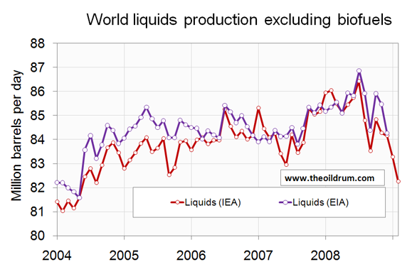
2) Total liquids production - In February 2009 world production of total liquids decreased by 1 million barrels per day from January according to the latest figures of the International Energy Agency (IEA), resulting in total world liquids production of 83.93 million b/d. Average global production in 2008 was 86.59 million b/d according to the IEA. In 2007 an average of 85.41 million b/d was produced. The US Energy Information Administration (EIA) in their International Petroleum Monthly puts average global 2008 production at 85.47 million b/d and average 2007 production at 84.43 million b/d.
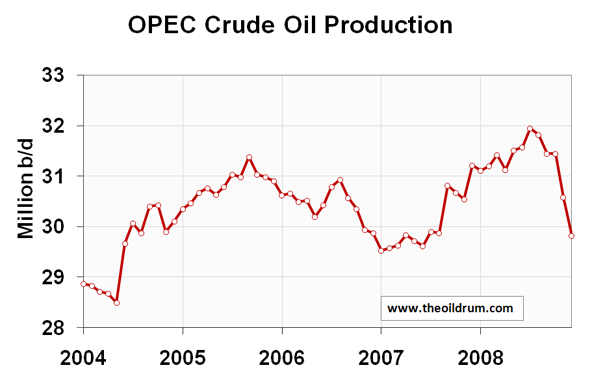
3) OPEC Production - Total crude oil production excluding lease condensates of the OPEC cartel decreased by 1.06 million b/d to a level of 28.0 million b/d, from January to February 2009, according to the latest available estimate of the IEA. OPEC natural gas liquids production remained stable from January to February to a level at 4.68 million b/d. Average total liquids production in OPEC countries in 2008 was 36.09 million b/d, versus 35.02 million b/d in 2007 and 35.13 million b/d in 2006.
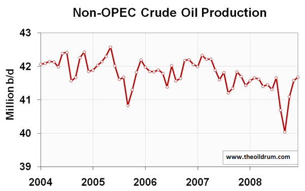
4) Non-OPEC Production - Total crude oil production including lease condensates of non-OPEC increased by 99,000 b/d from November to December 2008 to a level of 41.68 million b/d, according to the latest available estimate of the EIA. Average crude oil production of non-OPEC in 2008 was 41.32 million b/d, versus 41.81 million b/d in 2007 and 41.87 million b/d in 2006. Total non-OPEC liquids production increased by 60,000 b/d to a level of 51.25 million b/d from January to February 2009, according to the latest figures of the IEA. Average total liquids production of non-OPEC in 2008 was 50.5 million b/d, versus 50.41 million b/d in 2007 and 49.76 million b/d in 2006.
5) OECD liquids demand - OECD consumption in December 2008 was 46.74 million b/d, a decline of 1.53 million b/d year on year. Average consumption in 2008 was 46.16 million b/d, which is 1.52 million b/d lower than consumption in the same period in 2007. In the United States. Consumption is 1.14 million b/d lower on average in 2008 than in 2007. In the 27 countries of the European Union oil consumption increased from 15.80 million b/d in November to 15.96 million b/d in December 2008. Average consumption in 2008 was 16.16 million b/d, relative to 16.26 million b/d in 2007.
6) Chinese & Indian liquids demand - Chinese liquids consumption increased from 5.76 million b/d in November to 6.33 million b/d in December 2008 according to the JODI database. Average consumption in 2008 was 6.92 million b/d. In 2005 China consumed on average 6.27 million b/d, growing to 6.78 million b/d in 2006 and 7.29 million b/d in 2007. But growth was impacted since July 2008. Consumption in India was 2.6 million b/d in 2008, versus an average of 2.43 million b/d in 2007 and 2.29 million b/d in 2006.
7) World Liquids exports - The most recent estimate suggests average world exports amounted to 47.61 million b/d in 2008, a slight increase from a level of 47.4 million b/d in 2007.
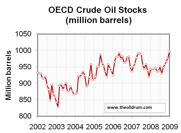
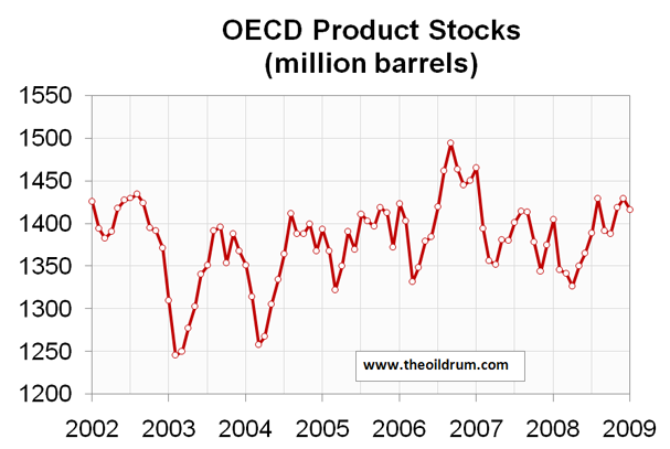
8) OECD oil stocks - Industrial inventories of crude oil in the OECD in January 2009 increased to a level of 997 million barrels from 977 million barrels in December 2008 according to IEA statistics. Total industrial product stocks in the OECD were 1416 million barrels in January 2009, a decrease of 14 million barrels from a stock level of 1430 million barrels in December. Total product stocks stand slightly higher than the five year average of 1384 million barrels.
Personnel
Editors
Contributors
Peak Oil Primers
Archives
- November 2010 (3)
- October 2010 (6)
- September 2010 (4)
- August 2010 (7)
- July 2010 (6)
- June 2010 (7)
- May 2010 (2)
- April 2010 (8)
- March 2010 (4)
- February 2010 (6)
- January 2010 (3)
- December 2009 (5)
- November 2009 (8)
- October 2009 (12)
- September 2009 (6)
- August 2009 (5)
- July 2009 (11)
- June 2009 (8)
- May 2009 (16)
- April 2009 (10)
- March 2009 (7)
- February 2009 (10)
- January 2009 (15)
- December 2008 (9)
- November 2008 (9)
- October 2008 (9)
- September 2008 (13)
- August 2008 (10)
- July 2008 (14)
- June 2008 (23)
- May 2008 (16)
- April 2008 (12)
- March 2008 (16)
- February 2008 (9)
- January 2008 (13)
- December 2007 (13)
- November 2007 (16)
- October 2007 (22)
- September 2007 (8)
- August 2007 (9)
- July 2007 (16)
- June 2007 (8)
- May 2007 (7)
- April 2007 (7)
- March 2007 (10)
- February 2007 (10)
- January 2007 (12)
- December 2006 (9)
- November 2006 (15)
- October 2006 (4)
- September 2006 (5)
- August 2006 (5)
- July 2006 (9)
- June 2006 (5)
- May 2006 (10)
- April 2006 (9)
- March 2006 (13)
Vital Trivia
License

This work is licensed under a Creative Commons Attribution-Share Alike 3.0 United States License.
Rembrandt, as always an excellent monthly update.
What is striking (with reference to your figure 2 (OECD consumption) and figure 3 China consumption) is the decline in consumption and thus demand. The scaling of the diagrams may be a little deceptive, but to me it seems that China alone has a reduction that in absolute volumetric terms equals that of OECD. Both seem to have reduced total petroleum consumption with approximately 2 Mb/d in a year or less.
OECD PETROLEUM CONSUMPTION VS OIL PRICES
Diagram above is based on petroleum consumption data for OECD from EIA and covers the period June 1987 to October 2008 plotted against the left y-axis. A smoothed 12 Month Moving Average is added to the consumption data to take out any wild swings. NOTE: The axis is not zero scaled.
In the diagram is also plotted the average monthly oil price against the right y-axis.
The diagram shows how oil consumption in OECD grew steadily as the oil price remained in the US$20/Bbl range. As oil prices started a steeper climb as of mid 2004 consumption continued to grow, but something seemed to happen as oil prices went north of US$60/Bbl as of late 2005 (This is before subprime and the financial crisis.)
This suggests that the OECD economies could handle a year on year price increase of approximately US$15/Bbl, but anything beyond that started to affect petroleum consumption and possible GDP growth. This may be some food for thought with regard to future price developments for oil as in the period leading up to the “super spike” in the oil prices was fed by growth in debt and many now believes that some deleveraging need to take place before economical growth within OECD again may enter positive territory.
Less future debt and the prospect of a future anemic economical growth suggest that OECD economies may be vulnerable to dramatic price increases on oil.
This fuels a vicious circle as too low oil prices restrict investments in new oil capacities.
North of US$60/Bbl growth in petroleum consumption within OECD came to a halt and as oil prices continued to move further north petroleum consumption started to decline and beyond US$100/Bbl the decline in consumption accelerated.
UK PETROLEUM CONSUMPTION VS OIL PRICES
Diagram above is based on petroleum consumption data for UK from EIA and covers the period June 1987 to October 2008 plotted against the left y-axis. A smoothed 12 Month Moving Average is added to the consumption data to take out any wild swings. NOTE: The axis is not zero scaled.
In the diagram is also plotted the average monthly oil price against the right y-axis.
UK has been a net petroleum exporter and still gets most of its petroleum from indigenous production.
Still there are some interesting features in total UK petroleum consumption from the recent past.
As of early 2004 and until mid 2006 the UK saw a growth in its petroleum consumption that may rival Chinas growth and even surpass it. The UK economy seemed more resilient to the oil price increases until prices hit approximately US$75/Bbl. From there the consumption started to decline and during the last two years (or so), the UK petroleum consumption has (as of October 2008) declined with approximately 8 %.
In relative terms, this is way above the decline observed in the petroleum consumption for the USA (where it is also important to adjust for the effects from hurricanes last summer/early fall). I have seen data showing steep growth in UK industrial output during the recent growth in petroleum consumption, but what I was hoping for from the readers was to help shed some more light on this UK phenomena.
I plan to post some separate posts with more on this subject later and about GDP and oil/energy consumption.
It seems that you are using nominal prices for brent.
If you look at the price in constant 2008$:
-from 1987 to 1998 the price goes slowly down from 40$ to about 10$ (expect for a short gulf war spike)
-from 1998 to 2004, the price goes slowly back up to 40$
-after 2004, the price shoots up
The only periods of declining consumption (OCDE), are end 1990, 2001 and after 2005.
1990 and 2001 don't seem very related to price, as consumption went back up with the same prices, but more to small recessions.
The current decline seems to have accelerated since 2008, after prices went past 100$
I have no direct evidence but I strongly suspect that the UK consumption increase 2002-2006 was due to the booming economy based on ridiculously cheap credit, and the fashion for large (by European standards) SUVs. A quick google failed to find the relevant stats, but the press was full of reports of booming sales in this period, followed by falling sales afterwards.
Large cars and SUVs are now very cheap to buy, very small and efficient cars have months long waiting lists.
Rune - thanks for posting these excellent charts. For now I just want to focus on the OECD. For a number of years my feeling was that UK inflation at least was understated - food bills, energy bills and fuel bills were marching upwards in leaps and bounds but we were expected to believe that inflation was in the 2 to 3 % range. In short I believe much of the "economic growth" since 2005 was in fact inflation and wonder if your chart does not support this idea.
It picks out .com bust recession and since 2005 we (the OECD) have been using less oil. Unless there have been major efficiency gains, its hard to see how we could have economic growth on the back of using less energy. (I know this is all a gross simplification). In the UK the illusions of growth were created by 1) the FOOTSIE being top heavy in oil and mining stocks, 2) property prices rising making people believe they were rich, 3) financial services furiously selling that bit of paper to each other - again making believe they were rich. All these bubbles have of course now burst.
Our oil consumption is back to mid-1990s levels - and so is the FOOTSIE. I don't think we have had any economic growth since then. The trappings of wealth that may give the illusion of prosperity are balanced by ballooning government debts - as fractional banking debts get transferred to government. We will be paying for this binge for decades - long after the SUVs and digital images of holidays in Thailand have faded.
Looking forward, BRICs, especially China may actually build some wealth via infrastructure projects using an ever larger share of world oil - and the OECD must inevitably use less and become increasingly impoverished - unless we work out a way of generating lots of low energy content GDP.
Euan, thanks.
I have (for some time) been playing a little around with GDP numbers from IMF and energy data (mostly from BP Statistical Review 2008).
By adjusting the GDP (PPP) with estimates on energy costs (which are embedded in the GDP data) the adjusted growth becomes less than with the unadjusted GDP data.
This should come as no surprise when energy prices grows faster than GDP.
Next step adjust for inflation (IMF data), and the underlying GDP growth becomes anemic.
Looking at USA ( I have not done anything on UK, yet) the GDP adjusted for energy costs shows a surprisingly low GDP growth and some of this growth may have come from financial stimulus (or economical steroids if you like). USA GDP growth slowed down after the bust of the dot com bubble, but started to regrow as of 2003 (which suggests an effect from FED lowering interest rates as a response to the dot com bubble bust). FED then increased the interest rate and growth slowed down and assuming a time lag from changes in the interest effects in USA GDP again started to slow down late 2006 and during 2007 (by which time the effect from increased energy prices starts to erode GDP adjusted for energy prices) the FED started to lower interest rates.
The other thing is the increase in food prices which is a little harder to make estimates on, but the combined effects on GDP adjusted for growing energy and food prices should expectantly show a more realistic picture of the real growth in the economy.
Some of the energy consumption may have been pure waste as a response to too low prices.
Looking at Rembrandt’s excellent diagrams, you will see that China’s oil consumption recently has been falling off a cliff.
Euan you wrote;
”- unless we work out a way of generating lots of low energy content GDP.”
I consider energy usage as a GDP multiplier or “physical steroids” for the economy.
The other potent (and non-physical) steroid for the economy seems to be interest rates.
Note that it appears that global crude oil consumption only fell one year in the Thirties, in 1930, with rising consumption thereafter, and as Downsouth observed there were three million more cars on the road in the US in 1937, versus 1929. Today, hundreds of millions of people worldwide want to drive a car for the first time. Also, after hitting a low in 1931, oil prices rose from 1931 to 1937.
Monthly constant dollar prices in the Thirties:
http://mjperry.blogspot.com/2008/11/oil-shock-of-1930s.html
In regard to net oil exports, note that the US went from finding its largest Lower 48 field, the East Texas Field, in 1930 and from being a leading net oil exporter, especially during the Second World War, to net oil importer status in only 18 years (in 1948).
This argument hold no water with me. If hundreds of millions of people want to take a trip to the moon does that mean its going to happen? Should I invest in rocket fuel? The fact is when those people do want vehicles they mostly likely choose a new urbanism community that doenst require a car, those that can afford cars will purchase plug in EV's. This "hundreds of millions of people" want to drive cars is a strawman.
This website has annual passenger cars, commercial vehicles and total vehicle production by year, through 2007:
http://oica.net/category/production-statistics/2007-statistics/
It appears that total vehicle production increased from 58.4 million in 2000 to 73.2 million in 2007. Of course, in order to know the net increase in vehicles, we would need to know how many vehicles were scrapped.
In any case, for the sake of argument, if we assume 70 million vehicle sales per year, the 10 year cumulative gross increase in vehicle production would be 700 million vehicles.
The 10 year cumulative gross increase in vehicle production, ending in 2007, was about 615 million.
Again you make the huge assumption that these 700 million vehicles will be built, further you make the assumption that they will run on gasoline. Lot's of assumptions, just sayin'
Actually, I'm not assuming that they will be built, especially since our middle case is that the top five net oil exporters will have shipped about half of their post-2005 cumulative net oil exports by the end of 2012, but the automotive supertanker is going to take some time to slow down. At 70 million vehicles per year, we would be over 200 million cumulative new vehicles in only three years. And I wonder what percentage of them would be powered by petroleum products?
Then why have car sales in China boomed?
http://www.bloomberg.com/apps/news?pid=20601087&sid=aDCOM2mACDYY&refer=home
Also, a car is not "going to the moon" technology. It is something we understand how to do extremely well, and have mass production capabilities in.
Cars sold in China are more than likely the families "first car," so they are new users of oil, unlike in the US where a new car is more than likely a replacement of an older car.
As long as the car fleet is growing at all, the consumption of oil will grow.
Besides, the other major user of fossil fuels, food production, is more stable in its oil consumption growth.
The fact is when those people do want vehicles they mostly likely choose a new urbanism community that doenst require a car, those that can afford cars will purchase plug in EV's"
--Why would they do that when they can buy an old beater for a thousand bucks and gas is $1.50 a gallon? People will buy whatever is economical for them to buy. As a side note, how many EVs can our current infrastructure support? Every summer the grid here in the US groans and strains under the weight of the existing electric loads. How is this currently practicable to any meaningful degree? I am not even in the third world,I am an American who runs a small business that often involves driving and/or hauling w/ my car. There is no EV even remotely on the horizon that would suit my needs. If I were to buy a new card I would buy a Fit.
"The fact is when those people do want vehicles they mostly likely choose a new urbanism community that doenst require a car"
--yeah assuming they are Yuppies!
Yes people always and for all times buy according to only one factor--price--and always with full information and pure rationality---not.
Just because this is the world depicted in your ideological propaganda...er...intro economics textbook doesn't mean that it has any glimmering relationship to most people's reality.
The explosive growth in organic produce, farmers markets, hybrids...are not primarily driven by price-only thinking by any stretch of the imagination.
EV's have been discussed at length elsewhere, but just for your information and for those who haven't caught those earlier conversations--a significant portion of the current car fleet could be replaced by electric vehicles without the need to build one more power plant. The two main reasons are: 1) They are charged mostly at night when there is large excess capacity, and 2) They are some five times more efficient than even the optimistic efficiency ratings of hybrids, which are some five times more efficient than the average SUV.
And this without any improvement in the grid or supplying available "smart technologies" that charge when energy is available and can draw down a bit of energy from the batteries if the grid needs it. With these simple developments, a large fleet of EVs could greatly stabilize the grid and allow much higher use of intermittent renewable generations such as wind and solar.
Because there may not be an EV on the market right now that fits your particular needs does not mean that millions of people couldn't either get by without a car or use an EV for almost all of their motoring needs. It's not all about you.
Hi Rune
Like you I've spent a bit of time looking at oil consumption in terms of gdp and the link between the two. I think I had it at about 0.4% change in oil consumption = 1% change in gdp for a period 1985-2003 when oil prices were relatively stable. I would be interested in looking at any data summaries or graphs you have compiled - any chance you can link or post these please?
One thing you will have to take into account, especially if comparing the US to Europe, is the continuing higher population growth of the former. If you look at real growth in gdp/capita for the US it's even more anaemic than just adjusting for energy costs!
TW
Hello Watcher,
So far I have covered only a few countries and there seems to be some differences of how oil impacts the GDP between the countries. In a preliminary phase, it seemed to me like a 1 % increase in oil consumption translated into a 2 % increase in GDP (which is fairly in agreement with your observations/results).
Some preliminary observations is that growth in GDP and total energy consumption seems to drive growth in oil consumption (after all the economies (GDP) produces a lot of vehicles to consume oil from other energy sources like nat gas, coal, nuclear, hydro, wind etc.). How would GDP look like if it was not tuned into consume oil?
Presently my spreadsheets looks like something which could be a welcomed challenge for the world’s most foremost Egyptologists as my spreadsheets are covered with a lot of preliminary diagrams, notes in both English and Norwegian and other supportive calculations.
I plan to make this into several posts (it is a rather complex and extensive subject) and as you point out it is important to make adjustments for changes in the population with time. Specific GDP and oil consumption should help filter out some of the differences.
I also try to understand how the recent increase in debt/credit has (rather) more (than) less acted as steroids for the GDP.
I am aware that this is not necessarily a universal way to find these relations, but hopefully there is the possibility of a better understanding of the relations between energy and GDP.
Hi the Watcher and Rune you have to be very careful with how you do this.
The problem is you can borrow money over a wide range of time periods from days or less to generally up to 30 years.
By refinancing loans this can be extended out reasonably to 50 years or more.
GDP and oil consumption are measured per annum but the balance of debt can extend well past the nominal GDP created.
For example buying a new house adds significantly to the GDP in the year the house was built with lots of materials and workers
involved but the debt load is generally paid over a thirty year period. If you pay cash you don't have to discount indeed past GDP
was arguably lower since you where storing wealth to spend in the present. With debt its tough to say what the real growth rate was.
But one can argue that as long as debt levels are increasing real growth i.e a growth in wealth is not taking place. Your borrowing
from the future for today.
Repeated injections of ever more debt can cause energy usage and nominal GDP to increase but its not clear how much real wealth has been created vs debt.
A very easy metric is the precentage of total homes vs those that are paid off for example. If the precentage of homes with no mortgage remains constant or grows as housing units are added then we have created wealth since we are paying off debt as fast as we are creating new debt. This is wealth thats been captured i.e its not debt its a cash equivalent.
This is a good paper.
http://repository.upenn.edu/cgi/viewcontent.cgi?article=1000&context=pen...
You can look at other forms of debt but housing mortgages are such a large part you really don't need to look at more then them to get a rough idea of whats happening.
Its actually interesting that oil prices have remained so low for so long all things considered.
Oil or energy in general seems to be a non factor with debt induced increases in consumption overwhelming oil availability.
Sure consumption increased but debt loads increased a lot faster than oil demand increased and GDP decreased much slower.
The debt bubble is arguably much larger than changes in either energy consumption or real GDP.
Only when we get into the last few years do real economic concepts reassert themselves as the debt frenzy finally ends.
In the paper I linked mortgage debt went from 10% of GDP in 1950 to 70% of GDP in 2004. This debt load dwarfs all other factors
and distorts the economic picture dramatically.
The debt economy is like 10 times larger than the real economy which uses oil.
Even as oil prices remained low and consumption increased in line with nominal GDP and population you have this monster of a debt bubble per barrel growing. Every "cheap" barrel is effectively bought with more and more debt.
I dunno but the relationship between energy and debt is perplexing my opinion is maybe there simply is no relationship as long as energy suspplies are in marginal excess. I.e as long as the real economy has enough resources this monstrous secondary debt economy is able to grow untouched only periodically do the two interact.
I dunno but once you throw in debt then resources just seem to have been significantly undervalued for a long time.
In a sense its like a bar extending credit to its customers in the end it may find out its lost a tremendous amount of real money.
Memmel,
Thanks for sharing and the link.
I increasingly get confirmed that these waters needs careful treading, as one is surrounded with slippery stones.
From what I saw from the linked document (from briefly browsing it) was that US total mortgage relative to GDP has been growing with time. The problem here (as I see it) is to differentiate between how much went into creating new “real” wealth and how much was used for increased consumption or pay off higher energy bills by home owners using their houses/homes as an ATM.
From my standpoint I see no good way to filter out what parts of the mortgage growth went to create new “real” wealth and what went to consumption.
In many ways using official data on GDP (which may be distorted) may at all not be good. Perhaps look for some other alternatives.
A debt is a claim on future resource consumption (as I understand it) and/or work effort and what we here on TOD increasingly discusses is that the future will come with resource constraints or lots of claims on the same resources, this suggests that prices has only one way to go, but still there will be someone who at the end of the day will not be able to get his hands on the needed resources and therefore ends up going bankrupt. (Is this the message you are trying to convey, and I think you are right about it.)
Then there is the mystery of the “low” price on energy. Could this more or less have become an illusion resulting from several decades with too low energy prices?
Somewhere else I compared energy to steroids for the economy. Energy has greatly enhanced man’s ability to produce (or draw down resources), less future energy should translate into less ability to produce and thus pay off debts.
There is something here I am trying to get better grips on, and I appreciate you taking your time and sharing.
Well first lets consider low energy prices.
I posted this concept in other threads I'll recap it here.
First and foremost we don't have a freemarket economy its a command economy just like the Soviet Union just because you don't always see the man behind the current does not mean he is not there. There is absolutely no way the energy industry could predict correctly out into the future what the economic growth rate would be and they need to make plans decades in advance five year at the minimum for a big project.
But if you read all significant fields are at least ten to fifteen years in bring online. This means the growth rate of oil supplies can't respond well to the economy. But in a planned economy no problem you can grow the economy with oil availability being one of the major factors in determining the growth rate. Thus what probably has really happened is the economy was allowed until recently to grow at such a rate to ensure that it did not outpace oil supplies.
The relationship between GDP and oil usage was planned its no accident. Next increasing debt loads were used to drive growth.
Two big lies drove our economic ponzi scheme.
First the Fed and most central banks claimed they did not include volatile energy and food prices in their inflation number I think thats a complete lie they watched overall commodity prices like a hawk. Low raw material prices are critical to getting real growth as you expand the money supply if commodity prices start rising as you inflate then your stuck in a price spiral inflation does no good.
The second big lie was they booked rising housing values as real gains in wealth despite the fact these values were increasingly backed by mortgages with less and less real equity the where treated as real gains. Thus rising housing and land prices and real estate prices in general where never treated is capable of long term decline even though they were really debt. Basically continued financial innovation we accepted as real wealth not a game.
So my guess is that what happened was inflation pressure simply went into housing for decades and not really into commodities and thence into wages (If you can't eat on a given wage you will fight for higher wages). By controlling the growth rate they ensured demand increases where inline with commodity prices.
This game unraveled over time. Relentless inflation in property values is simply unsustainable eventually it went insane. Madoff shows that ponzi schemes can be played for a long time before they unravel but eventually they become unglued. And thats all that was going on as long as inflation resulted in overall increasing home values then the game could continue in the end of course it was insanity.
As it became insane and as commodity supply could not be expanded we got stuck in the situation that we had to continue to pump growth or the whole scheme would come crashing down. The debt bubble took on a life of its own and could no longer be contained at any level.
Overall what we where doing is really placing ever more leverage on future earnings because thats all debt is.
For the US at least we have had no real growth since we peaked in internal oil production. This does not mean that additional real wealth
was not created but per capita we have been in decline for some time.
Now as far as economics goes what can you say it was a game or farce since the 1980's and probably the 1970's. I'd argue the only real growth took place after WWII as most of the rest of the world was reduced to rubble. A lot of that was cold war generated wealth flowing into the military industrial complex not even true manufacturing. But 1950-1960 could easily be picked out as a sort of golden time.
Later in the 1960's deficit spending for Vietnam and the cold war was already causing the economy to become unreal.
http://en.wikipedia.org/wiki/United_States_public_debt
You can see the public debt increasing as we deficit spent during the Vietnam war and cold war.
I don't buy into a lot of the GDP growth starting from say 1965 America was cooking the books seriously this early on.
Eventually we had to drop the gold standard.
http://en.wikipedia.org/wiki/Bretton_Woods_system
The US left the gold standard in 1971 but the books if you will where already fully cooked well before 1971 they had messed with the system to the point it collapsed in 1971. I personally don't buy into a lot of the published economic info from 1965-1971 I think its
fudged to say the least lots of hidden stuff in the government budget.
Now whats interesting is that the short period of time that maps to a period when the economy was fairly uncontrolled i.e as close to a free market as we have had since WWII maps onto a time when oil production was naturally growing rapidly globally.
http://inflationdata.com/inflation/inflation_Rate/Historical_Oil_Prices_...
Oil prices indicate stability from 1948-1965.
Obviously I don't buy into government inflation numbers from 1965-1972 and indeed the gold standard was busted by 1971.
The US economy 1965-1971 was the first post WWII big lie.
Not sure this graph comes through but you can see my interest in 1965.
http://www.measuringworth.org/datasets/usgdp/graph.php
That website is fantastic btw !
I tried to find a smoking gun that was easy to show I can't find something thats obvious.
It may well be hidden in the movement of gold during this time period and some things France did.
My point is that the game has been on for a long time fairly obvious if you look since 1965.
Be careful about the conclusions you draw from a ponzi scheme.
Now of course this whole thing is breaking down so don't expect the future to match the past forty years
and don't expect it to match any past recession in the last 40 years in fact its not clear we have any one period in
the past that can be used as a reliable model for our future.
One thing you can be certain is that inflation, commodity prices and real estate prices are no longer coupled.
They have almost certainly become decoupled. Right now the last vestiges of coupling result in briefly lower
oil prices but both our fiat currencies and ever rising real estate prices are dead.
One would expect that oil prices will eventually seek a real value i.e they will begin to heavily discount
the future value of the fiat currencies. I'm suggesting that commodities will increasingly be sold for money
thats converted to something else fairly quickly. Right US treasuries but maybe gold who knows.
A flight to gold by commodities sellers makes a lot of sense and could happen. Right now US Treasuries
are sensible. But going forward I'd suggest that wealth increasingly held buy countries the US is indebted to will
seek out non-dollar based stores of value of some sort.
But who knows the whole game has changed in other posts I've suggested that we will also see a crisis with the GBP
and that it will be saved but result in the sacrifice of another tradable currency with the Australian dollar a top
unintended casualty. Maybe the Japanese Yen collapses ?
Regardless oil will probably decouple from fiat currencies and may as I said track gold or it could track something else.
No way to tell whats going to happen the past was a lie and the future is unknown.
However the chances of low dollar denominated oil prices remaining for long are slim.
My only comment is that the housing bubble peaked generally in 2005 and was already headed downward from that point onwards.
The bursting debt bubble actually started back in 2005 so declining demand matches well with declining housing starts not oil price.
http://www.calculatedriskblog.com/2008/08/single-family-housing-starts-l...
http://1.bp.blogspot.com/_pMscxxELHEg/SKq_PggiYQI/AAAAAAAACcg/QZipe-Vxg9...
http://mysite.verizon.net/vzeqrguz/housingbubble/
The key is that housing starts peaked in the 2005-2007 time frame and prices peaked in 2005 by 2007 the housing bubble
was already bursting and collapsed but the overall system began to decline in 2005.
The peak in the economy was driven by debt not high oil prices.
In fact if you look at the volume of sales you find that housing sales had already fallen substantially even as new
record prices where being recorded.
http://www.economagic.com/cenc25.htm#US
You can go here and see that various indicators had already started to peak by 2004.
Thus the economic engine driving our bubble was already starting to slow by 2004 eventually it crashed but the key is that demand
was following closely to the prime economic indicator which was home construction driving our economy.
VMT has often been posted and it follows the same general graph peaking in the 2004-2005 time frame then dropping.
http://www.fhwa.dot.gov/policyinformation/travel/tvt/history/
Oil prices steadily increased the entire time only finally falling in 2008 as if you look at the graphics the economy went from slow decline into fast crash.
In my opinion oil prices played a secondary role to the housing bubble it peaked well before oil prices finally peaked your reading way to much into the overlap of oil prices and the collapse of the housing bubble. They are coincident in the sense that every factor that reduced the ability of over indebted consumer to service his/her debt contributed to the collapse but overall the pullback was caused simply by the housing bubble running out of steam.
Think about it this way if you have economic growth and rising commodity prices then at some point on the graph if growth slows or drops you can pick a commodity price and claim this was the cause. Your argument works for any price there is no magic at 40,60,100 etc.
If it was a critical price and economic growth was slowing then the price should have peaked shortly there after. Instead price of oil continued to climb well past peak when the rate of economic growth had slowed.
I'd say high oil prices played a role in the rate of collapse but not in collapse itself the housing bubble pretty much collapsed on its own at the time it was peaking oil prices had yet to rise to the point that demand was significantly impacted.
My point is that the end of growth has preceded the period of contraction from high commodity prices esp oil.
The first collapse if you will is the bursting debt bubble this is rapidly becoming a past even the debt collapse has peaked and is in decline. Debt based growth is behind us and we have seen our fiat currencies fail before we hit resource constraints.
Resource lead contraction happens in the second stage as we are unable to re-inflate and high commodity prices lead to even more economic contraction. The short overlap period of high prices and economic contraction we just experienced should thus be view as a foreshadowing of the future the overlap was a coincidence of the rates of decline working to cause a supply demand gap.
The real peak oil induced depression lies ahead in our future what we just went through was not peak oil but peak credit.
So the time line is.
1.) Credit expansion fails and contracts. ( High commodity prices can influence the rate of contraction)
2.) Traditional recession ( commodity prices should pull back how much is unknown completely unpredictable )
3.) Resource induced contraction. ( We can't maintain even a normal recession commodity prices start rising )
4.) Resource lead depression. ( Commodity prices continue to rise even as real economic depression level breakdowns occur)
5.) Change or die. ( The old economy is dysfunctional either you face full economic collapse or dramatic change i.e renewable)
The most important point is in 2. We can pick any sets of numbers for 2 to prove anything you want the absolute price changes during the initial recession phase are irrelevant even what I'm arguing that prices continued to increase is not relevant. In different saner scenarios prices could have indeed induced or initiated the initial contraction how they overlap is not critical. But you get a simple increase and decline in commodity prices as growth slows stops then declines. We could have even seen prices slow their rate of increase then keep going up. All outcomes are theoretically possible depending on how economic decline and commodity supply overlap.
The exact nature of the curve is irrelevant since this stage is simply a natural recession and end of credit driven expansion.
Its driven by fiat money supply and resource availability and prices are secondary but intrinsic force in the collapse.
And finally and most important we really have no clue what prices will be as we pass through 2 and onwards we can expect that they can go much higher then we have seen and we can expect the price increases to become even more relentless with economic contraction and even collapse have less and less of and effect. The problem as you pass 2 is that it becomes difficult to collapse everywhere at the same time. The credit collapse was tightly coupled given our global financial system the entire world was pulled down at the same time.
A energy lead collapse is demand destruction it happens at the personal, local, regional, national, global level. As prices cross literally individual thresholds its not tightly coupled like the financial system and thus sharp changes in demand will be rare.
memmel,
Are you commenting to my comment?
The diagrams I have used are for OECD and UK.
The diagram for USA (which I may post a little later after "cleaning it up") shows a different story than for UK.
For USA the diagram shows a slow down in total petroleum consumption starting around June 2005.
Opps :)
You mean there is something outside the US ?
Seriously though on that note as far as I know Chinese consumption is still increasing.
The main point is the interplay between the debt bubble and oil prices is complex a simple argument that high oil prices
decrease the ability of people to service other debt is sufficient as a base argument. But outside of this my opinion
is that the debt bubble overwhelms oil prices.
No, what I mean is that US is inside something.:)
Looking at Rembrandts figure 3 it looks like petroleum consumption in China in the recent past has been falling of a cliff.
I would agree that the interplay between the debt bubble and the oil prices are complex.
Apart from that I hope I have not written anything which is in disagreement with what you points out.
"The first collapse if you will is the bursting debt bubble"
But what I always wonder is what inflated this debt bubble in the first place? Would banksters willingly make all these wild bets if they hadn't grown to expect that prices would keep going up because the economy would keep going up because oil would keep becoming more available?
It is certainly complex, but I don't think one has to be able to conclusively show that PO was the pin exclusive pin that burst the bubble (it certainly wasn't) to accept that the expectation of ever-more-available oil and all that it does to an economy had a lot to do with out bubbly economy.
Keep in mind that at the peak we were extracting more oil per year than at any time in history. Such heights of consumption are sure to lead to giddiness of various sorts.
And of course the dominant ideology taught in every econ class and trumpeted in every editorial of the WSJ was/is that infinite growth was not only possible and desirable, but essentially inevitable. And of course this ideology itself was fostered by a century and a half of ever-growing access to cheap ffs.
Maybe its better to think similar to what your thinking. At peak oil production assuming its the constraining resource then thats the peak point that people can service their debt i.e it represents the maximum excess cash flow possible as oil is converted to other goods and services. Thus it represents the peak real debt servicing ability. One could argue that efficiency gains could extend this but why do them before you reach peak oil ? I would argue that future efficiency gains will happen against a declining real resource based and only slow the rate at which your ability to service debt declines.
Literally it boils down to if you can make all your payments per month or not most being for debt service. If energy declines actually regardless of its price the absolute ability to create goods and services to make debt payments declines period.
Now on the front side i.e as the debt bubble is increasing as long as energy costs don't act to slow the rate of growth below what is needed to service the current debt load then they literally don't matter. Thus they are unimportant until they become important.
We have a quite similar situation in California with water, Australia has it in spades. Water is a limiting factor for the agricultural industry. Thus we should watch both with a keen interest. Right now in both regions water rights have been withdrawn from agriculture and this will implode any debt bubble or debt period thats been extended to agriculture in expectation of future returns from crops.
My opinion is I'd not be surprised in the least for Australia's water problems to not lead to a real overall recession as agricultural production declines. This should act as a micro example of the interaction of the decline of a primary resource with a debt/fiat currency based economy. This is outside of any additional effects of the slowing economy.
I know California is deep in debt and actually not far from default thus the additional slowdown from agriculture should make California's economy pronouncedly more troubled. The marginal ability to service debt should decrease dramatically with a fairly small changed in the availability of a natural resource.
We will see say by the end of this year if this is true for both Australia and California. And what happens with water for them should be similar to what is happening with oil for us but hopefully clearer.
Thanks for the further insights.
Will Californians soon become the new Okies? Where will they flee to? OK?? That would be a truly historic irony.
memmel/rune
Firstly to confess right off that I don't fully understand all the debt arguments! However, it is often claimed that the build-up of debt has not been mirrored by a rise in real assets. OK, but the flip-side of that is that a destruction of the debt (by whatever means) need not be accompanied by destruction of real assets.
The argument that debt is bought forward from future earnings is only partly true. You have to also look at the other side of the glass which is the money created at the same time as the debt. Every time a loan of £100,000 (I'm based in the UK) is generated to buy a house, the seller recieves that £100,000. So one persons debt of £100,000 is another persons credit.
It seems to me that the depression of gdp due to the build-up of debt is due not so much to the absolute level of debt but more to do with the size the imbalance created between debtors and creditors. Both within a Nation and between Nations. The greater this imbalance, the less the debtors are able to contribute to gdp because they have to spend more and more on debt repayment. This means the overall level of transactions in the economy declines compared to a situation in which wealth is more evenly distributed. In an extreme example, seen in the 1930's, a population of debtors are no longer able to even buy basic foodstuffs.
But there are many ways to eliminate the imbalance between debtors and creditors and thus redistribute wealth. Some are being attempted (e.g. reducing debt burdens through interest rates) whilst others will likely follow (repayment, asset sales, default, inflation, redistribution through tax). Today, unlike in the 30's, we have limited personal liability (bankruptcy laws) and the welfare state which prevent anyone declining into abject poverty. Eventually, through a combination of market forces and political intervention, the imbalance between creditors and debtors will be reduced.
So whilst I agree that debt will impact gdp and oil use it may not neccessarily be the very long effect that some pundits believe. Imbalances can be corrected very quickly - think about the sovereign default of e.g. Russia and how quickly they managed to return to growth.
Just thinking out loud...
TW
Your not following all the loans the seller himself has a loan thus he makes the difference between his outstanding loan value and the sale price of the house. The cash if you will entering the economy is the various commissions and fees.
I'll give you a common example. Buyer A is a first time buyer and buys B's house for 200k USD. Seller B paid 100k for house 10 years ago.
Buyer A takes out a low down no down payement loand on house Seller B then goes on to buy a house for 400k that was 200k ten years ago.
We have tax laws in the US the defer tax for profits if your both buying and selling a houe.
So B has say a profit of 120k and he rolls 100k into his 400k house with a loan of 300k and blows 20k as payments for say and SUV and furniture for the big house.
Now lets say housing prices fall 50%.
Buyer A is underwater by 100k house value now 100k
Buyer B is underwater by 100k house value now 200k
The "profit" your talking about is completely gone.
The only way to retain this profit would have been to sell and rent or move to a much cheaper area and probably even then buy
the same house. This is why so many people from California where moving to surrounding states and on to Texas.
Even then they will take a certain hit. So there are other scenarios that work out.
But for every case that someone did the math and retained the profit you have probably 100 cases where everyone just moved up
taking on ever larger debt loads. In a lot of cases these move up buyers did not even put 20% down but kept the cash and took
out a dubious loan.
In cali in many cases it was B i.e the buyer seller selling his 100k house for 200k then buying a 800k house with basically nothing down.
In any case all the transactions that worked to cause a net increase in the debt level i.e most of them since the 1960's where increasing leverage in the system the loan to equity ration was slowly declining until it went to zero now at that its at zero the leverage blows up the moment house prices decline.
Also in many cases even people that put 20% down turned right around and HELOC'd out the down payment to make the payments buy more houses etc etc so often this equity and later appreciation did not stay in the house for long. Many long time mortgage payers took out substantially all of their value increase over the last several years.
Thus you have to look at the overall flows and the overall flows have lead to ever dwindling equity and housing prices increased until finally of course it all blew up.
Now you have to look at who really made money playing this game. Of course its the bankers if you look at an amortization table for a standard 30 mtg you will see that the interest payments are front loaded on the loan. Thus the real interest rate you pay is much higher in the first ten years of the loan if you pay the loan amount off. In fact its practically the same is paying rent these mortgages are really just a sort of rent to own contract that results in little equity gains in the first 10 years.
Given that the losses are socialized i.e if a bank goes under the loan losses are written off you have and enormous sum of money flowing into the banking industry. For most people it represents a 50% tax for all intents and purposes levied by the banking industry.
The rate that wealth is concentrated in this ponzi scheme is enormous and the length of time it ran astounding. Now where did this money go ? Eventually most of it after getting concentrated in the hands of bankers flowed back out into equities buying up companies via new loans and eventually via leveraged buyouts as the amount of concentrated money grew large enough to start buying up large companies outright.
The bankers owned your home and they owned the company you worked for they owned the stores you shopped in and you had no savings so every penny you spent you paid interest to the bankers on.
And everything works until the debt load gets so high that defaults become rampant then it all falls apart and the banks are left with trillions in bad loans. But of course the bonus's have all been paid and the mansions and yachts purchased etc. So yes wealth was generated in a sense but most of it went into luxury items for the very rich that also suffered inflation as the wealthy competed for the best houses. They also played the same game over paying for assets and they also leveraged up ( Hedge funds).
Almost everyone was leveraged to the hilt.
My argument is that energy flows played a secondary role to this ponzi scheme and that the job of the central bank was to ensure that this massive ponzi scheme did not bleed over into the real economy resulting in a price/wage spiral as basic commodities increased in price and workers had no choice but to seek higher wages. You have no choice if food prices are spiraling but to seek a wage that you can at least eat on. By having the money flows directed into paper equity profits the effects of inflation are masked.
Thus my guess now that the mortgage bubble is blown up is that attempts to reinflate won't do anything but force commodity prices higher and put pressure on wages and of course interest rates. But rising interest rates would simply force the housing bubble down faster.
And of course you can see how peak oil can interact badly.
Now unlike a lot of people I'm actually not all that worried about the trillions in losses associated with the blown housing bubble this debt is going to be socialized and put on the Government books. It means the government is going to run out of credit but the sooner their hands are tied the better. They will of course eventually raise taxes to punishing levels but so what it just send the economy deeper into a tailspin. What do they get in the end ? Some more houses that we don't need and some SUV's ?
Basically they can socialize the losses as long as they wish it does not change the situation it just turns a fast banking collapse into a multi-decade depression ala Japan.
But Japan has to export its ass off and devalue the hell out of its currency and effectively impoverish its people for decades to prevent collapse. I'd suggest that the US can't export its debt the rest of the world simply cannot afford to buy it.
It can't internalize the debt via high taxes since the people can't pay. It can't really print money since this will eventually lead to commodity inflation.
I really don't know for sure how things will play out we are at the end of a old monetary system and every attempt will be made to ensure that we can sneak into a new one without paying our debts. I suspect the game will fail its always failed regardless the Kings and Empires of past ages always debased the currency before they fell and they fell non the less.
Historically you end in rampant inflation with the currency completely worthless but I actually wonder if this will be the route we go down at least for a while. We just have to wait and see if commodities start on a price spiral. Historically before mortgages attempts and inflation always hit the basic needs the hardest. I think we are going to have to have that happen first before we see what happens next. The reason food and now energy gets hit first during a round of currency devaluation is that these are generally consumable item with the cost basis rising quickly following a devaluation of a currency i.e the farmers costs closely track real inflation they increase prices to ensure they can afford to plant next years crops.
So right now my bet is on good old traditional commodity inflation esp given peak oil. We will continue to see debt deflation for decades to come or at least as long as our current monetary system exists so a return of the debt ponzi scheme is impossible.
How long ? I doubt we make it through the year before the new system starts to take hold. My best guess right now is a currency crisis involving the GBP and we will save it leading to shaking up other currencies and this will probably lead to the Bond markets reacting badly as government bonds are no longer viewed as a safe haven. This sets off commodity prices and forces interest rates higher and then we are off to the final race. Basically once we see commodity prices increasing and interest rates increasing its game over.
The final wealth extraction scheme I see is for rising commodity prices to become the key source for flow of wealth then rising intrest rates attract this wealth to fund government debt thats monetizing our old housing debt. We cycle it through food and energy which people have to buy. Ever increasing government interest rates attract this money and funds the debt.
I think thats how the old debasement schemes worked the commodity prices skyrocketed the farmers made a profit then bought government debt at attractive interest rates to keep from having their profits inflated away. This game was played often in the past.
http://en.wikipedia.org/wiki/Roman_currency
Whats left out is the flow of funds into the government itself i.e loans the governments take out from the wealth citizens who own most of the farmland and a lot of the trade. Eventually debasement in my opinion forces people who are trying to concentrate wealth to loan money to the government with interest to cover inflation. Monetary systems seem to almost always work in such a manner that the government is given almost unlimited borrowing capacity. Wonder why :)
This does not appear to be true.
Demand had already fallen by the beginning of 2006 (-0.3MB/d YOY for Jan06 and 06Q1), whereas housing starts hit their highest level in Jan06.
A YOY decline in demand with a YOY increase in starts does not seem to support the theory that starts drive demand.
(Note that exactly the same thing is true about 05Q4 - demand down 0.2Mb/d YOY with starts up YOY - but 06Q1 is less likely to be attributed to hurricane effects.)
You don't know much about construction loans ?
Construction loans don't consume oil.
You were arguing that falling housing starts and falling oil demand were linked. That was shown to be unlikely, as demand fell even while starts rose to their peak. Suddenly talking about loans is a red herring.
If you want to claim that housing construction is important to changes in oil demand, first you need to demonstrate that housing construction is a large enough part of US oil demand to realistically create noticeable changes.
UK prices should probably be shown in Pound, since that also moved substantially during this period.
Thxs again Rembrandt,
Glad to see the 12-month rolling average in many charts. I think it is a great idea to help filter out short term statistical reporting 'noise' and geo-political production decision fluctuations. I hope you can expand it to all your charts over time to more clearly illustrate the underlying geological-driven trends.
Year-long averaging is definitely wise, but we still want to be able to observe (or model) perturbations to the data. In terms of modeling it's pretty simple as we apply small variations to the depletion/extraction rate to the current reserves and watch what happens. It looks like we will see many of these negative perturbations (demand destruction blips) and the eventual positive ones (demand increases). This works out well using the oil shock model (and something/anything else?)
Hello WHT,
Yep, no doubt we also want to see the immediate fluctuations, especially if we are going to see future, wild volatility pricing and production superspikes akin to the earlier history of postPeak whaleoil. IMO, it might get increasingly difficult for laymen [like me :)] to mentally eyeball-in an accurate rolling average trend line-- that why I was encouraging Rembrandt to keep flogging this dog. It is just another useful chart-communication tool that hopefully is not too difficult for Rembrandt to software install.
I'd be careful using whale oil as a perfect predictor of future oil prices. Just like using the first depression as a model for our current one. Certainly there are valid point but also the systems are intrinsically different enough that the future will not follow the past.
For the Great Depression the overlap is pretty good during the initial collapse phase but our society is fundamentally different from the 1930's so I expect that the similarities with the 1903's will decline with time and we will go down our on unique way. From energy to demographics the fundamental differences will cause us to diverge from the self similar monetary collapse. Housing itself is fundamentally different from the 1930's for example with far less equity in homes with mortgages. Far more will be upside down earlier in this collapse vs the 1930's. The number of farmers is far lower. And hmm dependency on oil based fertilizers and mechanization higher ( Need I remind you :)
For Whale Oil substitution with rock oil was valid so again outside of the initial onset of volatility signaling peak we simply don't know the future price changes. The basic argument is demand destruction I argued in my other post that true demand destruction is a loosely coupled event with little overlap between demand declines this implies that wild price swings won't happen and that the later price swings in whale oil where possible because of the onset of substitution. Without substitution after the initial demand pull back which may result in volatile swings in prices we may not see any more.
Put it this way pretty much for any system right at its peak you get a highly correlated pullback this is the cause of the peak but as you decline correlation of the components decline. Volatility is possible when events are highly correlated but not when they become uncorrelated if we have no driver for correlation you cant get fast enough swings to occur to cause large spikes and drops.
Think of a herd moving together over a cliff we have already done that in our case most survived the drop now its every man for himself and everyone is moving independently.
In fact globally we will see more and more retrenchment and pullback from globalization as everyone focuses on boosting domestic consumption. This of course leaves the only strong connection being global commodity supplies i.e food and energy.
And this connection is in general positive in the sense that everyone is trying to keep consumption of food and energy constant to growing. Sharp pullbacks in either are now highly unlikely even at the regional level.
Poll: Will EIA Report Inventories Increased or Decreased?
Vote here: http://energyfortunes.blogspot.com
From the EIA data, crude oil and lease condensate reached a new annual high, in 2008, beating the 2005 record (73.791 versus 73.737). However, 2005 has been through a lot more revisions than 2008, so that 2005 record may yet be reinstated.
If we look at five month averages, 12 month averages and annual averages, I couldn't find any examples of world crude production (EIA, C+C) ever hitting 74 mbpd on a sustained basis. Given the mathematical model (logistic, or HL), given the state of so many giant fields ("Oil stained brine" as Simmons puts it) and therefore high decline rates from existing production, and given the declining investment in oil production, I seriously doubt that we will ever produce more than 74 mbpd on an average annual basis in future years.
March08-July08 (74.2Mb/d).
More generally, Jan-Jul08 (i.e., the period until the price collapsed) was also over 74Mb/d. It seems likely that annual C+C production would have exceeded 74Mb/d had demand not plunged.
(That's not to say it'll ever do so again, of course; recessionary effects on demand and exploration are likely to keep C+C production below 2008 levels for several years, after which 74Mb/d of supply may or may not be available.)
Good point. It's true that I missed this period, when oil prices exceeded $74 by 0.3%. I was focused on the two months following July, 2008. I suspect that June and July were inventory drawdown flukes--as producers took advantage of the highest oil prices in history, followed by sharp reported production declines in August and September (rebuilding inventories?), in a period I would not describe as "collapsing" oil prices, since both months exceeded the annual average price of $100.
Rembrandt - only 129 charts in this edition!
Some of the more significant ones for me:
Charts 52 and 53 showing OPEC spare capacity of 4 to 6 million bpd (average 5)
Chart 2, showing 84 mmbpd production
2009 new capacity additions from mega-projects of 4.8 mmbod (subject to revision)
2009 decline at 5% ~ 4.2 mmbpd
Giving a production capacity at year end of around 90 mmbpd - not surprising the oil price is where it is then?
I know Memmel believes that oil prices would be about $10/barrel or less if these capacity and production figures were anywhere near correct.
40 is the new 10.
Fact is that demand has weakened a bit, but not by a huge amount so far, and $40 looks sufficient to bolster demand.
$147 provided a lot of momentum for capacity expansion - IMO, but at a price higher than the world on average could afford to pay.
Of course, as I outlined in other threads, the price/production model broke down in the Lower 48 and the North Sea in 1970 and 1999 respectively, where we saw declining production in response to higher oil prices. Oil prices went up by more than ten-fold from 1970 to 1980 and about five fold from 1999 to 2008.
And of course mathematically, regarding conventional production, the world was to 2005 as the North Sea was to 1999 as the US was to 1970.
In contrast to the 43 month period ending on 5/05, when we saw a significant increase in world production in response to higher oil prices, in the 43 month period ending in 12/08 we saw a cumulative shortfall of close to a billion barrels oil--between what we would have produced at the 5/05 rate and what we actually produced (EIA, C+C). Average annual oil prices went from $56 in 2005 to $100 in 2008. In other words, like the Lower 48 and the North Sea case histories, the oil industry worldwide delivered less oil in response to higher prices.
I agree that in post-peak basins, high price does little / nothing to alter decline. But high price does create capacity expansion opportunities in high cost areas.
A group of mature basins produce the kind of peaks and declines that we saw in regions like Texas (in 1972, in blue) and the North Sea (in 1999, in black):
Then what happens when we have a group of mature, generally post-peak regions?
This is the problem with the "Undulating Plateau" model, at least regarding conventional production, i.e., they are expecting that the sum of the output of a group of regions like Texas, the overall Lower 48 and the North Sea will produce a plateau in production. And of course each of these regions had considerable opportunities to exploit high cost areas. Two of the regions, Texas and the North Sea, had virtually no restrictions on drilling. BTW, note the similarity between the initial North Sea decline and post-2005 world data.
IMO, it all comes down to the areas like the tar sands play in Canada. I don't think it will be nearly enough to offset the conventional decline, and IMO the ELM (Export Land Model) will in any case wipe out any gains from unconventional production. For example, just the estimated one year 2008 decline in net oil exports from Venezuela and Mexico, about 650,000 bpd, is almost two-thirds of total net oil exports from Canada.
And then, I think that the wild card that makes most of the "Have we peaked?" discussion a moot point is the decline in investment versus high underlying decline rates from older fields. If a near-doubling in oil prices (average annual) and a rapid increase in drilling from 2005 to 2008 resulted in less oil production delivered to the markets (relative to 5/05), what happens as drilling activity declines, especially as the world moves into the decline territory that we saw in the North Sea, from 2003 on? Note that Peter Wells expects North Ghawar to be "Effectively watered out," by the end of 2010, almost certainly joined by the Cantarell Field.
North Sea (EIA, C+C):
1999 to 2002 Decline Rate: -0.9%/year
(It would take 80 years to fall by 50%)
2002 to 2008 Decline Rate: -6.7%/year
(It would take less than 11 years to fall by 50%)
Average annual Brent crude prices increased at about +19%/year from 1999 to 2008.
Lower US 48 (EIA, C+C):
1970 to 1973 Decline Rate: -1.4%/year
(It would take 51 years to fall by 50%)
1973 to 1979 Decline Rate: -3.9%/year
(It would take less than 19 years to fall by 50%)
Average annual US crude oil prices increased at about +15%/year from 1970 to 1979 (and at about +21%/year from 1970 to 1981, going up ten-fold in 11 years).
Mathematically, world conventional production is to 2009 as the North Sea was to 2003 and as the Lower 48 was to 1974. 2003 was the beginning of the more rapid North Sea decline, as was 1974 for the Lower 48. It's possible that the decline in demand may be masking a more rapid decline in world crude production.
If the world had maintained the 2005 rate of 73.7 mpbd, we would have produced 80.7 Gb from 2006 to 2008, inclusive. The EIA shows cumulative production over this time period of 80.3 Gb.
Euan disagree 40 is not ten its 75% higher and the dollar is very strong right now so financial arguments point to lower prices.
As far as $40 bolstering demand economically we are getting close to the bottom of a normal recession yes its global and yes its deep but
you can read about economic indicators and recessions here.
http://www.calculatedriskblog.com/2009/03/hamilton-what-will-recovery-lo...
But understand things are still heading down.
http://www.calculatedriskblog.com/2009/03/empire-state-manufacturing-sur...
If the economic models and supply models where correct of a significant amount of excess capacity and an equal fairly large drop in demand where true we should now be approaching a minimum price point. With what seems to be the generally accepted model whats happening now should not be happening. Note we have not quite reached bottom according to standard indicators but we are approaching at least
the second half of recession and oil demand should technically still be dropping.
My own model has been that the price of oil collapsed because of a number of factors financial problems, A unsustainable Saudi surge, Damage to US facilities from the hurricane leading to both inability to import a significant quantity of oil and to 1/4 of the US experiencing forced shortages. And finally to a overall erosion of demand from the general economic downturn.
Only the demand erosion was relatively long term and from my research of the rustbelt and oil usage in economically depressed areas the result I got was that demand generally only fell say 3-6% then flattened pretty much becoming constant per-capita.
With my model demand should be fairly constant. Now with my model all you would get is a flattening of oil prices if capacity was in excess. This flatting occurs as the short term oversupply becomes allocated and demand and supply are in balance. As long as supply is adequate we should not see strong increases in price.
Its to early to tell yet but this does not seem to be whats happening what seems to be happening and to be clear time will tell.
Is that the short term glut made the bulk of the contribution to the drop in oil prices but supply was also steadily dropping this means that supplies may soon become strained and we are supply constrained.
The fact that we did not reach 10-20 a barrel and see the futures market collapse destroying the long term market contango indicates the market never priced in a longer term supply excess. The market itself never ever said it had plenty of oil. In fact the steep contango actually caused it to be profitable to store oil for later delivery. Well now its later. The market may have well mispriced the absolute price of oil over the short term but if anything its indicating that prices went to low for a relatively short period.
But if your looking at the market from a fundamental perspective the most important piece of info is not price but direction of prices and where the bottoms occur. The way the current market is moving indicates we may very well see us move from a standard recession albeit a deep on thats probably L shaped to a energy supply induced depression.
People that predict oil prices will only recover once we start a recovery are in my opinion simply full of crap they where wrong about supply and demand and prices as we entered the current situation and they will be just as wrong as we move forward.
And last but not least the other half of my argument is that high oil prices in themselves did not reach a level in 2008 to cause significant demand destruction because of oil prices alone it was the secondary effect they had on reducing the ability of consumers to service the crushing debt loads they had acummulated. The combination of insane debt loads and rising fuel and food prices help push many into default. The primary problem was debt and oil prices played a small but important role is helping prick the debt bubble.
This is important because we never reached the level of energy prices required to force a pure energy price induced depression. And its a depression not a recession since its a permanent decline. Unless we see oil prices moderate in the coming months then we will in my opinion see this debt induced recession transition into a energy price depression with no recovery.
The only thing that will cause this is if the claims of spare capacity are real if they are then oil prices will moderate at some level probably below 100 a barrel say 50-60. As prices approach 60 and cross over more OPEC members will cheat and we will experience at least a moribund economy.
If I'm right and now you can add Simmons who is saying the same thing I am then we won't see this oil prices will simply climb steadily and faster as the short term surge is finally burned off and they will go to whatever level is required to cause a energy induced depression and real and permanent demand destruction.
Whats important is the way prices move and when they make their moves prices bottoming out right now is for me a huge red flag that throws out the "traditional" view of demand destruction and ample supply.
Memmel - I think I agree with most of what you are saying, though I think it is absolutely impossible to work out in detail what will happen next and in the next decade.
Maybe this is an important point and by that virtue, maybe the follow on points are also important, i.e. that the real energy price crisis has yet to hit.
I suspect this depression is rooted around 1995 - when the OECD share of oil began to stagnate, if you see Rune's charts and my comments.
I think the OPEC spare capacity is real, but has come at a cost. And unused, it will slowly dissipate. New capacity waiting to come on is expensive new capacity. So oil prices will either have to rise to pay for it, or companies will go to the wall. But the mega projects stream is likely unstoppable for the next 2 to 3 years since these projects will already be under construction. With continued low price, some companies that have committed to these may go to the wall.
A very volatile and unpredictable time lies ahead.
The share of GDP we spend on energy will have to rise, and in a stagnating / declining economy that means we will have less to spend on other things - and the way things are shaping up, energy intensive industries are being selected for extinction. So this feeds back into the demand profile.
Looking 10 to 20 years into the future, I think energy and commodities (including food) will become the "new global currency". The transition period will be one hell of a ride. Energy efficiency will enable us to pay more for energy, and the most energy efficient countries will be able to pay most and have greatest energy security.
Euan
PS 40 is 400% higher than 10:-)
Yeah I almost worded it 400% :)
Just to keep it short we will find out the truth I think this year.
I'm personally very irritated at the turn of events since I expected a 4mbd drop in 2008.
The turmoil has completely hidden the truth. A number of key values from oil supply to demand to economic variables
went though historic swings the entire system was shaken to its core.
As the dust finally begins to settle out we will see what really happened.
Also I might add the problem of expensive supplies vs price for oil indicates that Nates EROEI arguments are beginning
to become important. If we did really pass over the EROEI cliff then society will be forced to leave oil in the ground
at any price for many of the current uses. It will increasingly make no economic sense to pump oil for personal transportation.
My honest opinion is you will find that the oil industry finds itself facing the problem of receding horizons with rising oil prices
now forcing up the price of new mega projects faster than they can be brought online i.e these project not become permanently
uneconomical. If they proceed I suspect it will only be with government funding.
The projects to watch of course are the tar sands projects in Canada if we see these continue to stall regardless of the price of
oil then we can expect all the high priced project to generally reach the point where they simply don't work out economically.
The oil industry itself becomes a big competitor with its own customers for oil.
Whats interesting is that in a lot of ways the price pull back and slowing of investment works to ensure that when prices do increase and investment does start to renew that new production will be brought online with goods and services produced from potentially much more expensive oil. In short you will see the cost of new oil production explode the recent price increases for production will be nothing compared to what we will see if we are over the EROEI cliff. The new cost basis if you will has paradoxically continued to exponentially increase even as we pull back.
Time will tell but I think we have passed over this point of no return and that the oil industry itself is going to start seeing its costs literally spin out of control. Very little new oil will be economically viable at any price.
Note this is the same problem you face in macro economics if you try to stimulate the economy by adding government workers.
It works in the short term but in general government workers are a negative asset decreasing overall GDP not increasing it.
The oil industry is large enough that it faces this sort of government worker effect. I really think that the overall oil industry is now a net drain on the worlds economy not a net gain. We can't afford the current level of oil industry much less future investment.
Being a natural supporter of the net energy cliff concept, I think this is playing a marginal role at present. I suspect, but am unsure, that frenetic nat gas drilling in USA may have low ERoEI. Likewise, shale gas and tight gas may have low ERoEI. The tar sands have "viable" EroEI but are a bit player. Most new big oil projects I believe will have large net energy surplus - but are expensive.
One problem we have is that energy cost of energy infrastructure is front loaded. A boundary has to be crossed to reap the benefits.
But a closer look at this chart shows that for ERoEI between 20 and 10, there is a significant increase in energy used for procurement - and I suspect that may be sufficient to shift the balance of GDP that has to be spent on energy. If GDP is correlated with net energy then this is bad news. Ultimately I think all this ties back to OPEC spare capacity and Ghawar - where I imagine ERoEI may have been 1000 in the early days. The steroids are running low.
Yes its far from clear where we are with EROEI and and even harder to determine when it begins to strongly influence our future.
Somewhere between 10:1 and 1:1 and of course decline does not have to be homogeneous its the EROEI of the marginal barrel that will have the largest economic impact some precentage say 5% of our future supply with a EROEI of less than say 10:1 is probably enough to slide us down the EROEI cliff.
We present it as a simple problem but its not and the complexity is whats probably going to make it hard to see.
We don't have very good Energy pyramids period much less different ones for different industries its intuitive that the energy pyramid for say the health care industry or the the computer industry is less than say housing, automobiles or the oil industry.
How much less we really don't know the cascade of secondary industries driven by a particular primary industry may overwhelm the actual direct energy usage we calculate.
What I mean by energy pyramid can be visulized by simply removing all the primary workers in a given industry. Say you wake up one day and the entire computer industry is gone since all hardware engineers and software engineers are gone ( We will not debate the merit of such and event :) If the industry just dissapeared a whole segment of support and related economic activity would disappear obviously directly related but increasingly indirectly related such that you get a general economic decline thats effectively per capita.
I've made a wag that major industries tend to have at least a 10:1 economic impact i.e for every direct worker at least ten other support industry workers are involved. This WAG suggests that direct EROEI investment of below 10:1 for complex modern industry is unsustainable since the support pyramid uses as much energy as is produced.
A simple example would be if farming was only providing enough food for farmers and people that sold stuff to farmers then the economy would be 100% agrarian driven and constrained by the amount of food produced. Same for fishing etc. Many of the local resource exploiting economies run at the sort of neutral level they make as much money as they spend with no net growth in wealth.
Obviously I'm not talking about energy with the general case but a basic 10:1 return on wealth its not exactly money either maybe well being is a better word dunno.
If its the oil industry itself i.e a energy industry this implies that a direct EROEI of 10:1 or less for a sizable but unknown fraction of the industry is enough to send it into decline.
Here one could look at say the western old growth logging as and example. I looked for the numbers but you should be able to get a ratio of board feet vs number of employees and it should head towards a minima. Whatever this number is given that the industry matured over decades would be something close to sustainable level. I'd suggest that the Oregon lumbar industry probably no longer provides any real growth but has entered a sort of semi-sustainable level that moves up and down with the economic demand. By semi-sustainable I mean the number of people that can be employed per board foot and still turn enough of a profit to retain the industry. This does not mean the logging level has reached sustainability. Oregon and Washington are good places to look because they are fairly isolated and exploitation of the forests started at a fairly sharp date.
I like to use someones arguments agianst them.
http://www.forphoto.com/issues_info/local/renewable_forests_01.php
I'd argue that a lot of this economic activity was make work with no net gain in wealth. How much wealth was created vs how much wealth was consumed directly in the form of lumbar itself for these fairly direct wood users vs indirect may well be negative.
He is not subtracting all the lumbar used to build the houses for the direct wood workers or business providing support for them.
So they harvested abut 1 million board feat and use about 10,000 per house or enough for about 100 houses. Is hard to draw the line but I'd say about 5,000 are directly involved so using my times ten your talking 50,000 people supporting or the need for 50,000 houses.
Assuming that this took one month of people time to move (big assumption) They produced 12,00 homes and consumed 50,000 so it takes about 5 years of logging at a steady rate to get a net payout. They would create as much as they consumed in about 10 years. I.e they would have provided enough to build twice as many houses as they initially consumed within ten years. The next five years i.e 15 years from t0 all the wood produced is pretty much profit. But as you go past 15 years your starting to get into replacing original homes so your peaking about 15-20 years after first complete production. Net wealth creation reaches a minimum.
Looking about a bit.
http://www.kyphilom.com/www/wood/measure.html
This gives 2000-3500 board feet per acre in Kentucky. Or a low of 35,000 board feet for 17 acres.
Oregon seems to be a bit higher 5,000 to 6,000 board feet per acre.
http://books.google.com/books?id=Q2q_SWsivBcC&pg=PA21&lpg=PA21&dq=Oregon...
Turns out surprise surprise the number this guy gave is probably and excellent old growth stand 50,000 board feet per acre or ten times the norm.
Hmm if I cut down everything by ten and go back through the match then it seems that now extracting lumber from Oregon is not generating massive wealth in fact the marginal return is not a lot more then the rate of lumbar usage. Its still positive but its not much above making enough money selling wood to support the people cutting wood. And indeed we don't have reports of the new Lumber Barrons and sheiks with their yachts and sports cars getting rich cutting wood in the PNW. This is a very good indicator that the net flow of wealth is stagnant to declining. Your job is to figure out the numbers and build the right pyramid.
The same sort of procedure holds for the oil industry at some point its simply not producing more oil then it consumes it does not take a large decline in average EROEI for the overall industry to be negative. In the case of lumbar it seems a tenfold decline in nominal board feet was enough. For oil this is our 100:1 to 10:1 decline. For all kinds of reasons esp since the support pyramids are generally the same I'd argue that every primary advanced resource extraction industry goes from creating immense wealth to basically neutral when its ability to create wealth goes from a 100:1 return to a 10:1 return. And I hate to use the term wealth since thats not the right word its product consumed * price per pound vs product produced or basically net product. The key idea is that the support pyramids are surprisingly similar thus the return tends towards 10:1 for any industry based on a modern pyramid. Older pyramids which had a smaller support base could get away with 2:1 or less support subsistence living is probably at 1:10 reversed with only 1 non direct food gather supported per 10 direct food workers. This suggests that a extended family living via subsistence farming could only have one invalid or one young child not contributing. This is a bit extreme but not far off so its probably close to say 1:7 or 1:5 with one extra non-worker per say 5-7 people. This seems to map fairly well to what we know with a household able to support one elderly person and on average one young child in any given year. And of course this inverted support pyramid explains the vicious population dynamics of agrarian life.
There is a constant excess of old and young.
Sorry for the long post but hopefully you can see how immensely wealthy we used to be from 1800-2005 before we burned, chopped and dug everything up. The wealth we created and destroyed during this time period probably equals all the rest of the wealth we created before and after until we eventually either die out or learn to live sustainability. So I'm saying we used up 50% of humanities total URR on wealth in a period of 200 years.
What I was thaught was that 40 is 300 % higher than 10. :-(
Should I sue the University?
Yes - you should definitely sue.
Everyone knows its not possible to exceed 100%
:-)
Then I will contact a good lawyer and then sue subject university all the way to the full 100 %. :-)
(How much is that in £££££££?)
Euan, you wrote;
Everyone knows its not possible to exceed 100%
You, should tell that to my lawyer, his take is going to be 250 %.
Well I guess I will have to increase the demand to 350 %.
And just to throw the cat amongst the pigeons again, here's what Simmons says are the true figures
Here's a comparison of Simmons figures and the latest IEA and EIA public estimates
In 2005 Simmons is claiming worldwide production was over reported by only 1.2mb/day. By 2008 this had grown to about 3-4mb/day or approximately 5% of the total if you believe Matt. As memmel has said, these figures are in line with what his own modelling work suggests.
Now clearly if only a few countries account for up to 4mb/day then someone has had a massive production drop. Simmons presumably knows exactly which countries he claims are lying and by exactly how much but has chosen not to publish that information directly at this time.
More discussion and figures from Simmons at http://www.theoildrum.com/node/5194#comment-482281
Hello Undertow,
Thxs for these figures comparing Matt, IEA, & EIA. It would be fascinating to have Matt get with Fatih Birol and the EIA topdog to reconcile these numerical discrepancies. If we are on Peak Plateau [approx. 2003,2004-->now]: it becomes very important to have data reporting as accurate as possible [minimal statistical noise] so that we can more accurately determine when we come off the plateau and the ensuing decline rate.
3-4 mpd difference is a shocking amount if Matt's info is credible. At a minimum, it could really embarrass the EIA & IEA for sloppy work. Or potentially, it could set off a firestorm in the trading pits as the market tries to adjust to this lower amount; this diminished reality [if true].
At the moment it matches very well with the steady decline in demand worldwide they don't differ all that much as the global economy has fallen into a recession. First the high prices certainly worked to contain and even cause a slow demand decline then the economy collapse jolted demand downwards. High end estimates are 7mbd of demand decline I think they are just that high. Probably its been more like a steady 2mbd-3mbd decline spread over four years since 2005 with a sharp 1mbd drop second half of 2008. So overall your talking about at most a global demand drop of 0.75mbd annually. Or about a 1% annual decline or so in demand as oil prices increased dramatically.
The same people that have reported a steady decline in supply from 2005 to 2007 also reported a steady increase in demand.
I'd argue that supply and real demand are balanced so obviously demand somewhere in the world was not being met thus the high oil prices.
And to be clear at the end I think everyone would agree that we probably saw worldwide oil demand drop sharply by at least 1mbd second half of 2008 most every estimate is actually higher but thats all thats needed to get us to the current price/supply level.
Both demand and supply and for that matter prices haver returned to 2004 levels. So the stock market thinks we are back in the 90's and the oil supply thinks we are back to 2004. Note however that population growth has not been accounted for and its relentless we have added significantly to our population since 2004 and this never stops. Its a little over 1% a year so intrinsic population growth alone will overwhelm economic decline. In countries with growing populations its rare for declines in energy consumption to last more than a year before flattening and turning around. Relentless population growth plays a role in this.
My suggestion is enjoy the cheap oil while it lasts take the road trip you never took chances are it won't last long.
My guess right now is 3-9 months it in another recent post.
Question on the averages, were the data points generated with only previous data (e.g. was the June 2006 number the average of July 05 to June 06?
If so, would the smoothed peaks change months if the the average was month x + the five and a half months before and after / 12? I'm probably wrong, but it seems to me that the data should be symmetrical about a date.
Well obviously I find that we declined in production after 2005 then suddenly managed to recover and exceed the 2005 rate highly questionable. Regardless of the fact I think that the decline accelerated I'd suggest the probability of a global rebound like whats been reported is very low. The argument that high oil prices caused it is weak since it takes a decade to bring large projects online.
The chances that they all happened to land on a single year is possible but improbable.
Now we have seen credible reports that the global decline rate is actually accelerating even CERA is publishing higher decline rate.
Once you add this in then it becomes difficult to believe we ever rebounded back above 2005 levels in 2008.
This puts real crude production around 71-72mbd inline with 2004-2005 production. Or down about 3mbd.
Also if you look at the demand side global demand seems to have fallen at least back to 2004 levels if not 2000 levels.
Depending on how you aggregate the various economic indicators and adjust for population growth.
A strong case can be made for demand being somewhere between 2000-2004 levels with 2002-2003 looking most likely.
Production seems to be at 2004 levels.
Oil prices should have easily fallen to 2000-2003 levels i.e 20-30 dollars a barrel. They did not they stopped at 2004-2005 levels.
What this implies is that whats probably happened is real production has already fallen by closer to 4mbd. It could well be at that level
and obviously I'm completely ignoring the production increases after 2005. I argue you can get a good rough fit by ignoring them completely.
Note this extra drop if you will below 3mbd can be directly attributed to real OPEC cutbacks instead of outright decline.
Given the above we seem to be able to see the OPEC cutbacks having a real effect. They are coming from a much lower level then posted but they seem to be real oil being removed from the market over natural decline.
That's about 2 oil tankers a day; wouldn't that be noticed by professional tanker-trackers? Or by the countries on the other end of a pipeline? Who's getting so much less oil than they claim, and why would they fake it?
The IEA and EIA have, presumably, a fairly good idea of the oil consumed by the industrialized nations of the OECD. 3Mb/d represents almost 10% of the consumption of the non-OECD world, though. EIA data shows that non-OECD consumption has been growing at 3-4%/yr since 2004; are you suggesting that their consumption has hardly grown at all? Wouldn't that contradict the flood of news about soaring consumption in China, OPEC, and other non-OECD nations?
A billion barrels of oil a year is a lot to lose track of. Do you have any evidence that production is so much lower than claimed, or even a detailed theory on whose production and consumption were so overstated? Creative speculation, while interesting, is not as persuasive as evidence.
Whats the density of heavy crude vs light ?
Do you always have to fill your tanker ?
Many tankers actually make multiple trips say they take oil from the Arabian gulf to the US then they pick up a load in Africa and go back to the US or to Europe.
A lot of oil moves by pipeline and not ship.
Saudi Arabia owns its own tanker fleet it can fill its ships as full as it wishes and deliver what ever it wants.
Just the differences in oil densities alone is a problem. And of course as non-OPEC sources decline OPEC sailings replace them and they are generally longer haul voyages.
Next of course a lot of the trade is not crude oil but finished products also shipped in various tankers including bunker fuel and other grades of crude. And of course you have tankers used periodically as floating storage further confounding tracking tanker traffic.
So no its not obvious. In fact WT export land model which seems valid is difficult to prove from tanker traffic alone. It works regardless of the price of oil as long as demand is growing in the exporting countries and it works even if their production is climbing.
I challenge you to say develop the export land model for Nigeria given their internal demand changes and production level from tanker traffic data.
Here is some data.
http://www.nationmaster.com/time.php?stat=ene_oil_con-energy-oil-consump...
Another link
http://www.wtexecutive.com/cms/content.jsp?id=com.tms.cms.section.Sectio...
The challenge is to find tanker data for Nigeria and then replicate the export level vs reported overall production and the reported internal consumption.
Good luck.
About 4.4% higher (API27 Saudi Heavy vs. API34 Saudi Light). Fluctuations in the amount of heavy vs. light oil cannot account for the difference you claim.
Tanker-trackers closely estimate the ship's load by how low it sits in the water. This has been covered here before.
Why would a receiving country lie and say it got more oil than it did? And how would that lie survive the knowledge of everyone working on the pipeline?
Most consuming countries have little apparent reason to participate in this kind of charade.
Which is why you might want to provide some evidence, no?
Why?
You made a claim, so you back that claim up with evidence. Insisting I prove something completely irrelevant to the discussion at hand does nothing to make your argument more credible.
I thought OPEC's graph with its estimate of world and OPEC production through February was interesting: