Energy Export Databrowser
Posted by Robert Rapier on June 10, 2008 - 9:50am
Jonathan Callahan, a Ph.D. chemist who spent 12 years working for NOAA, has created a very useful databrowser for exploring the supply/demand situation in various countries around the world. Based on BP's 2007 Statistical Review, it provides a quick and easy way to see the trends for whether countries are consuming or producing, importing or exporting crude oil and natural gas. The tool may be found at Energy Export Databrowser.
How useful is this tool? It took me about 5 seconds to pull up the following graphic for crude oil trends in the U.S.:
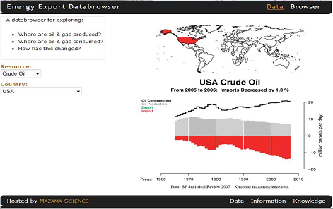
The databrowser contains over 80 countries. The strength of the tool is that it groups a lot of valuable information in one place, and makes it easily accessible. So, the next time someone asks you how much oil Gabon produces, in about 15 seconds you can tell them that Gabon produces a little over 200,000 bbl/day, down 0.2% from the previous year - and that it looks like their production has peaked.
Jonathan informs me that he is looking for constructive feedback so he can make the tool even better. So, give him your thoughts in this thread. He said he will monitor the thread, but can also be reached at mazamascience "at" gmail "dot" com.
Contact
- Content: editors at theoildrum dot com
- Tech support: support at theoildrum dot com
License

This work is licensed under a Creative Commons Attribution-Share Alike 3.0 United States License.
Great! Totals, overall and regional. Also, coal other energy, etc. And if you run out of things to, other mineral resources. Plus reserves?
I doubt that one can trust BP for accurate data on reserves. The following is from the first issue of the Hubbert Center Newsletter http://hubbert.mines.edu
---------------------------------------------
OIL RESERVES AND SEMANTICS
by
L.F. Ivanhoe
The prestigious British newsmagazine “The Economist” stated in its 10/07/95 feature article ‘The Future of
Energy’:
“Fossil fuels supply over three-quarters of the world’s energy needs...In the energy needed to
move transport, oil is still king, supplying 97% of the fuel used...Truly modern renewables such
as solar and wind power provide less than 1% of world electricity...Proven reserves of oil are
now enough to supply the world for 43 years at current rates of production, compared with 35
years during the 1970s, according to BP, one of the oil giants...But even given the growth in
demand, the proven reserve figures probably underestimate the longevity of fossil fuels... ‘I
don’t believe that we will be out of oil in 40 years’, says Sean O’Dell, chief economist of the
International Energy Agency.”
Such optimistic statements are typical of the views of most economists in financial newspapers and magazines.
Unfortunately, their opinions are often based on research quoting questionable data. For example, the much-quoted
annual ‘BP Statistical Review of World Energy’s’ tables and graphs on ‘Distribution of oil reserves in 1994’ contains a
fine-print footnote:
“...(reserve) estimates contained in this table are those published by the Oil and Gas Journal
(O&GJ) in its issue of 26 Dec. 1994, plus an estimate of natural gas liquids (NGL) for North
America.”
O&GJ RESERVES
One must go back to the O&GJ annual year-end reports to check each of the oil producing nation’s oil and gas
reserves / production. On close examination, one soon runs into problems with the O&GJ numbers. The O&GJ merely
compiles the RESERVE information provided annually by each country’s government source. There is no way for the
O&GJ to check on the accuracy of foreign reports. To many foreign ministries, the O&GJ requests for reserve data was
either a sensitive state secret or a nuisance chore that no one was critically concerned about. Due to lake of guidance or
ignorance, a common answer was apparently “same as last year”. (52% of the 67 nations listed in O&GJ’s 25/12/95
report gave the identical oil reserve numbers as on 26/12/94; many for several years.)
Some nations’ numbers are obviously gross approximations. IRAQ doubled its reported reserves from 47 Bbo to
100 Bbo (Billion barrels of oil) in 1987, the number that IRAQ still lists for its reserves. Who could prove IRAQ wrong?
And what difference did it make to IRAQ if the world’s economists and planners were misled? By 1989 all of the OPEC
nations had raised their reported reserves to maintain everybody in line for their “oil quotas”. All of this increase was
creative bookkeeping “political reserves” rather than new oil discovered. These are the figures that bolster the apparent
change as reported by The Economist, that the world potential of reserves / production (R/P) increased from 35 years in
the 1970’s to 43 years in 1995.
Operating oil companies pay only limited attention to details of the O&GJ reserve numbers which are the domain
of academic planners. It is simply impossible to check foreign reports. Caveat Emptor! If the USA / UN will not trust
IRAQ’s Saddam Hussein to correctly report details of his military might - how can they trust his report on IRAQ’s OIL
RESERVES (his economic might)? The same question might be raised for all nations who get foreign government and
World Bank grants and loans based on large reported RESERVES. In summary - don’t trust the O&GJ (or BP’s) reserve
numbers implicitly - some 300 Bbo of political reserves may need to be subtracted therefrom.
In short - OPEC nations’ claimed reserves are intended to increase their “OPEC PRODUCTION QUOTAS” -
not to evaluate their oil as in other countries. Consequently, relating OPEC’s with other nations’ oil reserves is like
comparing apples with oranges (see Figure 1).
USGS OIL RESOURCES
The possible exaggerations in the O&GJ reserve numbers don’t bother me nearly as much as the economists’
treatment of the U.S. Geological Survey (USGS) “RESOURCE” numbers. These are commonly added to the O&GJ
RESERVES to produce a grand total of each nation’s “OIL ENDOWMENT”. The sum of two (unknown) values gives
huge numbers which are routinely and incorrectly called “RESERVES” - rather than “undiscovered RESOURCES”. The
equation should be:
(known) RESERVES + (undiscovered) resources = (unknown) resources.
The two technical terms (known) RESERVES and (unknown) RESOURCES are virtually synonymous to the
public - but not to the oil industry. Known RESERVES are calculated by the petroleum reservoir engineers and
conservative bankers will lend money on such RESERVES. RESOURCES, however, are estimates by scientific
geological committees, of the total amount of oil they feel may be present but still undiscovered in any area. Conservative
bankers will not lend money on undiscovered RESOURCES.
USGS geologists now prepare RESOURCE numbers for all nations, based on elaborate computer programs and
global data bases. Nobody else could do a better job. Unfortunately, the basic problem - like earthquake predictions - is
beyond the ability of any scientific committee to solve. The USGS uses a statistical formula that gives estimates of the
PERCENTAGE PROBABILITY OF NEW DISCOVERIES (oil volumes) and their reports have lots of guesses,
assumptions and fine print qualifying their methodology. Their final computer printouts are very impressive. However,
few operating oil companies concern themselves much with the USGS RESOURCE numbers, which are designed for
global planners/economists rather than working oil people who have different problems. Government and academic
scientists are always much more optimistic about the chances of new discoveries than are their oil company colleagues
who are regularly humbled by dry holes drilled on the very best of data.
The 1994 USGS undiscovered world oil RESOURCE numbers were:
95% probable (sure things) = 292 Billion barrels oil
50% probable (likely) = 582 Billion barrels oil
5% probable (unlikely) = 1005 Billion barrels oil
But the actual oil discovered in new global fields discovered during the 1982-1991 decade was only 91 Bbo, at
the declining end of a global finding curve (see Figure 2). A straight extrapolation of the 1982-1991 finding rate would be
180 Bbo during the next 20 years...far less than the USGS 95% (sure thing) numbers! This USGS discrepancy may be the
result of errors in their basic computer model assumptions - or the lack of any TIME limits in their computations. Oil to
be found more than 20 years in the future- is effectively worthless today.
If “Reserves” are “apples”, and OPEC “quota reserves” are “oranges”, then USGS “Resources” might be
“olives.” Combining them results in “fruit salad” - not “apples.”
SUMMARY
Unfortunately, planners who trust the O&GJ and USGS numbers base their economic projections on overly
optimistic data. It is now a question of WHEN-not WHETHER the foreseeable world oil supply shortage will confront us
sometime between 2000-2010 AD when the global demand will exceed the world’s oil production...to the surprise and
dismay of those who believed the superoptimistic economists.
L.F.Ivanhoe #HC96/1-2
7/18/96
While I don't have an issue with your comments about reserve numbers, I'm not sure it relates to this topic. The numbers we are looking at here are historical production/consumption/export data and I think BP is a good source for this.
Great information!
Thanks
Addressing all comments upthread.
I agree that reserves are a very problematic issue if you want to present people with "just the facts". I'm not really sure yet what I want to do with the reserve numbers as so many of them, particularly for the Middle East, are clearly fabricated.
As for other resources, the visualization should lend itself to any resource that is traded globally. Coffee anyone?
Before I stray too far afield with coal and the like I'd like to allow folks to choose other datasets so that the "Resource:" selector might look like this:
Oil (BP)
Oil (EIA)
Oil (IEA)
Oil (OPEC)
Nat. Gas (BP)
etc.
Or perhaps the ability to choose the dataset to work with (BP, EIA, etc.) should be reserved for an "Advanced Features" tab.
Reseves aren't really the problem - we know they are huge (of the order of trillions of barrels) and are of no real importance for the next twenty years or so - and anyway many of the reserves may turn out to just be resource or lies - I wouldn't waste any time on them.
It's the flow rates that are important for peak oil purposes and this is the best tool, by far, that I have ever seen to quickly and graphically show this - good work, you have saved me lots of effort, thanks.
I would definitely like as many up-to-date datasets as possible because they are all in error to some extent.
My biggest wish? ... If possible I would like to see a grouping which is just the nations that have 'net exports'. Maybe a tool that allows you to select which countries you want to sum together?
Great tool, many thanks.
Requests: For Country add "World total" (some numbers of course make less sense, but production/consumption should come obvious)
As for labeling, this may sound technical, but I would personally appreciate: if reserves are added, use P level ratings (P, P2, P3, etc).
Also a wish, don't add R/P ratios even if people ask for them :)
I might also be enlightening to some people to be able to overlay an inflation adjusted price graph (perhaps a weighted average of the top 3 crude prices, instead of using WTI exlusively?)
Granted, that's lots of work. The browser is already very useful as it is.
Wonderful tool - thanks a lot.
My suggestion would be to also have aggregated totals and graphs, say the Middle East, Europe outside Russia, etc
Although BP provides regional totals, I want a little more flexibility. In a future version I'd like to allow users to select any combination of countries they want. "North America" is a fine grouping, but how about "English Speaking Nations" or BRIC or Commonwealth, etc.? And you'd want to see each country in the group colored by import/export. That's the plan at the moment.
Terrific.
Presumably it is part of your plan, but I would like to put a plea in that obvious and often used groups like the EU should be one-click accessible rather than needing to be created as a group - just thought I would clarify!
I'm in total agreement. The only reason I didn't include the groupings that BP has in their dataset is that I'd like to show which members of the group are importers and which are exporters instead of just coloring the entire block either red or green.
Jonathan, great to see this new tool.
If you are able to introduce the concept of groups (e.g. north america consists of Canada, Mexico & USA) then it would be easy for you to build a new group based on whatever criteria you want.
Can the graphics resize to fill the screen? Also on my monitor (1680 x 1050) the icon for consumption, production & import/export fits only the top right of the axis leaving a lot of white space "within" the graph.
Ukraine & Uzbekistan seem to have taken over Russia on the map! a small buglet i think.
It would be nice to see all the countries (whole globe) coloured in by exporter or importer.
You'll get your colored globe eventually -- it's part of the plan to allow groups of nations.
And the new ex-Soviet republics do present a problem for me. The code I'm using for maps (the R maps pacakge) does not have the post-USSR national boundaries. I have to do some searching to see if anyone has an add-on for R that willl draw Kazakhstan, etc.
For full screen plots you just need to click on the image. This will download a .pdf file that you can rescale to any size you want and, perhaps more importantly, prints out very nicely and can be embedded in documents.
An interesting grouping would be "Majority-Muslim Nations." Might provoke some analysis of the economic implications of "Islamophobia."
The EIA quite a bit of detail on their country website (click on 10 year history for details):
http://tonto.eia.doe.gov/country/index.cfm
And I think that they are updated for 2007.
It seems like BP's 2007 energy report came out in June last year. Perhaps the 2008 report (showing 2007 data) will be out shortly.
I noticed in looking at the report that Iran has been a net importer of natural gas for several years. Also, Russia's natural gas exports have been approximately flat for quite a few years. If they add lots of new pipelines, will there be more gas to go around?
Wow. I knew that Iran was importing gas. I didn't realize that they were a net importer. I frequently cite the Iranian gas situation this past winter as an example of the Export Land Model (ELM).
Turkmenistan cut off natural gas to Iran. Iran cut off gas to Turkey. Turkey cut off gas to Greece.
The gas did not go to the high bidders, and the various countries did not offer to share; they offered a middle finger salute to the export markets, basically taking the position that "Your stinking money is no good; you can't have any gas."
My premise is that the price of energy (and increasingly food) is being set at the margin as importers bid for the volume of food & energy that "escapes" into the export market.
Interesting that Iran is on the wrong side of the export/import equation regarding natural gas. Turkmenistan has doubled the price of natural gas:
http://www.jamestown.org/edm/article.php?article_id=2373014
BP 2008 was out today...shows decline in global output...
was out today - check bp website
The EIA web page is very slick and contains many more countries than the BP dataset but I would submit that their presentation of the data makes it difficult to understand the interaction of production, consumption and natural decline.
Their data does include 2007 but only goes back to 1980 so that it's harder to see the shape of the production curve in each nation. That is the real story behind these data and I believe it should be made as visible as possible.
Something's really wonky with the Canadian data. It shows that we don't import any oil, and I'm quite sure that central and eastern Canada import a whole bunch. Actually, it doesn't seem to match any of the CAPP statistics (whether you factor in the tar sands or not).
In general, it would be great if it were able to separate out conventional and unconventional sources, so as to give a better idea of just how screwed we actually are. (I'm a Canuck)
I think the problem is that what is being presented is NET imports/exports. i.e. it looks to me like the source data is simply production and consumption. The difference between the two is calculated and presented as either imports (red) or exports (green).
http://www.eia.doe.gov/pub/oil_gas/petroleum/data_publications/company_l...
shows the U.S. as importing about 1.8 million barrels of crude oil a day from Canada, and I think substantially all oil produced in Canada is exported to the U.S.. If net exports are 1 million barrels per day (estimated from mazamascience graph), then 0.8 million barrels per day is imported into eastern Canada and 1.8 million barrels per day are shipped (piped) to the U.S. from western Canada.
You are correct JustZisGuy. The BP dataset only contains production and consumption numbers and treats Canada as one big black box. My only choice with this dataset is to present the data as shown. If a province by province dataset were available for Canada (or state by state for the US) then we could set up a more detailed version of the databrowser that would show the difference between imports in Quebec and exports in Alberta.
If everything's netted out, then why isn't there just one line on the graph. And if we import 0.8 million barrels per day, why don't we have some of those red bars attached to us in the later years?
At some point I will place interactive code for the Oil Shock model on a web server. A while ago somebody wrote up the algorithm in Python and I will try to reuse that (and also implement the Dispersive Discovery model). The hard part of this is always to make a nice user interface and Callahan certainly chose a very intuitive one for his data.
BTW, last night I derived how the Logistic curve derives from a specific case of the Dispersive Discovery model. Read about it here first:
http://mobjectivist.blogspot.com/2008/06/double-dispersive-discovery-lea...
I know RR has some severe misgivings about the Logistic model, which I agree with, but when it gets placed in the light of a first-principles derivation, it becomes a real eye-opener.
How about some more real life case histories? We (my idea, Khebab did the heavy lifting) looked at two radically different producing regions, the Lower 48 and Russia, and generated prediction production curves based only on the data to 1970 and to 1984 respectively. The Lower 48 post-1970 and Russian post-1984 cumulative production was quite close to what the HL models predicted. And I did use the method to warn of near term production declines by both Saudi Arabia and Russia.
Why not extend this analysis (use the data through the peak to predict post-peak cumulative production) to some other post-peak regions, such as Indonesia, the North Sea and Mexico? The key of course is whether or not the data set shows a relatively stable pre-peak HL plot.
Well done!
Damn. I am going to have to sit and think about that one for a while.
Very nicely done, WHT!
Good work, clearly a solid foundation has been established. What a shame that WHT is either unable or unwilling to write for a general audience, or at least an audience that does not have an advanced degree in calculus and statistics, which would be just about everybody.
I ran across an article that does a reasonably good job of explaining some of the basics of mathematical modeling:
http://www.causascientia.org/math_stat/Tutorial.pdf
although still fairly advanced for those who didn't get much further than college level algebra, even so it's worth a read for those who would like to shed some light into the impenetrable gloom of "probability density functions".
Cheers,
Jerry
That's my niche I guess. :) Stuff that goes over people's heads.
Just saw a brief report on ABC news, Australia:
"One of many companies" (this one in UAE) "struggling to keep up" with building and supplying their massive drilling rigs (pictures were of a half-billion dollar unit, two years in the making. Rigs were also for hire, at exorbitant rates, minimum five year term - while oil remains at $100+).
Seems to me like there's a way to go before the big boys stop playing with their big toys. Also seems they'd rather spend their money on oil for the moment and not the alternatives.
(Ouch! Is the fence I sit on made of timber or steel? Whatever, it's getting a little uncomfortable!)
Per capita data would be a big plus!
Per capita is one of the very next scheduled improvements. I intend to use the data available at the US Census Bureau IDB unless anyone has a better suggestion.
According to the EIA data...Iran had a subsantial decrease in exports in 2005 of 2666.1 to 2462.4 in 2006.
I found this at..
http://www.theoildrum.com/node/4092#more
The Energy Export Browser using BP data shows an increase in exports of 0.5%. This is a quite a difference as the EIA data indicates a 7.6% decrease in exports?
Any comments?
Keopele
Tjis is a nifty tool, thanks R.R.
Some of the nations that were very interesting:
In South America
Argentina
Brazil
Columbia
Ecuador
Peru
Trinidad and Tobago
In Asia: Vietnam and Brunei
China is fascinating. How easy it is to forget that China has only been an importer for about 15 years, and still has substantial production. Like so many of the South American and Asian nations, so little is known about their oil reserves and productive capacity. Very interesting stuff.
RC
A Great tool.
I was surprised by how clearly it supports the idea that the peak has already been passed.
Of the big oil producing countries there are only a few that have actually increased production significantly between 2005 and 2006. Most are in decline. And some in significant decline. I bet that if this tool had data for 2007 it would be even clearer.
The EIA tool linked to in the comments is not as clear in terms of visualization. But the data is more up to date and 2007 definitely continues the trends set in previous year. Even Russia's exports are declining.
No wonder the price is rising through the roof.
Would someone please sell me an electric-car that my family of 4 can fit in and lets me drive 400 km without a recharge?
And some solar panels?
Great interface. Is there a way to combine all the information to get a composite world view?
It seems to me that some minor producers are missing. Austria was selfsufficent until the 1960´s, with the peak in 1949 at 3,7 Million tons/ Year, the present production beeing about 1 Million tons/ year . Also Germany has an indigenous oilproduction of about 3 Millions / year at present.
P.S, and of topic: One reason for the industrial decay of the US is the non metric system.
"off topic: One reason for the industrial decay of the US is the non metric system."
Are you serious? In the age of the computer?
Besides, metrics are used when it matters, like in engineering and chemistry/physics (9.81m/s2 pops to mind right away..)
Cheers from Munich, Dom
I would love to get a dataset that went back to 1900 so that we could see all the nations that once produced and their complete production profiles. If anyone knows of a suitable dataset, please let me know.
And no disagreement about the metric system. However, in order to communicate unfamiliar concepts to people one must use familiar language. And bbls is the defacto standarad unit for oil in the English language. When I translate the databrowser into other languages we can talk about appropriate units or even allow for unit conversion.
As to Germany's production -- Yes, it is a producer. But not in enough quantity to register in BP's dataset. Have a look at the EIA statistics for Germany ~ 150,000 barrels per day.
Since the focus is exports, imports, production and consumption, it would be great to see the top source nations for oil for the importers, and the top export destinations for the producer/exporters. A map that would show the selected producer in one color and light up its top customer nations in another color (or reversed for a selected importer) would be interesting.
Very nice idea. Do you know of a dataset that has things organized this way?
no, unfortunately. Certainly not for every country.
Great find Robert and just about exactly what I wanted to put against the intriguing Graph Nate put in in to Why oil costs over $130 per barrel: the decline of North Sea OilPosted by Euan Mearns on June 9.
The only disappointment is that it doesn't give a world picture total. I really would like to see that and maybe I missed the right button or also maybe you , Nate or combination thereof, could remedy that and put a world picture together?. Sorry, but that sort of information assembly just gives me migraines (actual).
World Total is, of course, one of the rows in the BP Stastical Review worksheet. The production and consumption numbers are almost exactly equal resulting in no net exports/imports and the same production curve we've seen in many places. It's not that compelling a graphic but should definitely be included for completeness.
The reason this and other groupings are not in the databrowser yet revolves around programming issues more than data issues. The data are all there in the dataset. But I need to be careful how I build this functionality into the system. If I design things properly I should be able to allow several desirable features:
These are all very desirable but I need to worry about the following as I build this functionality into the databrowser:
It is my hope that patience with my slow progress will be rewarded with a useful and stable tool that withstands the test of time.
Johnathan,
Thanks for the information, but I guess once again I wasn't too clear on what I was after. What I was looking to see was Nates decade by decade graph of oil discoveries graphed against decade by decade consumption. I thought that the intersection points between the two might form an interesting plotting on it's own.
Good luck with your project, sounds like a good one .
-------
edit
Gee I think I am still non too clear , what I mean is a 'consumption' graph subtracted from Nates 'discovery' graph and those resulting points forming a third graph.
Yes, plots showing both discovery and production curves are very telling. My main issue is what to make of discovery numbers and how to present these guesstimates. They certainly aren't as hard as the production/consumption numbers.
Anyone have a suggestion as to what the error bars should look like on discovery numbers?
The latest BP statistical review is out today, Wednesday 1 June, on their website so now you can revise all the figures:-)
Jonathan, great work! And very timely.
Do you grant permission to include your charts (with attribution of course) in other works?
By all means include the charts wherever you see fit. You may choose whichever level of attribution you wish though my preference is the one at the top of the list:
This databrowser is my way of advertising my skills and the more people that see the data graphics and appreciate why they are good, the better.
There is a special tab for 'groupings'.
I would be interested in that:
- Europe
- EU
- Euro zone
- North America
- Asia Pacific
- OECD
- OPEC / ...
- etc
excellent product Jon. Is there a way to increase the resolution, eg to make meaningful year to year numbers easily visible?
If you click on an image you will download a .pdf version of the image If you have Adobe Acrobat or some other .pdf reader installed in your system you will get a vector graphic that can be scaled to whatever size you want. They also print out very nicely as hardcopy.
I should also note that the year axis does not change from plot to plot. So once you know what they are you should be good. The white bars demarcate 1970, 1980, 1990 and 2000.
Conflicting Data on Exports for Iran from 2005-2006.
Look at the data for Iran provided by the EIA on the spreadsheet contained within the following post.
http://www.theoildrum.com/node/4092#more
Then pull up Iran in the Energy Export Databrowser.
The Databrowser shows an increase in exports of .5% while the EIA data show a significant decrease of around 7.6% ??
How can the data be differen't?
Keopele
Keopele,
The data in the databrowser comes from the BP Statistical Review 2007. It is not surprising that there are differences between the BP data and the EIA data. No doubt there would be further differences if you compared these data against the IEA data and the OPEC data. I am not really qualified to address the specific reasons why these different organizations came up with different numbers.
Would it be desirable in the future to display the data from all four organizations on top of each other to get a sense of the spread? Folks running weather and climate models do this all the time and call the resulting plots spaghetti plots. Hopefully, our multi-dataset plots would look like uncooked spaghetti still in the package as opposed to the cooked spaghetti the weather models spit out.
I question the validity of any conclusion based on this data, if the data from these sources is that differen't? How can you reach any conclusion of increase or decrease in net exports, when one source of data shows and increase of .5% and the other shows a decrease of 7.6% ? Scientists verify the validity of any conclusion with data from several independent and unbiased sources.
Keopele
He is displaying the data, and neither compiling it or drawing any conclusions from it, and furthermore attempting to show it from several different sources, so what is your issue?
The issue of conclusions from previous threads assuming net export decline rates of 1.1% for 2005-2006 and 2.4% for 2006-2007. This conclusion is based on EIA data at the thread here.
http://www.theoildrum.com/node/4092#more
Keopele
I guess my point is... What is the value of any data if differen't sources have such differn't numbers? Who's numbers are correct and how do we know if we don't know the method of how the data was collected? How can any reasonable person make any conclusion with that data? I don't have an issue with the person who posted the information, just the data itself and any conclusions that are derived from it.
Keopele
Perhaps it might be a mistake to condemn all of the data based on one country and one year?
There is also the chance that BP will revise the 2006 data, when they issue their 2007 annual data (the EIA revised their 2006 data, when they released their 2007 data).
When BP releases their 2007 data, perhaps you could do a detailed comparison of the top net oil exporters for each data set (and even better look at the variance over a five period).
In any case, my preference is the EIA, because of the amount of data that they provide: http://tonto.eia.doe.gov/country/country_time_series.cfm?fips=IR
Having said that, it's obvious that the data sets are not perfect, but the net export trend is pretty clear.
Keopele,
I understand your frustration. I have worked for over a decade with all kinds of data while employed at NOAA -- oceanographic and atmospheric, measured and modeled, station data and satellite data. There are a million reasons why we always include error bars on the absolute measurement of some value. Various groups will argue that their method is better but for the outsider it can be disconcerting.
That's why it's important to present data that is at least self-consistent. I have presented only the BP data in the databrowser and not mixed in data from other sources. I trust (hope really) that BP was as careful as they know how to be in assembling this dataset.
Secondly, it's important not to get too fixated on specific numbers and instead look at data trends. That is what I have tried to do with this data graphic -- focus on the longer term trends to make the interaction of production, consumption and natural decline more apparent. It's basically just westexas' Export Land Model with real data.
I'll try to get some EIA data up in the next month or two so folks can decide for themsleves whether these two datasets are telling the same or different stories regarding export/import trends.
I am not condemning all data, but I do question the source and the bias of the data collectors. I do appreciate everybody's hard work here at TOD. I am very happy that I found TOD and I feel most here have good intentions. I am just trying to uncover the truth and want to find all the tools I can to do so. I feel that everybody here is providing a great place to share information and discuss peak oil etc.. I have done some of my own reasearch long before I found TOD and I do beleive that we have past peak production. Based on my own research I do think that Sauidi Arabia and the rest of OPEC is lying about their reserves and possibly there production numbers recently. I feel feel that there will be no oil exports in 20 years as the countries who have remaining oil will most likely hoard it for there own use. I am concerned about the U.S. and it's history of using force to get what it wants.
I am very concerned about the future for my children. I am in the process of moving back to my wife's home of Lahaina Maui from San Francisco. I am very concerned about Hawaii and feel they are the most vulnerable of anywhere in the U.S.
My goal is to do eveything I can to move Hawaii towards independence from Oil and create more of a self sustainable community. Hawaii gets about 80% of it's electricty from oil and Maui get's 90%. I feel that most in Hawaii aren't aware of how vulnerable they are or how serious the problem is for them.
These are the things that drive my desire for the truth and I have a tendency to question everything, since bias is human nature.
Keopele
A 2006 article suggesting that Hawaii should consider nuclear power.
http://www.grassrootinstitute.org/GrassrootPerspective/EnergyChoicesHawa...
I noticed that Egypt is a good example for the ELM.
Jonathan,
Great tool! I am interested in seeing different time frames on the charts. In partic, I'ld love to be able to look at the charts since 2000.
Nice job! Exactly what I've been wanting to see.
Jon, great browser! Many others have commented on the utility of this tool; I will add that for us science teachers, it will be a useful research tool for students. I look forward to the fall when I can give it a whirl with the next year's students!